使用工程符号标记刻度线
使用工程格式化程序。
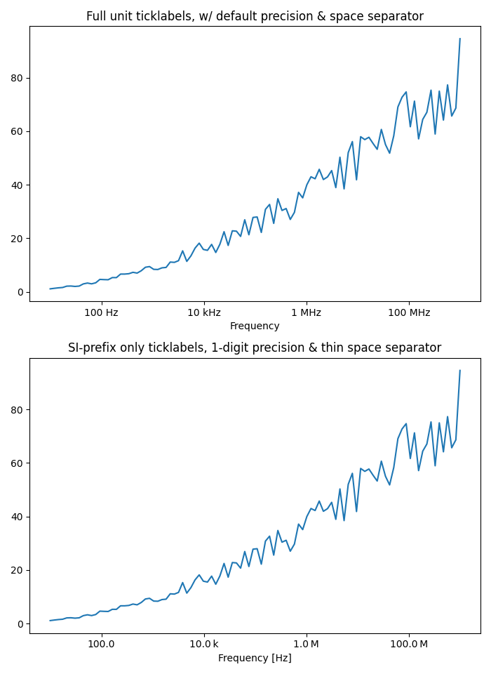
import matplotlib.pyplot as pltimport numpy as npfrom matplotlib.ticker import EngFormatter# Fixing random state for reproducibilityprng = np.random.RandomState(19680801)# Create artificial data to plot.# The x data span over several decades to demonstrate several SI prefixes.xs = np.logspace(1, 9, 100)ys = (0.8 + 0.4 * prng.uniform(size=100)) * np.log10(xs)**2# Figure width is doubled (2*6.4) to display nicely 2 subplots side by side.fig, (ax0, ax1) = plt.subplots(nrows=2, figsize=(7, 9.6))for ax in (ax0, ax1):ax.set_xscale('log')# Demo of the default settings, with a user-defined unit label.ax0.set_title('Full unit ticklabels, w/ default precision & space separator')formatter0 = EngFormatter(unit='Hz')ax0.xaxis.set_major_formatter(formatter0)ax0.plot(xs, ys)ax0.set_xlabel('Frequency')# Demo of the options `places` (number of digit after decimal point) and# `sep` (separator between the number and the prefix/unit).ax1.set_title('SI-prefix only ticklabels, 1-digit precision & ''thin space separator')formatter1 = EngFormatter(places=1, sep="\N{THIN SPACE}") # U+2009ax1.xaxis.set_major_formatter(formatter1)ax1.plot(xs, ys)ax1.set_xlabel('Frequency [Hz]')plt.tight_layout()plt.show()
下载这个示例

若有收获,就点个赞吧
0 人点赞
