等高线演示
演示简单的等高线绘制,图像上的等高线带有等高线的颜色条,并标出等高线。
另见轮廓图像示例。
import matplotlibimport numpy as npimport matplotlib.cm as cmimport matplotlib.pyplot as pltdelta = 0.025x = np.arange(-3.0, 3.0, delta)y = np.arange(-2.0, 2.0, delta)X, Y = np.meshgrid(x, y)Z1 = np.exp(-X**2 - Y**2)Z2 = np.exp(-(X - 1)**2 - (Y - 1)**2)Z = (Z1 - Z2) * 2
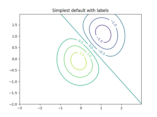
使用默认颜色创建带有标签的简单等高线图。clabel的内联参数将控制标签是否画在轮廓的线段上,移除标签下面的线。
fig, ax = plt.subplots()CS = ax.contour(X, Y, Z)ax.clabel(CS, inline=1, fontsize=10)ax.set_title('Simplest default with labels')
等高线的标签可以手动放置,通过提供位置列表(在数据坐标中)。有关交互式布局,请参见ginput_book_clabel.py。
fig, ax = plt.subplots()CS = ax.contour(X, Y, Z)manual_locations = [(-1, -1.4), (-0.62, -0.7), (-2, 0.5), (1.7, 1.2), (2.0, 1.4), (2.4, 1.7)]ax.clabel(CS, inline=1, fontsize=10, manual=manual_locations)ax.set_title('labels at selected locations')

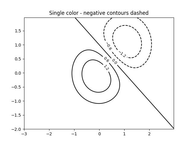
你可以强制所有的等高线是相同的颜色。
fig, ax = plt.subplots()CS = ax.contour(X, Y, Z, 6,colors='k', # negative contours will be dashed by default)ax.clabel(CS, fontsize=9, inline=1)ax.set_title('Single color - negative contours dashed')
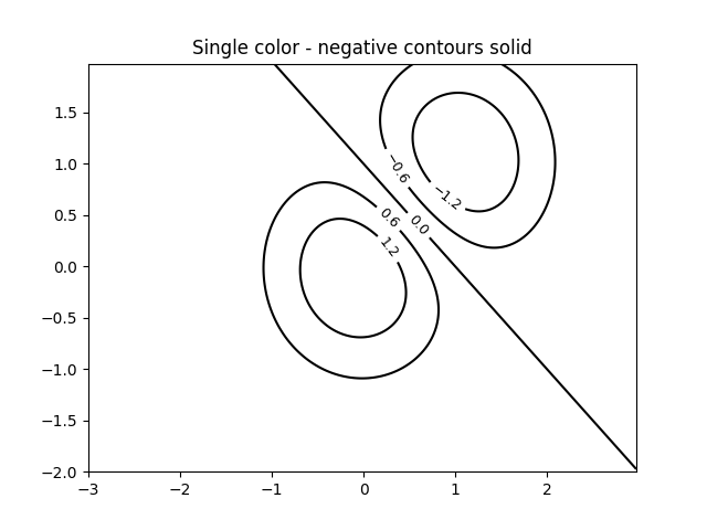
你可以将负轮廓设置为实线而不是虚线:
matplotlib.rcParams['contour.negative_linestyle'] = 'solid'fig, ax = plt.subplots()CS = ax.contour(X, Y, Z, 6,colors='k', # negative contours will be dashed by default)ax.clabel(CS, fontsize=9, inline=1)ax.set_title('Single color - negative contours solid')
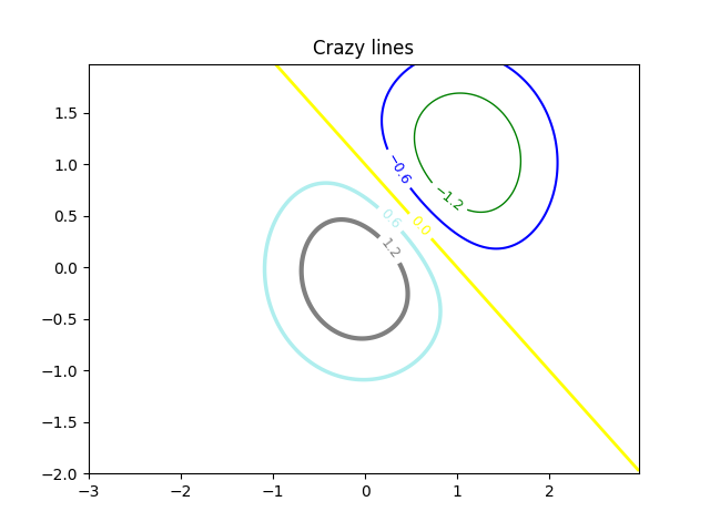
并且你可以手动指定轮廓的颜色。
fig, ax = plt.subplots()CS = ax.contour(X, Y, Z, 6,linewidths=np.arange(.5, 4, .5),colors=('r', 'green', 'blue', (1, 1, 0), '#afeeee', '0.5'))ax.clabel(CS, fontsize=9, inline=1)ax.set_title('Crazy lines')
也可以使用颜色图来指定颜色;默认的颜色图将用于等高线。
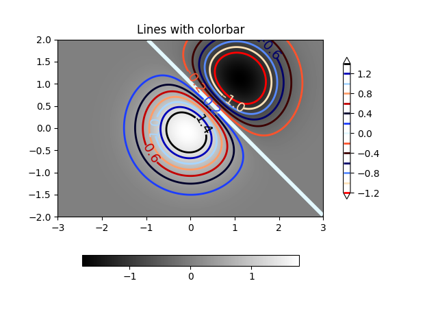
fig, ax = plt.subplots()im = ax.imshow(Z, interpolation='bilinear', origin='lower',cmap=cm.gray, extent=(-3, 3, -2, 2))levels = np.arange(-1.2, 1.6, 0.2)CS = ax.contour(Z, levels, origin='lower', cmap='flag',linewidths=2, extent=(-3, 3, -2, 2))# Thicken the zero contour.zc = CS.collections[6]plt.setp(zc, linewidth=4)ax.clabel(CS, levels[1::2], # label every second levelinline=1, fmt='%1.1f', fontsize=14)# make a colorbar for the contour linesCB = fig.colorbar(CS, shrink=0.8, extend='both')ax.set_title('Lines with colorbar')# We can still add a colorbar for the image, too.CBI = fig.colorbar(im, orientation='horizontal', shrink=0.8)# This makes the original colorbar look a bit out of place,# so let's improve its position.l, b, w, h = ax.get_position().boundsll, bb, ww, hh = CB.ax.get_position().boundsCB.ax.set_position([ll, b + 0.1*h, ww, h*0.8])plt.show()
参考
下面的示例演示了以下函数和方法的使用:
import matplotlibmatplotlib.axes.Axes.contourmatplotlib.pyplot.contourmatplotlib.figure.Figure.colorbarmatplotlib.pyplot.colorbarmatplotlib.axes.Axes.clabelmatplotlib.pyplot.clabelmatplotlib.axes.Axes.set_positionmatplotlib.axes.Axes.get_position
下载这个示例

若有收获,就点个赞吧
0 人点赞
