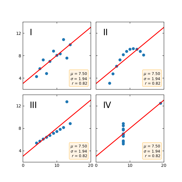
Anscombe的四重奏
输出:
mean=7.50, std=1.94, r=0.82mean=7.50, std=1.94, r=0.82mean=7.50, std=1.94, r=0.82mean=7.50, std=1.94, r=0.82
"""Edward Tufte uses this example from Anscombe to show 4 datasets of xand y that have the same mean, standard deviation, and regressionline, but which are qualitatively different.matplotlib fun for a rainy day"""import matplotlib.pyplot as pltimport numpy as npx = np.array([10, 8, 13, 9, 11, 14, 6, 4, 12, 7, 5])y1 = np.array([8.04, 6.95, 7.58, 8.81, 8.33, 9.96, 7.24, 4.26, 10.84, 4.82, 5.68])y2 = np.array([9.14, 8.14, 8.74, 8.77, 9.26, 8.10, 6.13, 3.10, 9.13, 7.26, 4.74])y3 = np.array([7.46, 6.77, 12.74, 7.11, 7.81, 8.84, 6.08, 5.39, 8.15, 6.42, 5.73])x4 = np.array([8, 8, 8, 8, 8, 8, 8, 19, 8, 8, 8])y4 = np.array([6.58, 5.76, 7.71, 8.84, 8.47, 7.04, 5.25, 12.50, 5.56, 7.91, 6.89])def fit(x):return 3 + 0.5 * xxfit = np.array([np.min(x), np.max(x)])plt.subplot(221)plt.plot(x, y1, 'ks', xfit, fit(xfit), 'r-', lw=2)plt.axis([2, 20, 2, 14])plt.setp(plt.gca(), xticklabels=[], yticks=(4, 8, 12), xticks=(0, 10, 20))plt.text(3, 12, 'I', fontsize=20)plt.subplot(222)plt.plot(x, y2, 'ks', xfit, fit(xfit), 'r-', lw=2)plt.axis([2, 20, 2, 14])plt.setp(plt.gca(), xticks=(0, 10, 20), xticklabels=[],yticks=(4, 8, 12), yticklabels=[], )plt.text(3, 12, 'II', fontsize=20)plt.subplot(223)plt.plot(x, y3, 'ks', xfit, fit(xfit), 'r-', lw=2)plt.axis([2, 20, 2, 14])plt.text(3, 12, 'III', fontsize=20)plt.setp(plt.gca(), yticks=(4, 8, 12), xticks=(0, 10, 20))plt.subplot(224)xfit = np.array([np.min(x4), np.max(x4)])plt.plot(x4, y4, 'ks', xfit, fit(xfit), 'r-', lw=2)plt.axis([2, 20, 2, 14])plt.setp(plt.gca(), yticklabels=[], yticks=(4, 8, 12), xticks=(0, 10, 20))plt.text(3, 12, 'IV', fontsize=20)# verify the statspairs = (x, y1), (x, y2), (x, y3), (x4, y4)for x, y in pairs:print('mean=%1.2f, std=%1.2f, r=%1.2f' % (np.mean(y), np.std(y),np.corrcoef(x, y)[0][1]))plt.show()
下载这个示例

若有收获,就点个赞吧
0 人点赞
