堆积条形图
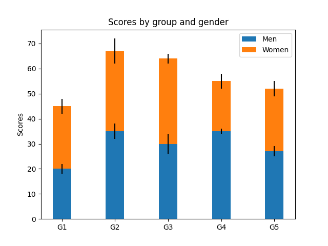
这是使用 bar 创建带有误差线的堆积条形图的示例。注意yerr用于误差条的参数,并且底部用于将女人的条形堆叠在男人条形的顶部。
 ;
;
import numpy as npimport matplotlib.pyplot as pltN = 5menMeans = (20, 35, 30, 35, 27)womenMeans = (25, 32, 34, 20, 25)menStd = (2, 3, 4, 1, 2)womenStd = (3, 5, 2, 3, 3)ind = np.arange(N) # the x locations for the groupswidth = 0.35 # the width of the bars: can also be len(x) sequencep1 = plt.bar(ind, menMeans, width, yerr=menStd)p2 = plt.bar(ind, womenMeans, width,bottom=menMeans, yerr=womenStd)plt.ylabel('Scores')plt.title('Scores by group and gender')plt.xticks(ind, ('G1', 'G2', 'G3', 'G4', 'G5'))plt.yticks(np.arange(0, 81, 10))plt.legend((p1[0], p2[0]), ('Men', 'Women'))plt.show()
下载这个示例

若有收获,就点个赞吧
0 人点赞
