直方图
演示如何使用matplotlib绘制直方图。
import matplotlib.pyplot as pltimport numpy as npfrom matplotlib import colorsfrom matplotlib.ticker import PercentFormatter# Fixing random state for reproducibilitynp.random.seed(19680801)
生成数据并绘制简单的直方图
要生成一维直方图,我们只需要一个数字矢量。对于二维直方图,我们需要第二个矢量。我们将在下面生成两者,并显示每个向量的直方图。
N_points = 100000n_bins = 20# Generate a normal distribution, center at x=0 and y=5x = np.random.randn(N_points)y = .4 * x + np.random.randn(100000) + 5fig, axs = plt.subplots(1, 2, sharey=True, tight_layout=True)# We can set the number of bins with the `bins` kwargaxs[0].hist(x, bins=n_bins)axs[1].hist(y, bins=n_bins)

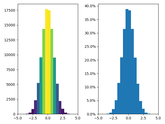
更新直方图颜色
直方图方法(除其他外)返回一个修补程序对象。这使我们可以访问所绘制对象的特性。使用这个,我们可以根据自己的喜好编辑直方图。让我们根据每个条的y值更改其颜色。
fig, axs = plt.subplots(1, 2, tight_layout=True)# N is the count in each bin, bins is the lower-limit of the binN, bins, patches = axs[0].hist(x, bins=n_bins)# We'll color code by height, but you could use any scalarfracs = N / N.max()# we need to normalize the data to 0..1 for the full range of the colormapnorm = colors.Normalize(fracs.min(), fracs.max())# Now, we'll loop through our objects and set the color of each accordinglyfor thisfrac, thispatch in zip(fracs, patches):color = plt.cm.viridis(norm(thisfrac))thispatch.set_facecolor(color)# We can also normalize our inputs by the total number of countsaxs[1].hist(x, bins=n_bins, density=True)# Now we format the y-axis to display percentageaxs[1].yaxis.set_major_formatter(PercentFormatter(xmax=1))
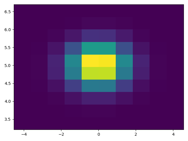
绘制二维直方图
要绘制二维直方图,只需两个长度相同的向量,对应于直方图的每个轴。
fig, ax = plt.subplots(tight_layout=True)hist = ax.hist2d(x, y)
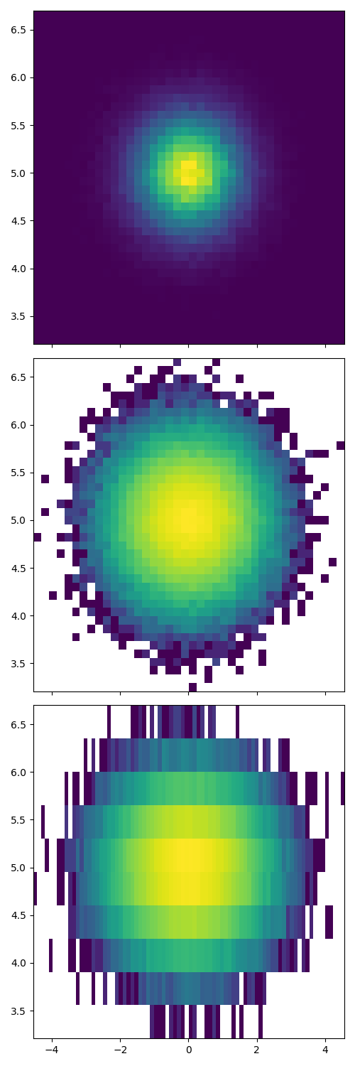
自定义直方图
自定义2D直方图类似于1D情况,您可以控制可视组件,如存储箱大小或颜色规格化。
fig, axs = plt.subplots(3, 1, figsize=(5, 15), sharex=True, sharey=True,tight_layout=True)# We can increase the number of bins on each axisaxs[0].hist2d(x, y, bins=40)# As well as define normalization of the colorsaxs[1].hist2d(x, y, bins=40, norm=colors.LogNorm())# We can also define custom numbers of bins for each axisaxs[2].hist2d(x, y, bins=(80, 10), norm=colors.LogNorm())plt.show()
下载这个示例

若有收获,就点个赞吧
0 人点赞
