轴线演示
例如,使用plt.axes在主绘图轴中创建嵌入轴。
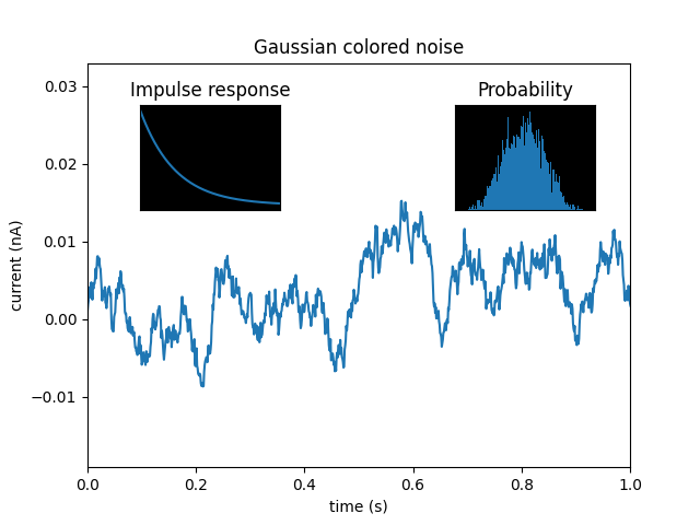
import matplotlib.pyplot as pltimport numpy as np# Fixing random state for reproducibilitynp.random.seed(19680801)# create some data to use for the plotdt = 0.001t = np.arange(0.0, 10.0, dt)r = np.exp(-t[:1000] / 0.05) # impulse responsex = np.random.randn(len(t))s = np.convolve(x, r)[:len(x)] * dt # colored noise# the main axes is subplot(111) by defaultplt.plot(t, s)plt.axis([0, 1, 1.1 * np.min(s), 2 * np.max(s)])plt.xlabel('time (s)')plt.ylabel('current (nA)')plt.title('Gaussian colored noise')# this is an inset axes over the main axesa = plt.axes([.65, .6, .2, .2], facecolor='k')n, bins, patches = plt.hist(s, 400, density=True)plt.title('Probability')plt.xticks([])plt.yticks([])# this is another inset axes over the main axesa = plt.axes([0.2, 0.6, .2, .2], facecolor='k')plt.plot(t[:len(r)], r)plt.title('Impulse response')plt.xlim(0, 0.2)plt.xticks([])plt.yticks([])plt.show()
下载这个示例

若有收获,就点个赞吧
0 人点赞
