极轴上的图例
极轴图上的图例演示。
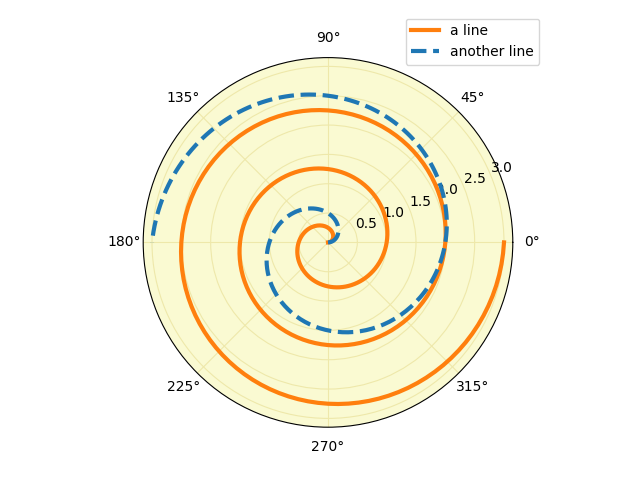
import matplotlib.pyplot as pltimport numpy as np# radar green, solid grid linesplt.rc('grid', color='#316931', linewidth=1, linestyle='-')plt.rc('xtick', labelsize=15)plt.rc('ytick', labelsize=15)# force square figure and square axes looks better for polar, IMOfig = plt.figure(figsize=(8, 8))ax = fig.add_axes([0.1, 0.1, 0.8, 0.8],projection='polar', facecolor='#d5de9c')r = np.arange(0, 3.0, 0.01)theta = 2 * np.pi * rax.plot(theta, r, color='#ee8d18', lw=3, label='a line')ax.plot(0.5 * theta, r, color='blue', ls='--', lw=3, label='another line')ax.legend()plt.show()
参考
此示例显示了以下函数、方法、类和模块的使用:
import matplotlibmatplotlib.axes.Axes.plotmatplotlib.axes.Axes.legendmatplotlib.projections.polarmatplotlib.projections.polar.PolarAxes
下载这个示例

若有收获,就点个赞吧
0 人点赞
