在二维图像中混合透明和颜色
混合透明与颜色,以突出显示部分数据与显示。
matplotlib.pyplot.imshow()的一个常见用途是绘制二维统计图。虽然imshow可以很容易地将二维矩阵可视化为图像,但它并不容易让您为输出添加透明度。例如,可以绘制统计量(例如t统计量)并根据其p值为每个像素的透明度着色。此示例演示如何使用matplotlib.colors.Normalize实现此效果。 请注意,无法直接将alpha值传递给matplotlib.pyplot.imshow()。
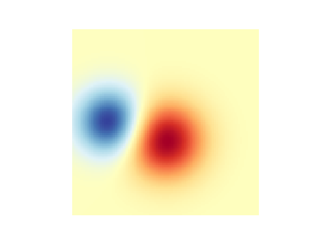
首先我们将生成一些数据,在这种情况下,我们将在二维网格中创建两个2维“blob”。一个blob是正面的,另一个是负面的。
# sphinx_gallery_thumbnail_number = 3import numpy as npimport matplotlib.pyplot as pltfrom matplotlib.colors import Normalizedef normal_pdf(x, mean, var):return np.exp(-(x - mean)**2 / (2*var))# Generate the space in which the blobs will livexmin, xmax, ymin, ymax = (0, 100, 0, 100)n_bins = 100xx = np.linspace(xmin, xmax, n_bins)yy = np.linspace(ymin, ymax, n_bins)# Generate the blobs. The range of the values is roughly -.0002 to .0002means_high = [20, 50]means_low = [50, 60]var = [150, 200]gauss_x_high = normal_pdf(xx, means_high[0], var[0])gauss_y_high = normal_pdf(yy, means_high[1], var[0])gauss_x_low = normal_pdf(xx, means_low[0], var[1])gauss_y_low = normal_pdf(yy, means_low[1], var[1])weights_high = np.array(np.meshgrid(gauss_x_high, gauss_y_high)).prod(0)weights_low = -1 * np.array(np.meshgrid(gauss_x_low, gauss_y_low)).prod(0)weights = weights_high + weights_low# We'll also create a grey background into which the pixels will fadegreys = np.empty(weights.shape + (3,), dtype=np.uint8)greys.fill(70)# First we'll plot these blobs using only ``imshow``.vmax = np.abs(weights).max()vmin = -vmaxcmap = plt.cm.RdYlBufig, ax = plt.subplots()ax.imshow(greys)ax.imshow(weights, extent=(xmin, xmax, ymin, ymax), cmap=cmap)ax.set_axis_off()
混合透明度
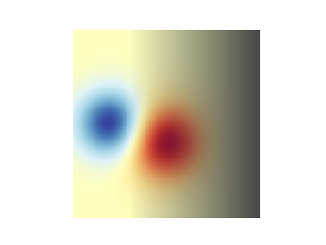
在使用matplotlib.pyplot.imshow()绘制数据时,包含透明度的最简单方法是将二维数据数组转换为RGBA值的三维图像数组。这可以用matplotlib.colors.Normalize来实现。例如,我们将创建一个从左向右移动的渐变。
# Create an alpha channel of linearly increasing values moving to the right.alphas = np.ones(weights.shape)alphas[:, 30:] = np.linspace(1, 0, 70)# Normalize the colors b/w 0 and 1, we'll then pass an MxNx4 array to imshowcolors = Normalize(vmin, vmax, clip=True)(weights)colors = cmap(colors)# Now set the alpha channel to the one we created abovecolors[..., -1] = alphas# Create the figure and image# Note that the absolute values may be slightly differentfig, ax = plt.subplots()ax.imshow(greys)ax.imshow(colors, extent=(xmin, xmax, ymin, ymax))ax.set_axis_off()
使用透明度高亮显示高振幅值
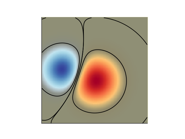
最后,我们将重新创建相同的图,但是这一次我们将使用透明来突出显示数据中的极端值。这通常用于突出显示具有较小p值的数据点。我们还将添加等高线,以突出显示图像值。评星
# Create an alpha channel based on weight values# Any value whose absolute value is > .0001 will have zero transparencyalphas = Normalize(0, .3, clip=True)(np.abs(weights))alphas = np.clip(alphas, .4, 1) # alpha value clipped at the bottom at .4# Normalize the colors b/w 0 and 1, we'll then pass an MxNx4 array to imshowcolors = Normalize(vmin, vmax)(weights)colors = cmap(colors)# Now set the alpha channel to the one we created abovecolors[..., -1] = alphas# Create the figure and image# Note that the absolute values may be slightly differentfig, ax = plt.subplots()ax.imshow(greys)ax.imshow(colors, extent=(xmin, xmax, ymin, ymax))# Add contour lines to further highlight different levels.ax.contour(weights[::-1], levels=[-.1, .1], colors='k', linestyles='-')ax.set_axis_off()plt.show()ax.contour(weights[::-1], levels=[-.0001, .0001], colors='k', linestyles='-')ax.set_axis_off()plt.show()
参考
本例中显示了以下函数、方法和类的使用:
import matplotlibmatplotlib.axes.Axes.imshowmatplotlib.pyplot.imshowmatplotlib.axes.Axes.contourmatplotlib.pyplot.contourmatplotlib.colors.Normalizematplotlib.axes.Axes.set_axis_off
下载这个示例

若有收获,就点个赞吧
0 人点赞
