条形图演示
使用Matplotlib的许多形状和大小的条形图。
条形图对于可视化计数或带有误差栏的汇总统计信息非常有用。这些示例显示了使用Matplotlib执行此操作的几种方法。
# Credit: Josh Hemannimport numpy as npimport matplotlib.pyplot as pltfrom matplotlib.ticker import MaxNLocatorfrom collections import namedtuplen_groups = 5means_men = (20, 35, 30, 35, 27)std_men = (2, 3, 4, 1, 2)means_women = (25, 32, 34, 20, 25)std_women = (3, 5, 2, 3, 3)fig, ax = plt.subplots()index = np.arange(n_groups)bar_width = 0.35opacity = 0.4error_config = {'ecolor': '0.3'}rects1 = ax.bar(index, means_men, bar_width,alpha=opacity, color='b',yerr=std_men, error_kw=error_config,label='Men')rects2 = ax.bar(index + bar_width, means_women, bar_width,alpha=opacity, color='r',yerr=std_women, error_kw=error_config,label='Women')ax.set_xlabel('Group')ax.set_ylabel('Scores')ax.set_title('Scores by group and gender')ax.set_xticks(index + bar_width / 2)ax.set_xticklabels(('A', 'B', 'C', 'D', 'E'))ax.legend()fig.tight_layout()plt.show()
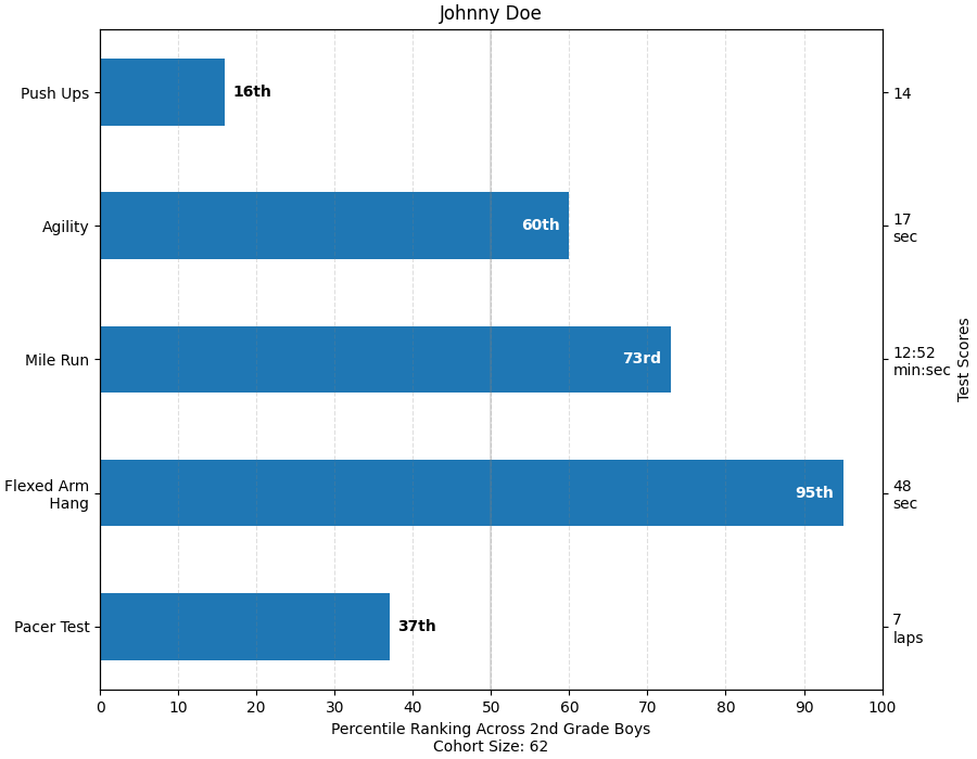
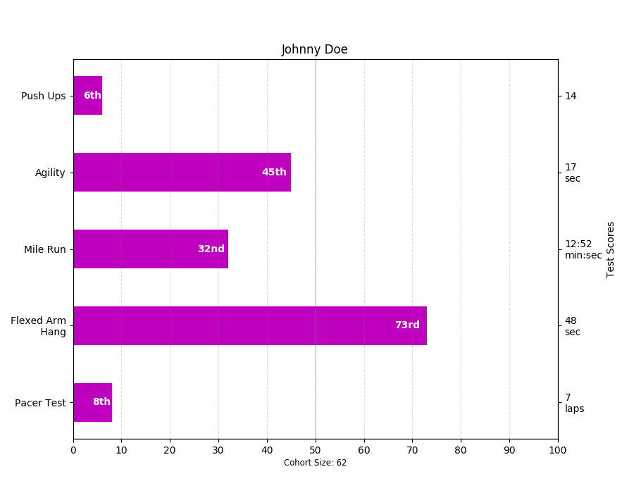
这个例子来自一个应用程序,在这个应用程序中,小学体育教师希望能够向父母展示他们的孩子在一些健身测试中的表现,而且重要的是,相对于其他孩子的表现。 为了演示目的提取绘图代码,我们只为小Johnny Doe编制一些数据……
Student = namedtuple('Student', ['name', 'grade', 'gender'])Score = namedtuple('Score', ['score', 'percentile'])# GLOBAL CONSTANTStestNames = ['Pacer Test', 'Flexed Arm\n Hang', 'Mile Run', 'Agility','Push Ups']testMeta = dict(zip(testNames, ['laps', 'sec', 'min:sec', 'sec', '']))def attach_ordinal(num):"""helper function to add ordinal string to integers1 -> 1st56 -> 56th"""suffixes = {str(i): vfor i, v in enumerate(['th', 'st', 'nd', 'rd', 'th','th', 'th', 'th', 'th', 'th'])}v = str(num)# special case early teensif v in {'11', '12', '13'}:return v + 'th'return v + suffixes[v[-1]]def format_score(scr, test):"""Build up the score labels for the right Y-axis by firstappending a carriage return to each string and then tacking onthe appropriate meta information (i.e., 'laps' vs 'seconds'). Wewant the labels centered on the ticks, so if there is no metainfo (like for pushups) then don't add the carriage return tothe string"""md = testMeta[test]if md:return '{0}\n{1}'.format(scr, md)else:return scrdef format_ycursor(y):y = int(y)if y < 0 or y >= len(testNames):return ''else:return testNames[y]def plot_student_results(student, scores, cohort_size):# create the figurefig, ax1 = plt.subplots(figsize=(9, 7))fig.subplots_adjust(left=0.115, right=0.88)fig.canvas.set_window_title('Eldorado K-8 Fitness Chart')pos = np.arange(len(testNames))rects = ax1.barh(pos, [scores[k].percentile for k in testNames],align='center',height=0.5, color='m',tick_label=testNames)ax1.set_title(student.name)ax1.set_xlim([0, 100])ax1.xaxis.set_major_locator(MaxNLocator(11))ax1.xaxis.grid(True, linestyle='--', which='major',color='grey', alpha=.25)# Plot a solid vertical gridline to highlight the median positionax1.axvline(50, color='grey', alpha=0.25)# set X-axis tick marks at the decilescohort_label = ax1.text(.5, -.07, 'Cohort Size: {0}'.format(cohort_size),horizontalalignment='center', size='small',transform=ax1.transAxes)# Set the right-hand Y-axis ticks and labelsax2 = ax1.twinx()scoreLabels = [format_score(scores[k].score, k) for k in testNames]# set the tick locationsax2.set_yticks(pos)# make sure that the limits are set equally on both yaxis so the# ticks line upax2.set_ylim(ax1.get_ylim())# set the tick labelsax2.set_yticklabels(scoreLabels)ax2.set_ylabel('Test Scores')ax2.set_xlabel(('Percentile Ranking Across ''{grade} Grade {gender}s').format(grade=attach_ordinal(student.grade),gender=student.gender.title()))rect_labels = []# Lastly, write in the ranking inside each bar to aid in interpretationfor rect in rects:# Rectangle widths are already integer-valued but are floating# type, so it helps to remove the trailing decimal point and 0 by# converting width to int typewidth = int(rect.get_width())rankStr = attach_ordinal(width)# The bars aren't wide enough to print the ranking insideif width < 5:# Shift the text to the right side of the right edgexloc = width + 1# Black against white backgroundclr = 'black'align = 'left'else:# Shift the text to the left side of the right edgexloc = 0.98*width# White on magentaclr = 'white'align = 'right'# Center the text vertically in the baryloc = rect.get_y() + rect.get_height()/2.0label = ax1.text(xloc, yloc, rankStr, horizontalalignment=align,verticalalignment='center', color=clr, weight='bold',clip_on=True)rect_labels.append(label)# make the interactive mouse over give the bar titleax2.fmt_ydata = format_ycursor# return all of the artists createdreturn {'fig': fig,'ax': ax1,'ax_right': ax2,'bars': rects,'perc_labels': rect_labels,'cohort_label': cohort_label}student = Student('Johnny Doe', 2, 'boy')scores = dict(zip(testNames,(Score(v, p) for v, p inzip(['7', '48', '12:52', '17', '14'],np.round(np.random.uniform(0, 1,len(testNames))*100, 0)))))cohort_size = 62 # The number of other 2nd grade boysarts = plot_student_results(student, scores, cohort_size)plt.show()
下载这个示例

若有收获,就点个赞吧
0 人点赞
