表格演示
演示表函数以在图表中显示表格。
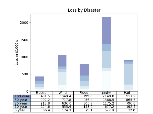
import numpy as npimport matplotlib.pyplot as pltdata = [[ 66386, 174296, 75131, 577908, 32015],[ 58230, 381139, 78045, 99308, 160454],[ 89135, 80552, 152558, 497981, 603535],[ 78415, 81858, 150656, 193263, 69638],[139361, 331509, 343164, 781380, 52269]]columns = ('Freeze', 'Wind', 'Flood', 'Quake', 'Hail')rows = ['%d year' % x for x in (100, 50, 20, 10, 5)]values = np.arange(0, 2500, 500)value_increment = 1000# Get some pastel shades for the colorscolors = plt.cm.BuPu(np.linspace(0, 0.5, len(rows)))n_rows = len(data)index = np.arange(len(columns)) + 0.3bar_width = 0.4# Initialize the vertical-offset for the stacked bar chart.y_offset = np.zeros(len(columns))# Plot bars and create text labels for the tablecell_text = []for row in range(n_rows):plt.bar(index, data[row], bar_width, bottom=y_offset, color=colors[row])y_offset = y_offset + data[row]cell_text.append(['%1.1f' % (x / 1000.0) for x in y_offset])# Reverse colors and text labels to display the last value at the top.colors = colors[::-1]cell_text.reverse()# Add a table at the bottom of the axesthe_table = plt.table(cellText=cell_text,rowLabels=rows,rowColours=colors,colLabels=columns,loc='bottom')# Adjust layout to make room for the table:plt.subplots_adjust(left=0.2, bottom=0.2)plt.ylabel("Loss in ${0}'s".format(value_increment))plt.yticks(values * value_increment, ['%d' % val for val in values])plt.xticks([])plt.title('Loss by Disaster')plt.show()
下载这个示例

若有收获,就点个赞吧
0 人点赞
