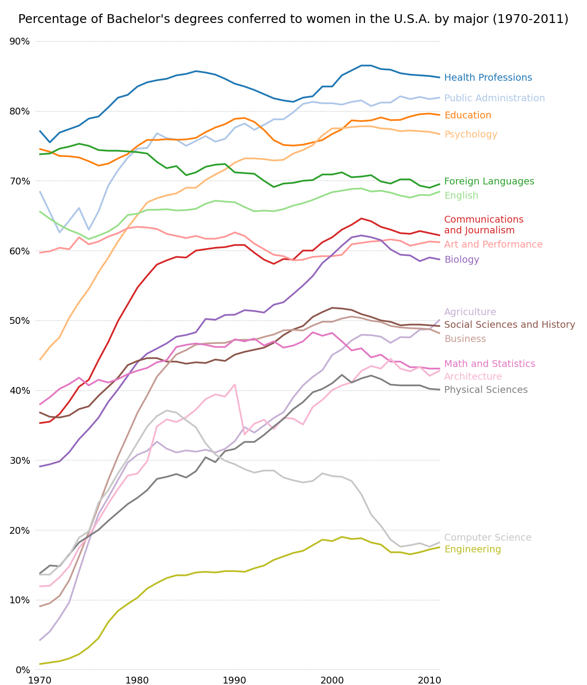
按性别分列的学士学位
包含多个时间序列的图形,其中演示了打印框架、刻度线和标签以及线图特性的广泛自定义样式。
还演示了文本标签沿右边缘的自定义放置,作为传统图例的替代方法。
import numpy as npimport matplotlib.pyplot as pltfrom matplotlib.cbook import get_sample_datafname = get_sample_data('percent_bachelors_degrees_women_usa.csv',asfileobj=False)gender_degree_data = np.genfromtxt(fname, delimiter=',', names=True)# These are the colors that will be used in the plotcolor_sequence = ['#1f77b4', '#aec7e8', '#ff7f0e', '#ffbb78', '#2ca02c','#98df8a', '#d62728', '#ff9896', '#9467bd', '#c5b0d5','#8c564b', '#c49c94', '#e377c2', '#f7b6d2', '#7f7f7f','#c7c7c7', '#bcbd22', '#dbdb8d', '#17becf', '#9edae5']# You typically want your plot to be ~1.33x wider than tall. This plot# is a rare exception because of the number of lines being plotted on it.# Common sizes: (10, 7.5) and (12, 9)fig, ax = plt.subplots(1, 1, figsize=(12, 14))# Remove the plot frame lines. They are unnecessary here.ax.spines['top'].set_visible(False)ax.spines['bottom'].set_visible(False)ax.spines['right'].set_visible(False)ax.spines['left'].set_visible(False)# Ensure that the axis ticks only show up on the bottom and left of the plot.# Ticks on the right and top of the plot are generally unnecessary.ax.get_xaxis().tick_bottom()ax.get_yaxis().tick_left()fig.subplots_adjust(left=.06, right=.75, bottom=.02, top=.94)# Limit the range of the plot to only where the data is.# Avoid unnecessary whitespace.ax.set_xlim(1969.5, 2011.1)ax.set_ylim(-0.25, 90)# Make sure your axis ticks are large enough to be easily read.# You don't want your viewers squinting to read your plot.plt.xticks(range(1970, 2011, 10), fontsize=14)plt.yticks(range(0, 91, 10), fontsize=14)ax.xaxis.set_major_formatter(plt.FuncFormatter('{:.0f}'.format))ax.yaxis.set_major_formatter(plt.FuncFormatter('{:.0f}%'.format))# Provide tick lines across the plot to help your viewers trace along# the axis ticks. Make sure that the lines are light and small so they# don't obscure the primary data lines.plt.grid(True, 'major', 'y', ls='--', lw=.5, c='k', alpha=.3)# Remove the tick marks; they are unnecessary with the tick lines we just# plotted.plt.tick_params(axis='both', which='both', bottom=False, top=False,labelbottom=True, left=False, right=False, labelleft=True)# Now that the plot is prepared, it's time to actually plot the data!# Note that I plotted the majors in order of the highest % in the final year.majors = ['Health Professions', 'Public Administration', 'Education','Psychology', 'Foreign Languages', 'English','Communications\nand Journalism', 'Art and Performance', 'Biology','Agriculture', 'Social Sciences and History', 'Business','Math and Statistics', 'Architecture', 'Physical Sciences','Computer Science', 'Engineering']y_offsets = {'Foreign Languages': 0.5, 'English': -0.5,'Communications\nand Journalism': 0.75,'Art and Performance': -0.25, 'Agriculture': 1.25,'Social Sciences and History': 0.25, 'Business': -0.75,'Math and Statistics': 0.75, 'Architecture': -0.75,'Computer Science': 0.75, 'Engineering': -0.25}for rank, column in enumerate(majors):# Plot each line separately with its own color.column_rec_name = column.replace('\n', '_').replace(' ', '_')line = plt.plot(gender_degree_data['Year'],gender_degree_data[column_rec_name],lw=2.5,color=color_sequence[rank])# Add a text label to the right end of every line. Most of the code below# is adding specific offsets y position because some labels overlapped.y_pos = gender_degree_data[column_rec_name][-1] - 0.5if column in y_offsets:y_pos += y_offsets[column]# Again, make sure that all labels are large enough to be easily read# by the viewer.plt.text(2011.5, y_pos, column, fontsize=14, color=color_sequence[rank])# Make the title big enough so it spans the entire plot, but don't make it# so big that it requires two lines to show.# Note that if the title is descriptive enough, it is unnecessary to include# axis labels; they are self-evident, in this plot's case.fig.suptitle('Percentage of Bachelor\'s degrees conferred to women in ''the U.S.A. by major (1970-2011)\n', fontsize=18, ha='center')# Finally, save the figure as a PNG.# You can also save it as a PDF, JPEG, etc.# Just change the file extension in this call.# plt.savefig('percent-bachelors-degrees-women-usa.png', bbox_inches='tight')plt.show()
下载这个示例

若有收获,就点个赞吧
0 人点赞
