功率谱密度图示例
在Matplotlib中绘制功率谱密度(PSD)。
PSD是信号处理领域中常见的图形。NumPy有许多用于计算PSD的有用库。下面,我们演示一些如何使用Matplotlib实现和可视化这一点的示例。
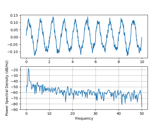
import matplotlib.pyplot as pltimport numpy as npimport matplotlib.mlab as mlabimport matplotlib.gridspec as gridspec# Fixing random state for reproducibilitynp.random.seed(19680801)dt = 0.01t = np.arange(0, 10, dt)nse = np.random.randn(len(t))r = np.exp(-t / 0.05)cnse = np.convolve(nse, r) * dtcnse = cnse[:len(t)]s = 0.1 * np.sin(2 * np.pi * t) + cnseplt.subplot(211)plt.plot(t, s)plt.subplot(212)plt.psd(s, 512, 1 / dt)plt.show()
将其与等效的Matlab代码进行比较,以完成相同的任务:
dt = 0.01;t = [0:dt:10];nse = randn(size(t));r = exp(-t/0.05);cnse = conv(nse, r)*dt;cnse = cnse(1:length(t));s = 0.1*sin(2*pi*t) + cnse;subplot(211)plot(t,s)subplot(212)psd(s, 512, 1/dt)
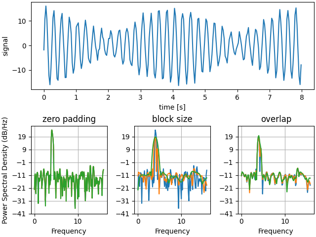
下面,我们将展示一个稍微复杂一些的示例,演示填充如何影响产生的PSD。
dt = np.pi / 100.fs = 1. / dtt = np.arange(0, 8, dt)y = 10. * np.sin(2 * np.pi * 4 * t) + 5. * np.sin(2 * np.pi * 4.25 * t)y = y + np.random.randn(*t.shape)# Plot the raw time seriesfig = plt.figure(constrained_layout=True)gs = gridspec.GridSpec(2, 3, figure=fig)ax = fig.add_subplot(gs[0, :])ax.plot(t, y)ax.set_xlabel('time [s]')ax.set_ylabel('signal')# Plot the PSD with different amounts of zero padding. This uses the entire# time series at onceax2 = fig.add_subplot(gs[1, 0])ax2.psd(y, NFFT=len(t), pad_to=len(t), Fs=fs)ax2.psd(y, NFFT=len(t), pad_to=len(t) * 2, Fs=fs)ax2.psd(y, NFFT=len(t), pad_to=len(t) * 4, Fs=fs)plt.title('zero padding')# Plot the PSD with different block sizes, Zero pad to the length of the# original data sequence.ax3 = fig.add_subplot(gs[1, 1], sharex=ax2, sharey=ax2)ax3.psd(y, NFFT=len(t), pad_to=len(t), Fs=fs)ax3.psd(y, NFFT=len(t) // 2, pad_to=len(t), Fs=fs)ax3.psd(y, NFFT=len(t) // 4, pad_to=len(t), Fs=fs)ax3.set_ylabel('')plt.title('block size')# Plot the PSD with different amounts of overlap between blocksax4 = fig.add_subplot(gs[1, 2], sharex=ax2, sharey=ax2)ax4.psd(y, NFFT=len(t) // 2, pad_to=len(t), noverlap=0, Fs=fs)ax4.psd(y, NFFT=len(t) // 2, pad_to=len(t),noverlap=int(0.05 * len(t) / 2.), Fs=fs)ax4.psd(y, NFFT=len(t) // 2, pad_to=len(t),noverlap=int(0.2 * len(t) / 2.), Fs=fs)ax4.set_ylabel('')plt.title('overlap')plt.show()
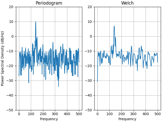
这是一个来自信号处理工具箱的MATLAB示例的移植版本,它显示了Matplotlib和MATLAB对PSD的缩放之间的一些差异。
fs = 1000t = np.linspace(0, 0.3, 301)A = np.array([2, 8]).reshape(-1, 1)f = np.array([150, 140]).reshape(-1, 1)xn = (A * np.sin(2 * np.pi * f * t)).sum(axis=0)xn += 5 * np.random.randn(*t.shape)fig, (ax0, ax1) = plt.subplots(ncols=2, constrained_layout=True)yticks = np.arange(-50, 30, 10)yrange = (yticks[0], yticks[-1])xticks = np.arange(0, 550, 100)ax0.psd(xn, NFFT=301, Fs=fs, window=mlab.window_none, pad_to=1024,scale_by_freq=True)ax0.set_title('Periodogram')ax0.set_yticks(yticks)ax0.set_xticks(xticks)ax0.grid(True)ax0.set_ylim(yrange)ax1.psd(xn, NFFT=150, Fs=fs, window=mlab.window_none, pad_to=512, noverlap=75,scale_by_freq=True)ax1.set_title('Welch')ax1.set_xticks(xticks)ax1.set_yticks(yticks)ax1.set_ylabel('') # overwrite the y-label added by `psd`ax1.grid(True)ax1.set_ylim(yrange)plt.show()
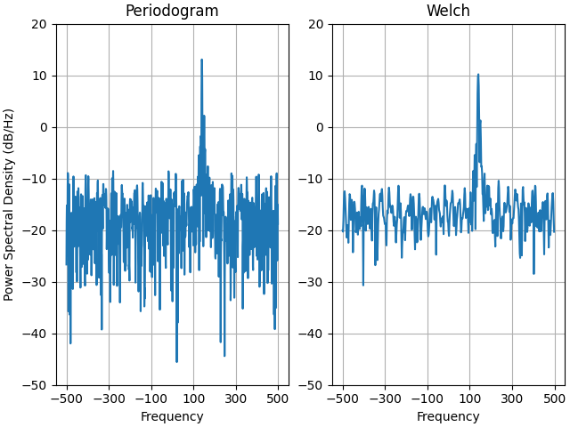
这是一个来自信号处理工具箱的MATLAB示例的移植版本,它显示了Matplotlib和MATLAB对PSD的缩放之间的一些差异。
它使用了一个复杂的信号,所以我们可以看到,复杂的PSD的工作正常。
prng = np.random.RandomState(19680801) # to ensure reproducibilityfs = 1000t = np.linspace(0, 0.3, 301)A = np.array([2, 8]).reshape(-1, 1)f = np.array([150, 140]).reshape(-1, 1)xn = (A * np.exp(2j * np.pi * f * t)).sum(axis=0) + 5 * prng.randn(*t.shape)fig, (ax0, ax1) = plt.subplots(ncols=2, constrained_layout=True)yticks = np.arange(-50, 30, 10)yrange = (yticks[0], yticks[-1])xticks = np.arange(-500, 550, 200)ax0.psd(xn, NFFT=301, Fs=fs, window=mlab.window_none, pad_to=1024,scale_by_freq=True)ax0.set_title('Periodogram')ax0.set_yticks(yticks)ax0.set_xticks(xticks)ax0.grid(True)ax0.set_ylim(yrange)ax1.psd(xn, NFFT=150, Fs=fs, window=mlab.window_none, pad_to=512, noverlap=75,scale_by_freq=True)ax1.set_title('Welch')ax1.set_xticks(xticks)ax1.set_yticks(yticks)ax1.set_ylabel('') # overwrite the y-label added by `psd`ax1.grid(True)ax1.set_ylim(yrange)plt.show()
下载这个示例

若有收获,就点个赞吧
0 人点赞
