散点图视图拆解
从散点图创建直方图,并将其添加到散点图的两侧。
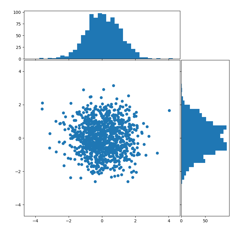
import numpy as npimport matplotlib.pyplot as pltfrom matplotlib.ticker import NullFormatter# Fixing random state for reproducibilitynp.random.seed(19680801)# the random datax = np.random.randn(1000)y = np.random.randn(1000)nullfmt = NullFormatter() # no labels# definitions for the axesleft, width = 0.1, 0.65bottom, height = 0.1, 0.65bottom_h = left_h = left + width + 0.02rect_scatter = [left, bottom, width, height]rect_histx = [left, bottom_h, width, 0.2]rect_histy = [left_h, bottom, 0.2, height]# start with a rectangular Figureplt.figure(1, figsize=(8, 8))axScatter = plt.axes(rect_scatter)axHistx = plt.axes(rect_histx)axHisty = plt.axes(rect_histy)# no labelsaxHistx.xaxis.set_major_formatter(nullfmt)axHisty.yaxis.set_major_formatter(nullfmt)# the scatter plot:axScatter.scatter(x, y)# now determine nice limits by hand:binwidth = 0.25xymax = max(np.max(np.abs(x)), np.max(np.abs(y)))lim = (int(xymax/binwidth) + 1) * binwidthaxScatter.set_xlim((-lim, lim))axScatter.set_ylim((-lim, lim))bins = np.arange(-lim, lim + binwidth, binwidth)axHistx.hist(x, bins=bins)axHisty.hist(y, bins=bins, orientation='horizontal')axHistx.set_xlim(axScatter.get_xlim())axHisty.set_ylim(axScatter.get_ylim())plt.show()
下载这个示例

若有收获,就点个赞吧
0 人点赞
