ggplot样式表
此示例演示了“ggplot”样式,该样式调整样式以模拟ggplot(R的流行绘图包)。
这些设置被无耻地从[1]窃取(经允许)。
[1] https://web.archive.org/web/20111215111010/http://www.huyng.com/archives/sane-color-scheme-for-matplotlib/691/
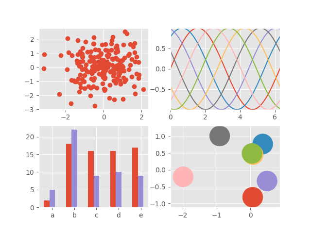
import numpy as npimport matplotlib.pyplot as pltplt.style.use('ggplot')# Fixing random state for reproducibilitynp.random.seed(19680801)fig, axes = plt.subplots(ncols=2, nrows=2)ax1, ax2, ax3, ax4 = axes.ravel()# scatter plot (Note: `plt.scatter` doesn't use default colors)x, y = np.random.normal(size=(2, 200))ax1.plot(x, y, 'o')# sinusoidal lines with colors from default color cycleL = 2*np.pix = np.linspace(0, L)ncolors = len(plt.rcParams['axes.prop_cycle'])shift = np.linspace(0, L, ncolors, endpoint=False)for s in shift:ax2.plot(x, np.sin(x + s), '-')ax2.margins(0)# bar graphsx = np.arange(5)y1, y2 = np.random.randint(1, 25, size=(2, 5))width = 0.25ax3.bar(x, y1, width)ax3.bar(x + width, y2, width,color=list(plt.rcParams['axes.prop_cycle'])[2]['color'])ax3.set_xticks(x + width)ax3.set_xticklabels(['a', 'b', 'c', 'd', 'e'])# circles with colors from default color cyclefor i, color in enumerate(plt.rcParams['axes.prop_cycle']):xy = np.random.normal(size=2)ax4.add_patch(plt.Circle(xy, radius=0.3, color=color['color']))ax4.axis('equal')ax4.margins(0)plt.show()
下载这个示例

若有收获,就点个赞吧
0 人点赞
