频谱图演示
频谱图的演示 (specgram())。
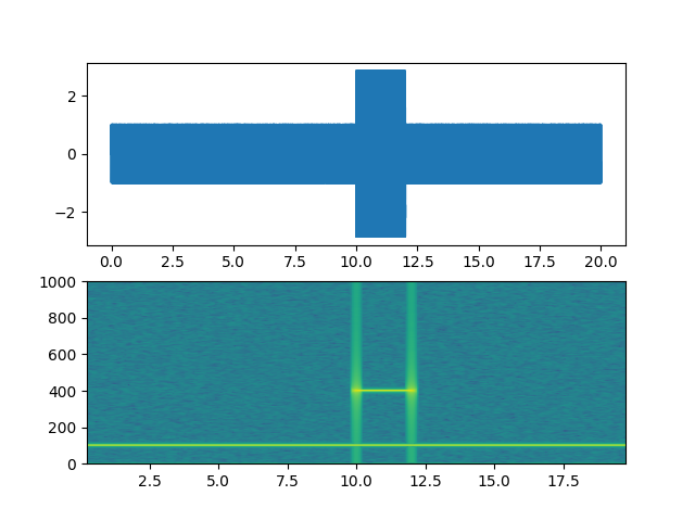
import matplotlib.pyplot as pltimport numpy as np# Fixing random state for reproducibilitynp.random.seed(19680801)dt = 0.0005t = np.arange(0.0, 20.0, dt)s1 = np.sin(2 * np.pi * 100 * t)s2 = 2 * np.sin(2 * np.pi * 400 * t)# create a transient "chirp"mask = np.where(np.logical_and(t > 10, t < 12), 1.0, 0.0)s2 = s2 * mask# add some noise into the mixnse = 0.01 * np.random.random(size=len(t))x = s1 + s2 + nse # the signalNFFT = 1024 # the length of the windowing segmentsFs = int(1.0 / dt) # the sampling frequencyfig, (ax1, ax2) = plt.subplots(nrows=2)ax1.plot(t, x)Pxx, freqs, bins, im = ax2.specgram(x, NFFT=NFFT, Fs=Fs, noverlap=900)# The `specgram` method returns 4 objects. They are:# - Pxx: the periodogram# - freqs: the frequency vector# - bins: the centers of the time bins# - im: the matplotlib.image.AxesImage instance representing the data in the plotplt.show()
参考
此示例中显示了以下函数的使用方法:
import matplotlibmatplotlib.axes.Axes.specgrammatplotlib.pyplot.specgram
下载这个示例

若有收获,就点个赞吧
0 人点赞
