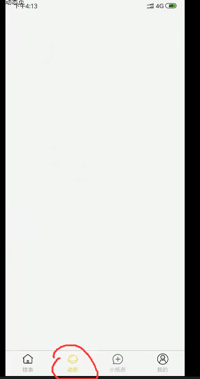
开始
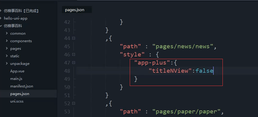
"app-plus": {"titleNView": false}
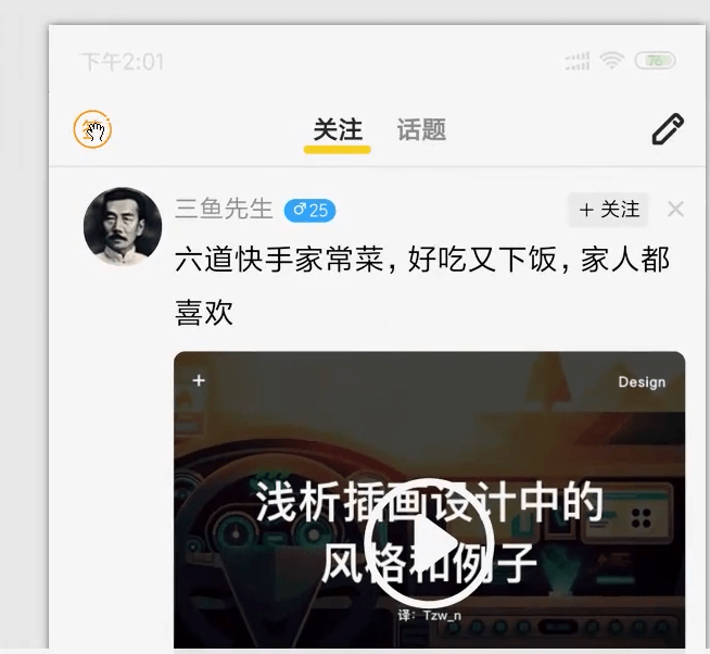
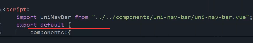
引入自定义导航栏
复制发布页的 过来改改
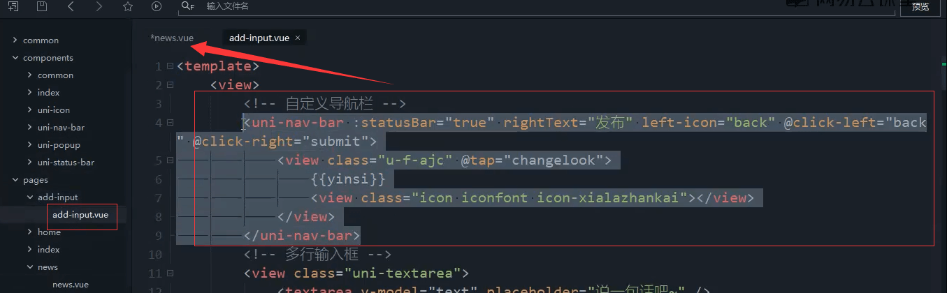
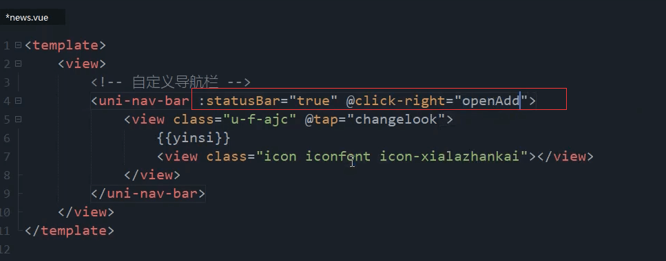
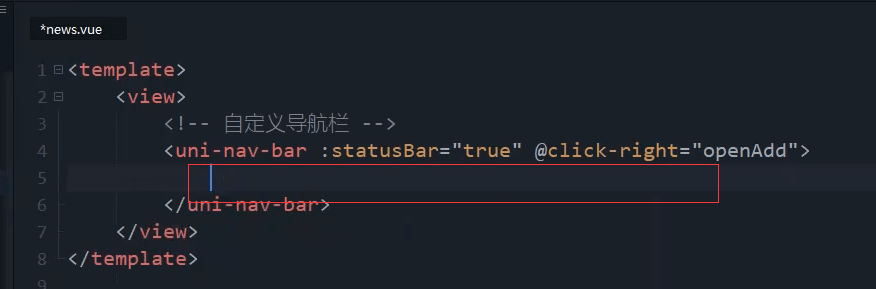
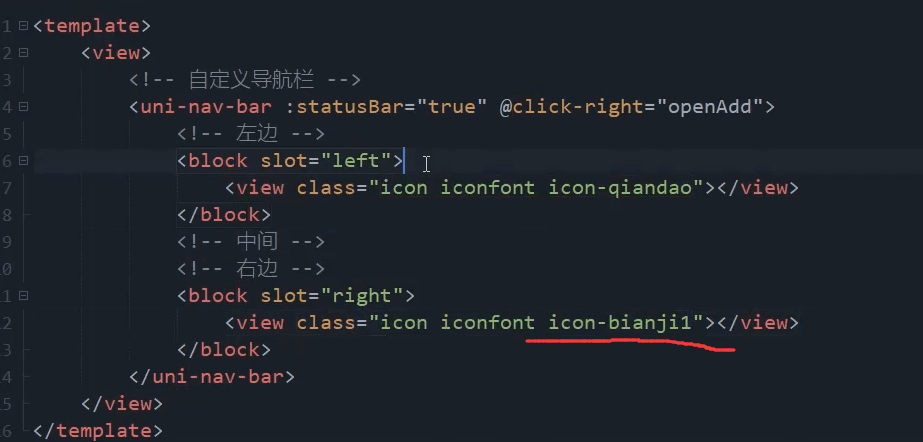
<uni-nav-bar :statusBar="true" @clickRight="openAdd"></uni-nav-bar>
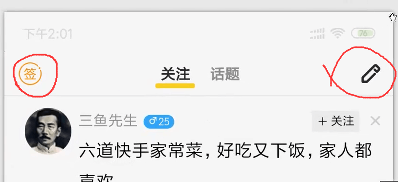
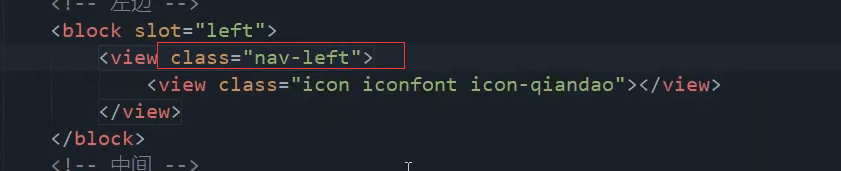
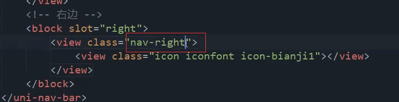
左边和右边的插槽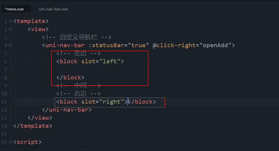
图标库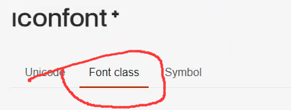
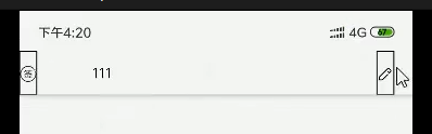
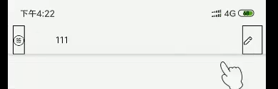
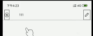
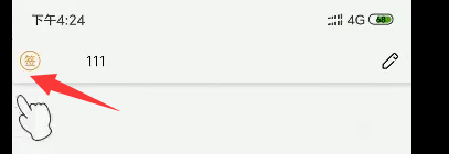
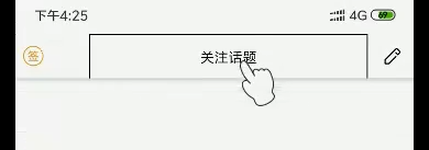
左边是签到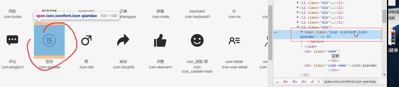
左边和右边图标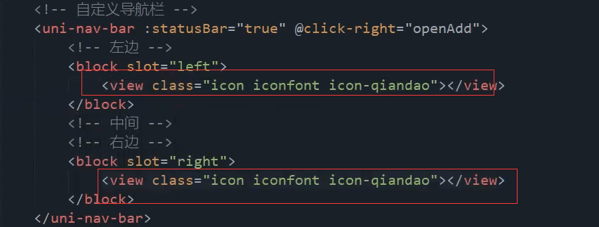
右边是铅笔图标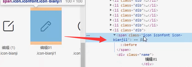
图标用view组件包裹起来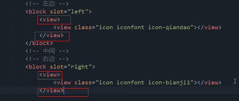
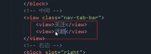
中间也用view组件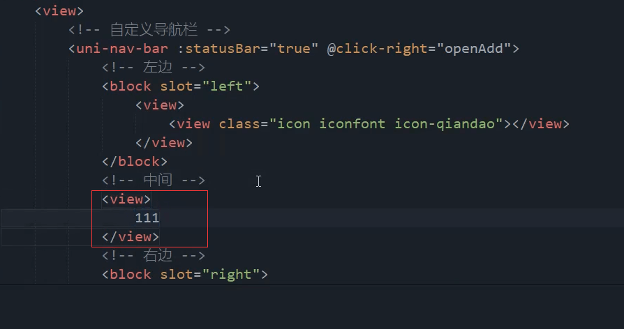
<!-- 自定义导航栏 --><uni-nav-bar :statusBar="true" @clickRight="openAdd"><!-- 左边 --><block slot="left"><view class=""><view class="icon iconfont icon-qiandao"></view></view></block><!-- 中间 --><view class=""></view><!-- 右边 --><block slot="right"><view class=""><view class="icon iconfont icon-bianji1"></view></view></block></uni-nav-bar>
签到图标太小了也太靠边了。 右侧的铅笔图标也位置不对。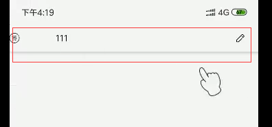
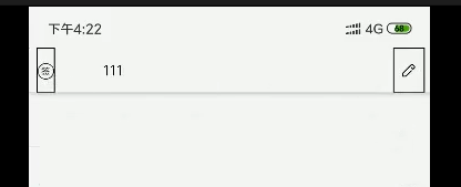
加黑色的边框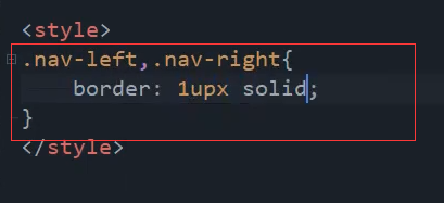

左边和右边的宽度不一样。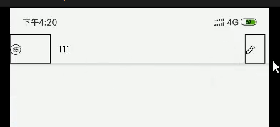
右边100%,左边加点外边距。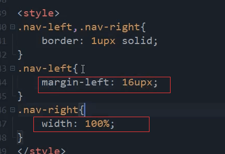
图标的大小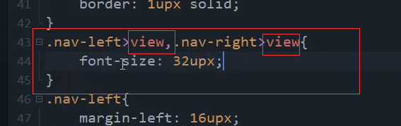
<style>.nav-left,.nav-right{border: 1upx solid;width: 100%;}.nav-left{margin-left: 16upx;}.nav-left>view,.nav-right>view{font-size: 32upx;}</style>
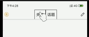
右边的图标需要居中一下
flex布局 上下左右居中。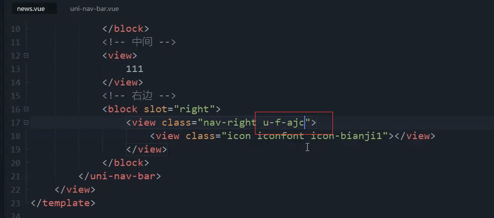
u-f-ajc
图标增大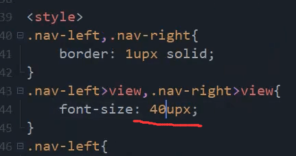
去掉边框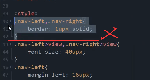
吸取图标颜色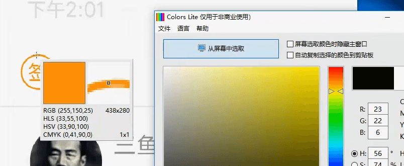
中间内容
加个边框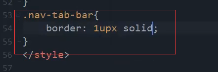
水平垂直居中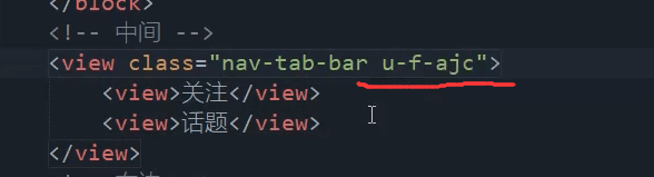
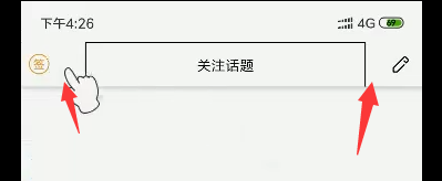
边框距离右边和距离左边是有一定的区别的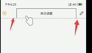
需要把中间的边框往左边移一下。负的20就向左边偏移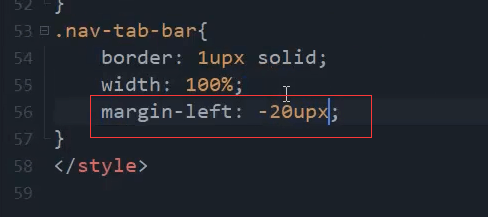
边框去掉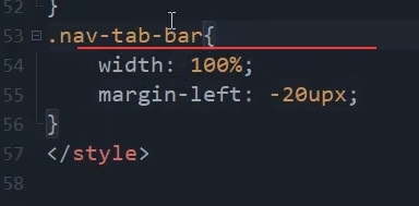
.nav-tab-bar{/* 父节点是flex为1的 所以这里100%宽度就可以继承父元素的宽度 */width: 100%;border: 1upx solid;margin-left: -20upx;}
可以看到字体大小和间距都小了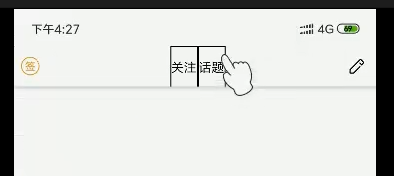
字体大小 和 左右的内边距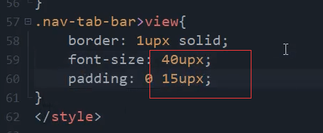
差多不了 但是字体有点大。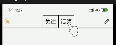
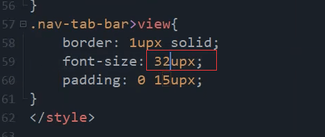
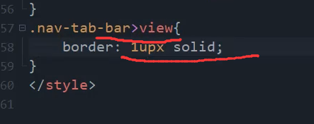
.nav-tab-bar>view{border: 1upx solid;font-size: 32upx;padding: 0 15upx;}
字体加粗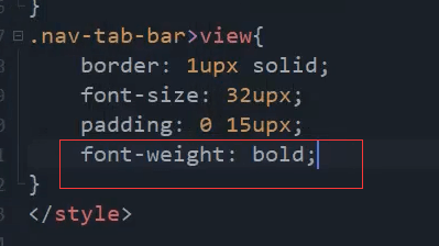
.nav-tab-bar>view{border: 1upx solid;font-size: 32upx;padding: 0 15upx;font-weight: bold;}
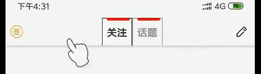
优化
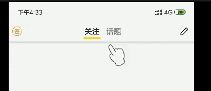
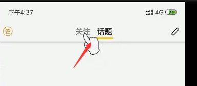
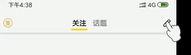
默认颜色 ,选中颜色, 底部黄线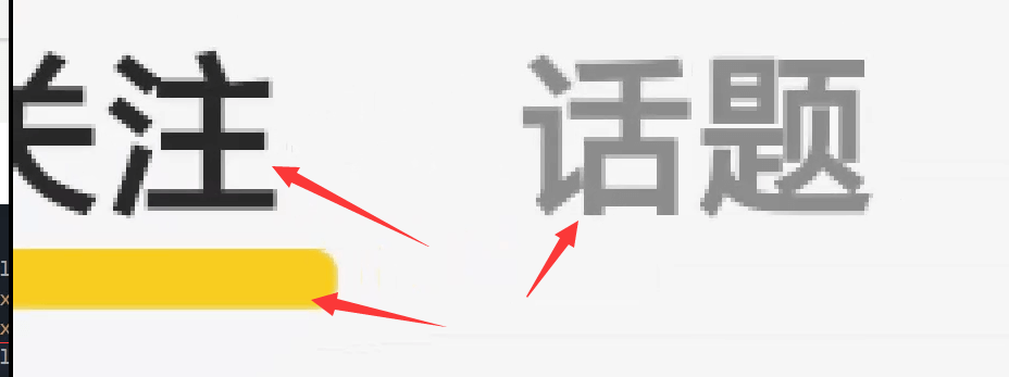
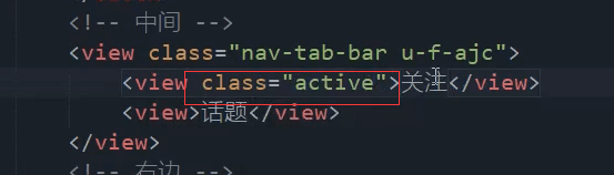
<view class="active">关注</view>
黄色的线,在里面再加一个view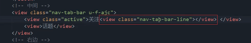
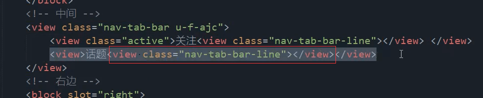
<view class="nav-tab-bar u-f-ajc"><view class="active">关注<view class="nav-tab-bar-line"></view></view><view class="">话题<view class="nav-tab-bar-line"></view></view></view>
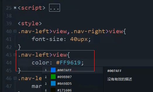
默认的字体颜色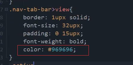
选中的的字体颜色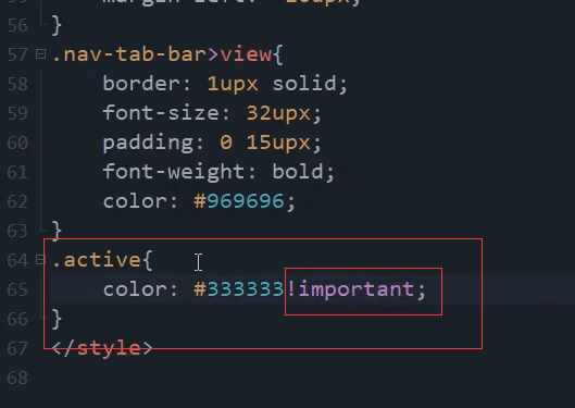
.active{color: #333333!important;}
线的样式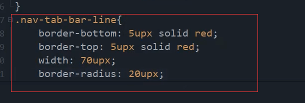
.nav-tab-bar-line{border-bottom: 5upx solid red;border-top: 5upx solid red;width: 70upx;border-radius: 20upx;}
没见黄线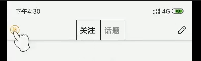
使用相对定位。父元素相对定位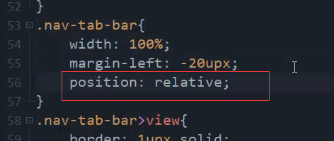
.nav-tab-bar{/* 父节点是flex为1的 所以这里100%宽度就可以继承父元素的宽度 */width: 100%;/* border: 1upx solid; */margin-left: -20upx;position: relative;}
子元素绝对定位。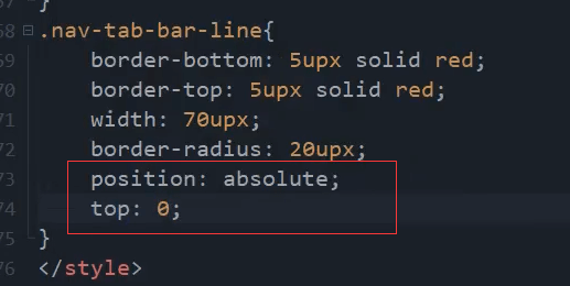
删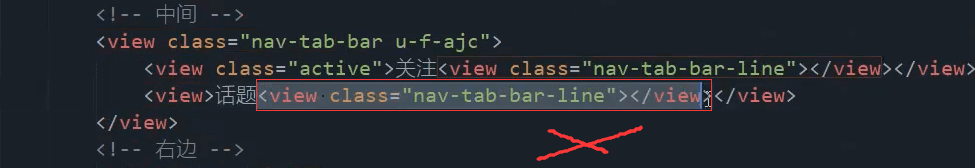
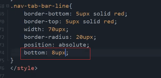
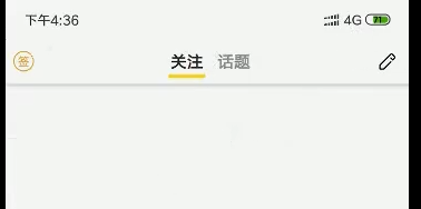
差不多了 希望再网上一点点。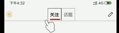
上下左右 垂直居中。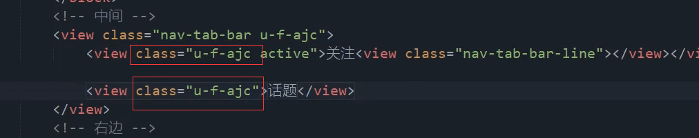
吸取黄色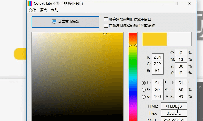
去掉外边框。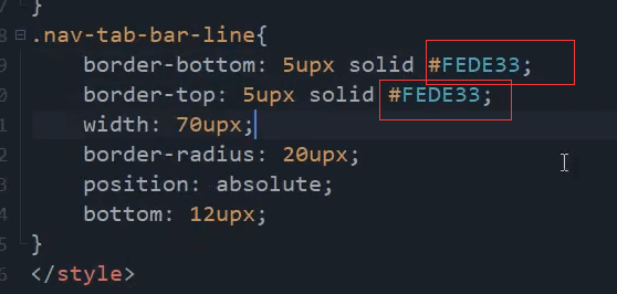
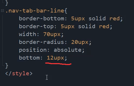
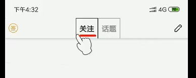
.nav-tab-bar-line{border-bottom: 14upx solid #FEDE33;/* border-top: 7upx solid #FEDE33; */width: 70upx;border-radius: 20upx;position: absolute;bottom: 12upx;}
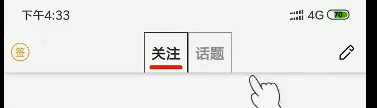
实现功能
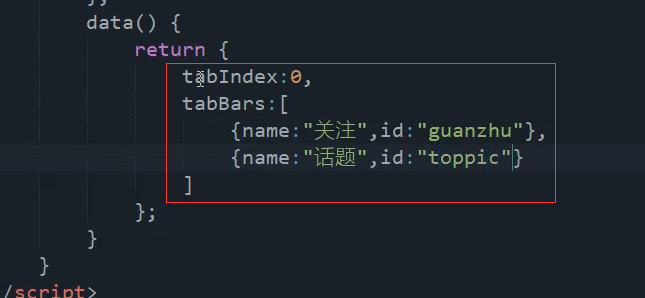
data() {return {tabIndex: 0,tabBaras: [{name:'关注',id:'guanzhu'},{name:'话题',id:'toppic'},]}},
block,然后v-for循环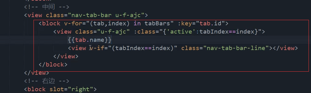
<view class="nav-tab-bar u-f-ajc"><block v-for="(tab,index) in tabBaras" :key="tab.id"><view class="u-f-ajc" :class="{'active':tabIndex==index}">{{tab.name}}<view v-if="(tabIndex==index)" class="nav-tab-bar-line"></view></view></block></view>
点击事件
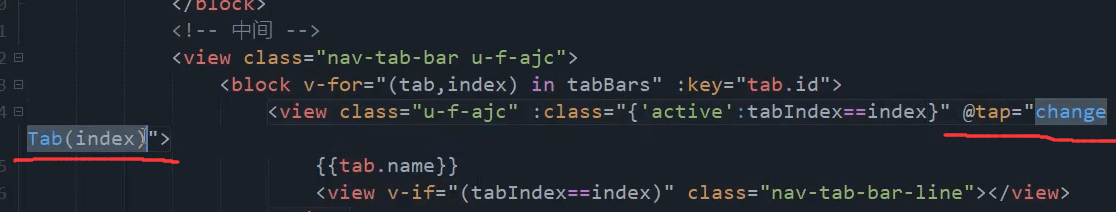
<view class="u-f-ajc" :class="{'active':tabIndex==index}"@tap="changeTab(index)">
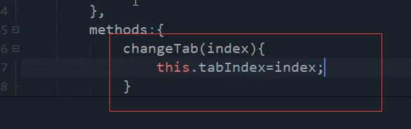
methods: {changeTab(index) {this.tabIndex=index;}}
发布点击事件
复制这段 navigateTo跳转的代码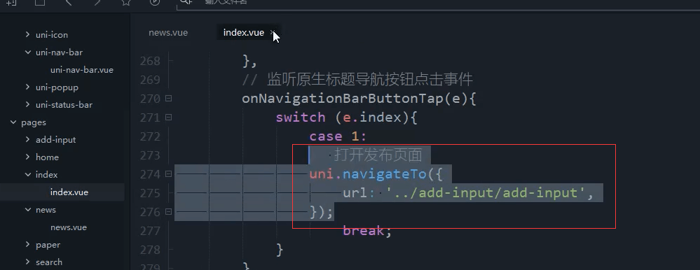
uni.navigateTo({url:'../add-input/add-input'});
增加openAdd方法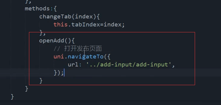
openAdd(){uni.navigateTo({url:'../add-input/add-input'})}
本节最终代码
<template><view><!-- 自定义导航栏 --><uni-nav-bar :statusBar="true" @clickRight="openAdd"><!-- 左边 --><block slot="left"><view class="nav-left"><view class="icon iconfont icon-qiandao"></view></view></block><!-- 中间 --><view class="nav-tab-bar u-f-ajc"><block v-for="(tab,index) in tabBaras" :key="tab.id"><view class="u-f-ajc" :class="{'active':tabIndex==index}"@tap="changeTab(index)">{{tab.name}}<view v-if="(tabIndex==index)" class="nav-tab-bar-line"></view></view></block></view><!-- 右边 --><block slot="right"><view class="nav-right u-f-ajc"><view class="icon iconfont icon-bianji1"></view></view></block></uni-nav-bar></view></template><script>export default {data() {return {tabIndex: 0,tabBaras: [{name:'关注',id:'guanzhu'},{name:'话题',id:'toppic'},]}},methods: {changeTab(index) {this.tabIndex=index;},openAdd(){uni.navigateTo({url:'../add-input/add-input'})}}}</script><style>/* .nav-left,.nav-right{border: 1upx solid;width: 100%;} */.nav-left{/* 这里视频中是左边16upx,实际这里是不需要的 */margin-left: 0upx;}.nav-left>view,.nav-right>view{font-size: 40upx;}.nav-left>view{color: #FF9619;}.nav-tab-bar{/* 父节点是flex为1的 所以这里100%宽度就可以继承父元素的宽度 */width: 100%;/* border: 1upx solid; */margin-left: -20upx;position: relative;}.nav-tab-bar>view{/* border: 1upx solid; */font-size: 32upx;padding: 0 15upx;font-weight: bold;color: #969696;}.active{color: #333333!important;}.nav-tab-bar-line{border-bottom: 14upx solid #FEDE33;/* border-top: 7upx solid red; */width: 70upx;border-radius: 20upx;position: absolute;bottom: 12upx;}</style>
结束

若有收获,就点个赞吧
0 人点赞
