在 JavaFX 教程的这一部分中,我们将使用图表。 在 JavaFX 中,只需添加几行代码即可构建图表。
在以下示例中,我们创建一个折线图,一个面积图,一个散点图,一个条形图和一个饼图。
折线图
折线图是一种基本类型的图表,它将信息显示为由直线段连接的一系列数据点。 JavaFX 中的折线图是使用javafx.scene.chart.LineChart创建的。
LineChartEx.java
package com.zetcode;import javafx.application.Application;import javafx.scene.Scene;import javafx.scene.chart.LineChart;import javafx.scene.chart.NumberAxis;import javafx.scene.chart.XYChart;import javafx.scene.layout.HBox;import javafx.stage.Stage;/** ZetCode JavaFX tutorial** This program creates a line chart.** Author: Jan Bodnar* Website: zetcode.com* Last modified: August 2016*/public class LineChartEx extends Application {@Overridepublic void start(Stage stage) {initUI(stage);}private void initUI(Stage stage) {HBox root = new HBox();Scene scene = new Scene(root, 450, 330);NumberAxis xAxis = new NumberAxis();xAxis.setLabel("Age");NumberAxis yAxis = new NumberAxis();yAxis.setLabel("Salary (€)");LineChart lineChart = new LineChart(xAxis, yAxis);lineChart.setTitle("Average salary per age");XYChart.Series data = new XYChart.Series();data.setName("2016");data.getData().add(new XYChart.Data(18, 567));data.getData().add(new XYChart.Data(20, 612));data.getData().add(new XYChart.Data(25, 800));data.getData().add(new XYChart.Data(30, 980));data.getData().add(new XYChart.Data(40, 1410));data.getData().add(new XYChart.Data(50, 2350));lineChart.getData().add(data);root.getChildren().add(lineChart);stage.setTitle("LineChart");stage.setScene(scene);stage.show();}public static void main(String[] args) {launch(args);}}
在示例中,我们有一个折线图,显示每个年龄段的平均工资。
NumberAxis xAxis = new NumberAxis();xAxis.setLabel("Age");NumberAxis yAxis = new NumberAxis();yAxis.setLabel("Salary (€)");
用NumberAxis创建两个轴。 setLabel()方法设置轴的描述。
LineChart lineChart = new LineChart(xAxis, yAxis);lineChart.setTitle("Average salary per age");
LineChart创建折线图。 setTitle()方法为图表设置标题。
XYChart.Series data = new XYChart.Series();data.setName("2016");
XYChart.Series为图表提供数据系列。 数据系列是数据点的列表。 每个数据点包含一个 x 值和一个 y 值。 setName()方法为系列命名。 (一个图表中可能有多个系列。)
data.getData().add(new XYChart.Data(18, 567));data.getData().add(new XYChart.Data(20, 612));data.getData().add(new XYChart.Data(25, 800));data.getData().add(new XYChart.Data(30, 980));data.getData().add(new XYChart.Data(40, 1410));data.getData().add(new XYChart.Data(50, 2350));
我们将数据添加到数据系列中。 XYChart.Data是一个单独的数据项,其中包含 2 个轴图的数据。
lineChart.getData().add(data);
数据被插入到图表中。
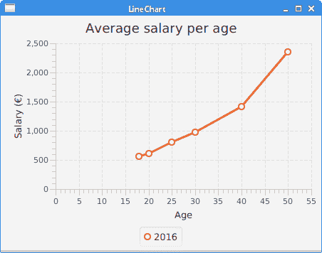
图:LineChart
区域图
区域图以图形方式显示随时间变化的定量数据。
AreaChart.java
package com.zetcode;import javafx.application.Application;import javafx.scene.Scene;import javafx.scene.chart.AreaChart;import javafx.scene.chart.CategoryAxis;import javafx.scene.chart.NumberAxis;import javafx.scene.chart.XYChart;import javafx.scene.layout.HBox;import javafx.stage.Stage;/** ZetCode JavaFX tutorial** This program creates an area chart.** Author: Jan Bodnar* Website: zetcode.com* Last modified: August 2016*/public class AreaChartEx extends Application {@Overridepublic void start(Stage stage) {initUI(stage);}private void initUI(Stage stage) {HBox root = new HBox();Scene scene = new Scene(root, 490, 350);CategoryAxis xAxis = new CategoryAxis();xAxis.setLabel("Time");NumberAxis yAxis = new NumberAxis();yAxis.setLabel("Thousand bbl/d");AreaChart areaChart = new AreaChart(xAxis, yAxis);areaChart.setTitle("Oil consumption");XYChart.Series data = new XYChart.Series();data.getData().add(new XYChart.Data("2004", 82502));data.getData().add(new XYChart.Data("2005", 84026));data.getData().add(new XYChart.Data("2006", 85007));data.getData().add(new XYChart.Data("2007", 86216));data.getData().add(new XYChart.Data("2008", 85559));data.getData().add(new XYChart.Data("2009", 84491));data.getData().add(new XYChart.Data("2010", 87672));data.getData().add(new XYChart.Data("2011", 88575));data.getData().add(new XYChart.Data("2012", 89837));data.getData().add(new XYChart.Data("2013", 90701));areaChart.getData().add(data);areaChart.setLegendVisible(false);root.getChildren().add(areaChart);stage.setTitle("AreaChart");stage.setScene(scene);stage.show();}public static void main(String[] args) {launch(args);}}
该示例显示了一个区域图,该区域图按年份显示了世界原油消耗量。
AreaChart areaChart = new AreaChart(xAxis, yAxis);areaChart.setTitle("Oil consumption");
使用AreaChart创建面积图。
CategoryAxis xAxis = new CategoryAxis();xAxis.setLabel("Time");
CategoryAxis适用于字符串类别。 我们在此轴上显示年份字符串。
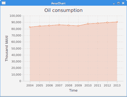
图:AreaChart
散点图
散点图是在水平和垂直轴上绘制的一组点。
ScatterChartEx.java
package com.zetcode;import javafx.application.Application;import javafx.scene.Scene;import javafx.scene.chart.CategoryAxis;import javafx.scene.chart.NumberAxis;import javafx.scene.chart.ScatterChart;import javafx.scene.chart.XYChart;import javafx.scene.layout.HBox;import javafx.stage.Stage;/** ZetCode JavaFX tutorial** This program creates a scatter chart.** Author: Jan Bodnar* Website: zetcode.com* Last modified: August 2016*/public class ScatterChartEx extends Application {@Overridepublic void start(Stage stage) {initUI(stage);}private void initUI(Stage stage) {HBox root = new HBox();CategoryAxis xAxis = new CategoryAxis();NumberAxis yAxis = new NumberAxis("USD/kg", 30, 50, 2);ScatterChart scatterChart = new ScatterChart(xAxis, yAxis);XYChart.Series data = new XYChart.Series();data.getData().add(new XYChart.Data("Mar 14", 43));data.getData().add(new XYChart.Data("Nov 14", 38.5));data.getData().add(new XYChart.Data("Jan 15", 41.8));data.getData().add(new XYChart.Data("Mar 15", 37));data.getData().add(new XYChart.Data("Dec 15", 33.7));data.getData().add(new XYChart.Data("Feb 16", 39.8));scatterChart.getData().add(data);scatterChart.setLegendVisible(false);Scene scene = new Scene(root, 450, 330);root.getChildren().add(scatterChart);stage.setTitle("Gold price");stage.setScene(scene);stage.show();}public static void main(String[] args) {launch(args);}}
在示例中,我们使用ScatterChart显示黄金价格。
CategoryAxis xAxis = new CategoryAxis();
x 轴是用于显示日期的CategoryAxis。
NumberAxis yAxis = new NumberAxis("USD/kg", 30, 50, 2);
y 轴是用于显示黄金价格的NumberAxis。 构造器的参数为:轴标签,下限,上限和刻度单位。
XYChart.Series data = new XYChart.Series();data.getData().add(new XYChart.Data("Mar 14", 43));...
使用XYChart.Series创建一系列数据,并使用XYChart.Data创建其数据项。
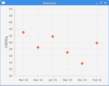
图:ScatterChart
条形图
条形图显示带有矩形条的分组数据,其长度与它们所代表的值成比例。 条形图可以垂直或水平绘制。
BarChartEx.java
package com.zetcode;import javafx.application.Application;import javafx.scene.Scene;import javafx.scene.chart.BarChart;import javafx.scene.chart.CategoryAxis;import javafx.scene.chart.NumberAxis;import javafx.scene.chart.XYChart;import javafx.scene.layout.HBox;import javafx.stage.Stage;/** ZetCode JavaFX tutorial** This program creates a bar chart.** Author: Jan Bodnar* Website: zetcode.com* Last modified: August 2016*/public class BarChartEx extends Application {@Overridepublic void start(Stage stage) {initUI(stage);}private void initUI(Stage stage) {HBox root = new HBox();Scene scene = new Scene(root, 480, 330);CategoryAxis xAxis = new CategoryAxis();NumberAxis yAxis = new NumberAxis();yAxis.setLabel("Gold medals");BarChart barChart = new BarChart(xAxis, yAxis);barChart.setTitle("Olympic gold medals in London");XYChart.Series data = new XYChart.Series();data.getData().add(new XYChart.Data("USA", 46));data.getData().add(new XYChart.Data("China", 38));data.getData().add(new XYChart.Data("UK", 29));data.getData().add(new XYChart.Data("Russia", 22));data.getData().add(new XYChart.Data("South Korea", 13));data.getData().add(new XYChart.Data("Germany", 11));barChart.getData().add(data);barChart.setLegendVisible(false);root.getChildren().add(barChart);stage.setTitle("BarChart");stage.setScene(scene);stage.show();}public static void main(String[] args) {launch(args);}}
在示例中,我们使用条形图显示了 2012 年伦敦奥运会每个国家/地区的奥运金牌数量。
BarChart barChart = new BarChart(xAxis, yAxis);
使用BarChart创建条形图。
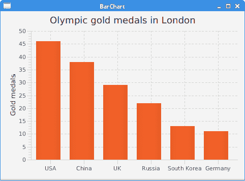
图:AreaChart
饼形图
饼图是一种圆图,分为多个切片以说明数值比例。
PieChartEx.java
package com.zetcode;import javafx.application.Application;import javafx.collections.FXCollections;import javafx.collections.ObservableList;import javafx.scene.Scene;import javafx.scene.chart.PieChart;import javafx.scene.layout.HBox;import javafx.stage.Stage;/** ZetCode JavaFX tutorial** This program creates a pie chart.** Author: Jan Bodnar* Website: zetcode.com* Last modified: August 2016*/public class PieChartEx extends Application {@Overridepublic void start(Stage stage) {initUI(stage);}private void initUI(Stage stage) {HBox root = new HBox();Scene scene = new Scene(root, 450, 330);ObservableList<PieChart.Data> pieChartData= FXCollections.observableArrayList(new PieChart.Data("Apache", 52),new PieChart.Data("Nginx", 31),new PieChart.Data("IIS", 12),new PieChart.Data("LiteSpeed", 2),new PieChart.Data("Google server", 1),new PieChart.Data("Others", 2));PieChart pieChart = new PieChart(pieChartData);pieChart.setTitle("Web servers market share (2016)");root.getChildren().add(pieChart);stage.setTitle("PieChart");stage.setScene(scene);stage.show();}public static void main(String[] args) {launch(args);}}
该示例使用饼图来显示 Web 服务器的市场份额。
ObservableList<PieChart.Data> pieChartData= FXCollections.observableArrayList(new PieChart.Data("Apache", 52),new PieChart.Data("Nginx", 31),new PieChart.Data("IIS", 12),new PieChart.Data("LiteSpeed", 2),new PieChart.Data("Google server", 1),new PieChart.Data("Others", 2));
饼图数据项是使用PieChart.Data创建的。
PieChart pieChart = new PieChart(pieChartData);
使用PieChart类创建一个饼图。

图:PieChart
在本章中,我们在 JavaFX 中创建了LineChart,AreaChart,ScatterChart,BarChart和PieChart。 JFreechart 教程显示了如何在流行的 JFreechart 库中创建图表。

若有收获,就点个赞吧
0 人点赞
