在本章中,我们将创建一些基本的 JavaFX 程序。
退出按钮
在下面的示例中,我们有一个Button控件。 当我们单击按钮时,应用终止。 按下并释放按钮时,将发送ActionEvent。
QuitButtonEx.java
package com.zetcode;import javafx.application.Application;import javafx.application.Platform;import javafx.event.ActionEvent;import javafx.geometry.Insets;import javafx.scene.Scene;import javafx.scene.control.Button;import javafx.scene.layout.HBox;import javafx.stage.Stage;/*** ZetCode JavaFX tutorial** This program has a Quit button. Clicking* on the button terminates the application.** Author: Jan Bodnar* Website: zetcode.com* Last modified: June 2015*/public class QuitButtonEx extends Application {@Overridepublic void start(Stage stage) {initUI(stage);}private void initUI(Stage stage) {Button btn = new Button();btn.setText("Quit");btn.setOnAction((ActionEvent event) -> {Platform.exit();});HBox root = new HBox();root.setPadding(new Insets(25));root.getChildren().add(btn);Scene scene = new Scene(root, 280, 200);stage.setTitle("Quit button");stage.setScene(scene);stage.show();}public static void main(String[] args) {launch(args);}}
Button控件位于窗口的左上角。 事件处理器将添加到按钮。
Button btn = new Button();btn.setText("Quit");
实例化Button控件。 setText()方法设置按钮的标签。
btn.setOnAction((ActionEvent event) -> {Platform.exit();});
setOnAction()方法设置按钮的动作,每当触发按钮时都会调用该动作。 上面的代码创建了一个匿名事件处理器。 Platform.exit()终止应用。
HBox root = new HBox();root.setPadding(new Insets(25));
HBox是将其子级布置在单个水平行中的窗格。 setPadding()方法在窗格内容周围创建填充。 (默认填充为Insets.EMPTY。)这样,按钮和窗口边框的边缘之间会留有一些空间。
root.getChildren().add(btn);
该按钮将添加到HBox窗格。
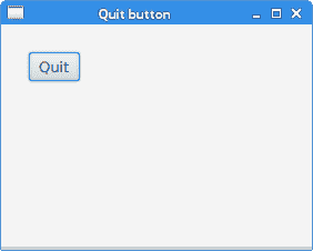
图:退出按钮
工具提示
任何节点都可以显示工具提示。 Tooltip是常见的 UI 元素,通常用于显示有关场景图中节点的其他信息。 当我们将鼠标指针悬停在节点上时,将显示该图标。
TooltipEx.java
package com.zetcode;import javafx.application.Application;import javafx.geometry.Insets;import javafx.scene.Scene;import javafx.scene.control.Button;import javafx.scene.control.Tooltip;import javafx.scene.layout.HBox;import javafx.stage.Stage;/*** ZetCode JavaFX tutorial** This program creates a tooltip for* a button control.** Author: Jan Bodnar* Website: zetcode.com* Last modified: June 2015*/public class TooltipEx extends Application {@Overridepublic void start(Stage stage) {initUI(stage);}private void initUI(Stage stage) {HBox root = new HBox();root.setPadding(new Insets(20));Button btn = new Button("Button");Tooltip tooltip = new Tooltip("Button control");Tooltip.install(btn, tooltip);root.getChildren().add(btn);Scene scene = new Scene(root, 300, 250);stage.setTitle("Tooltip");stage.setScene(scene);stage.show();}public static void main(String[] args) {launch(args);}}
在示例中,我们将工具提示设置为按钮控件。
Button btn = new Button("Button");
实例化Button控件。
Tooltip tooltip = new Tooltip("Button control");Tooltip.install(btn, tooltip);
创建一个Tooltip并将其设置为通过Tooltip的install()方法设置的按钮。
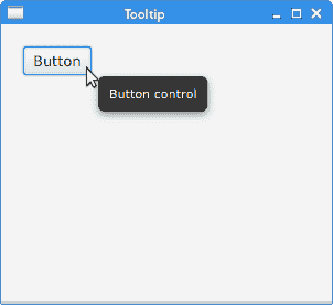
图:工具提示
助记符
助记符是激活支持助记符的控件的快捷键。 例如,它们可以与标签,按钮或菜单项一起使用。
助记符是通过在控件的标签上添加_字符来创建的。 它使下一个字符成为助记符。 字符与无鼠标修饰符(通常为 Alt )结合在一起。 选择的字符带有下划线,但是可以以平台特定的方式强调。 在某些平台上,仅在按下无鼠标修饰符后才对字符加下划线。
MnemonicEx.java
package com.zetcode;import javafx.application.Application;import javafx.event.ActionEvent;import javafx.geometry.Insets;import javafx.scene.Scene;import javafx.scene.control.Button;import javafx.scene.layout.HBox;import javafx.stage.Stage;/*** ZetCode JavaFX tutorial** This program creates a mnemonic for* a button control.** Author: Jan Bodnar* Website: zetcode.com* Last modified: June 2015*/public class MnemonicEx extends Application {@Overridepublic void start(Stage stage) {initUI(stage);}private void initUI(Stage stage) {HBox root = new HBox();root.setPadding(new Insets(20));Button btn = new Button("_Button");btn.setOnAction((ActionEvent event) -> {System.out.println("Button fired");});root.getChildren().add(btn);Scene scene = new Scene(root, 300, 250);stage.setTitle("Mnemonic");stage.setScene(scene);stage.show();}public static void main(String[] args) {launch(args);}}
我们为按钮控件设置了一个助记符。 可以使用 Alt + B 键盘快捷键激活。
Button btn = new Button("_Button");
在按钮的标签中,_字符位于B字符之前; 因此,B字符带有下划线,并包含在键盘快捷键中。
btn.setOnAction((ActionEvent event) -> {System.out.println("Button fired");});
触发按钮后,它将消息发送到控制台。
目前,有三种激活按钮的方式:单击鼠标左键, Alt + B 快捷方式以及空格键 按钮具有焦点)。
设置控件样式
JavaFX 中的控件可以使用 CSS 设置样式。
text.css
#root {-fx-background-color: linear-gradient(gray, darkgray); }#text {-fx-fill:linear-gradient(orange, orangered); }
此 CSS 文件为根节点和Text节点创建样式。
StylingTextEx.java
package com.zetcode;import javafx.application.Application;import javafx.geometry.Insets;import javafx.scene.Scene;import javafx.scene.layout.HBox;import javafx.scene.text.Font;import javafx.scene.text.FontWeight;import javafx.scene.text.Text;import javafx.stage.Stage;/*** ZetCode JavaFX tutorial** This program styles a Text control with CSS.** Author: Jan Bodnar* Website: zetcode.com* Last modified: June 2015*/public class StylingTextEx extends Application {@Overridepublic void start(Stage stage) {initUI(stage);}private void initUI(Stage stage) {HBox root = new HBox();root.setPadding(new Insets(20));Text text = new Text("ZetCode");text.setFont(Font.font("Serif", FontWeight.BOLD, 76));text.setId("text");root.setId("root");root.getChildren().addAll(text);Scene scene = new Scene(root);scene.getStylesheets().add(this.getClass().getResource("text.css").toExternalForm());stage.setTitle("Styling text");stage.setScene(scene);stage.show();}public static void main(String[] args) {launch(args);}}
该示例为根节点创建背景渐变颜色,并为Text控件创建线性渐变填充。
Text text = new Text("ZetCode");text.setFont(Font.font("Serif", FontWeight.BOLD, 76));
创建一个Text控件。 较大的粗体衬线字体设置为控件。
text.setId("text");root.setId("root");
节点由其 ID 标识,该 ID 由setId()方法设置。
scene.getStylesheets().add(this.getClass().getResource("text.css").toExternalForm());
样式表已添加到Scene中。
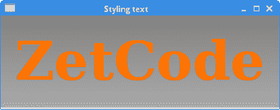
图:样式文本控件
在本章中,我们创建了一些简单的 JavaFX 程序。

若有收获,就点个赞吧
0 人点赞
