当子组件变化时执行动画,需要指定子组件的key进行标识。动画方式可以自定义,能指定动画时长、动画曲线等属性。
相关组件
AnimatedSwitcher基本使用
<br />【child】 : 孩子组件 【Widget】<br />【duration】 : 动画时长 【Duration】<br />【switchOutCurve】 : 切出曲线 【Curves】<br />【switchInCurve】 : 切入曲线 【Curves】<br />【switchInCurve】 : 切入曲线 【Curves】<br />【transitionBuilder】 : 动画构造器 【Widget Function(Widget, Animation<double>)】<br />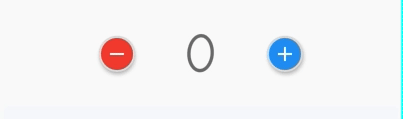
import 'package:flutter/material.dart';class CustomAnimatedSwitcher extends StatefulWidget {@override_CustomAnimatedSwitcherState createState() => _CustomAnimatedSwitcherState();}class _CustomAnimatedSwitcherState extends State<CustomAnimatedSwitcher> {int _count = 0;@overrideWidget build(BuildContext context) {return Container(child: Wrap(crossAxisAlignment: WrapCrossAlignment.center,children: <Widget>[_buildMinusBtn(),SizedBox(width:80,child: _buildAnimatedSwitcher(context)),_buildAddBtn()],),);}Widget _buildAnimatedSwitcher(BuildContext context) =>AnimatedSwitcher(duration: const Duration(milliseconds: 400),transitionBuilder: (Widget child, Animation<double> animation) =>ScaleTransition(child: RotationTransition(turns: animation, child: child),scale: animation),child: Text('$_count',key: ValueKey<int>(_count),style: Theme.of(context).textTheme.display3,),);Widget _buildMinusBtn() {return MaterialButton(padding: EdgeInsets.all(0),textColor: Color(0xffFfffff),elevation: 3,color: Colors.red,highlightColor: Color(0xffF88B0A),splashColor: Colors.red,child: Icon(Icons.remove,color: Colors.white,),shape: CircleBorder(side: BorderSide(width: 2.0, color: Color(0xFFFFDFDFDF)),),onPressed: () => setState(() => _count -= 1));}Widget _buildAddBtn() => MaterialButton(padding: EdgeInsets.all(0),textColor: Color(0xffFfffff),elevation: 3,color: Colors.blue,highlightColor: Color(0xffF88B0A),splashColor: Colors.red,child: Icon(Icons.add,color: Colors.white,),shape: CircleBorder(side: BorderSide(width: 2.0, color: Color(0xFFFFDFDFDF)),),onPressed: () => setState(() => _count += 1));}

若有收获,就点个赞吧
0 人点赞
