一个iOS风格的TabBar,通常用于CupertinoTabScaffold。可指定颜色、图标大小、边线等数据。接收item的点击事件。
相关组件
CupertinoTabBar基本用法
<br />【currentIndex】 : 当前激活索引 【Widget】<br />【items】 : 条目组件 【Widget】<br />【backgroundColor】 : 背景色 【Color】<br />【inactiveColor】 : 非激活色 【Color】<br />【activeColor】 : 激活色 【Color】<br />【iconSize】 : 图标大小 【double】<br />【border】 : 边线 【Border】<br />【onTap】 : 点击事件 【Function(int)】<br />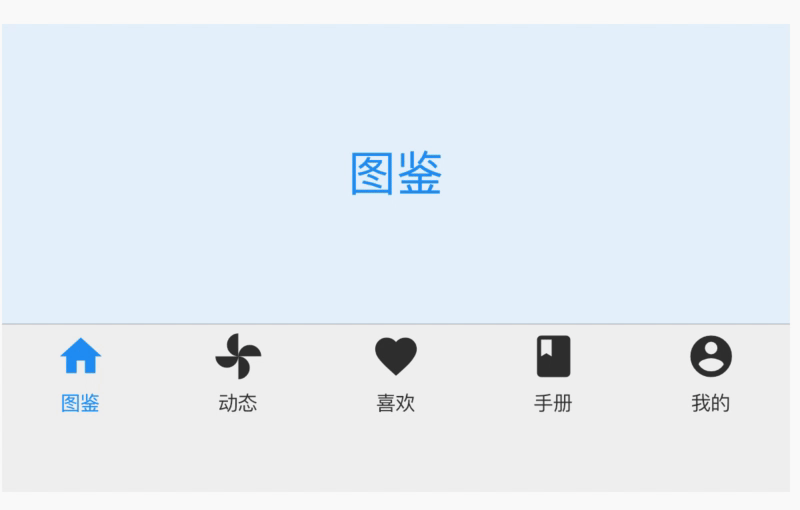
import 'package:flutter/cupertino.dart';
import 'package:flutter/material.dart';
class CustomCupertinoTabBar extends StatefulWidget {
  @override
  _CustomCupertinoTabBarState createState() => _CustomCupertinoTabBarState();
}

class _CustomCupertinoTabBarState extends State<CustomCupertinoTabBar> {
  var _position = 0;
  final iconsMap = {
    //底栏图标
    "图鉴": Icons.home, "动态": Icons.toys,
    "喜欢": Icons.favorite, "手册": Icons.class_,
    "我的": Icons.account_circle,
  };

  @override
  Widget build(BuildContext context) {
    return Column(
      children: <Widget>[
        _buildContent(context),
        _buildTabBar(),
      ],
    );
  }

  Widget _buildTabBar() {
    return CupertinoTabBar(
      currentIndex: _position,
      onTap: (value) => setState(() => _position = value),
      items: iconsMap.keys
          .map((e) => BottomNavigationBarItem(
                icon: Icon(
                  iconsMap[e],
                ),
                title: Text(e),
              ))
          .toList(),
      activeColor: Colors.blue,
      inactiveColor: Color(0xff333333),
      backgroundColor: Color(0xfff1f1f1),
      iconSize: 25.0,
    );
  }

  Widget _buildContent(BuildContext context) {
    return Container(
      alignment: Alignment.center,
      width: MediaQuery.of(context).size.width,
      height: 150,
      color: Color(0xffE7F3FC),
      child: Text(
        iconsMap.keys.toList()[_position],
        style: TextStyle(color: Colors.blue, fontSize: 24),
      ),
    );
  }
}

若有收获,就点个赞吧
0 人点赞
