可容纳一个孩子,为后代的Slider指定默认样式。常用于Slider的样式统一,避免一一设置,也可以对Slider进行样式定制。
相关组件
SliderTheme使用
<br />可通过SliderTheme.of获取Slider主题数据对象,其中包含大量属性用于对Slider的设定。"<br />可以为ButtonTheme【后代】的按钮组件设置默认样式,包括颜色、形状、尺寸等。<br />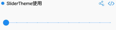
import 'dart:math';import 'package:flutter/material.dart';class SliderThemeDemo extends StatefulWidget {@override_SliderThemeDemoState createState() => _SliderThemeDemoState();}class _SliderThemeDemoState extends State<SliderThemeDemo> {var _bliss = 0.5;@overrideWidget build(BuildContext context) {return SliderTheme(data: SliderTheme.of(context).copyWith(activeTrackColor: Colors.orange),child: Slider(min: 0.0,max: 200.0,divisions: 10,label: "${_bliss.toStringAsFixed(1)}",onChanged: (double value) {setState(() {_bliss = value;});},value: _bliss,),);}}
SliderTheme对Slider的样式定制
<br />通过thumbShape和valueIndicatorShape可以对Slider进行样式定制。"<br />注: 本例参考flutter-gallery中的SlideDemo<br />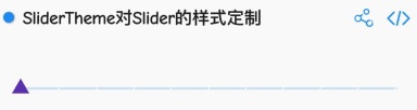
import 'dart:math';
import 'package:flutter/material.dart';
class DIYSliderTheme extends StatefulWidget {
  @override
  _DIYSliderThemeState createState() => _DIYSliderThemeState();
}

class _DIYSliderThemeState extends State<DIYSliderTheme> {
  var _bliss = 0.5;

  @override
  Widget build(BuildContext context) {
    final ThemeData theme = Theme.of(context);

    return SliderTheme(
      data: theme.sliderTheme.copyWith(
        activeTrackColor: Colors.deepPurple,
        inactiveTrackColor: Colors.blue.withAlpha(55),
        activeTickMarkColor: theme.colorScheme.onSurface.withOpacity(0.7),
        inactiveTickMarkColor: theme.colorScheme.surface.withOpacity(0.7),
        overlayColor: theme.colorScheme.onSurface.withOpacity(0.12),
        thumbColor: Colors.deepPurple,
        valueIndicatorColor: Colors.deepPurpleAccent,
        thumbShape: _CustomThumbShape(),
        valueIndicatorShape: _CustomValueIndicatorShape(),
        valueIndicatorTextStyle: theme.accentTextTheme.body2
            .copyWith(color: theme.colorScheme.onSurface),
      ),
      child: Slider(
        min: 0.0,
        max: 200.0,
        divisions: 10,
        label: "${_bliss.toStringAsFixed(1)}",
        onChanged: (double value) {
          setState(() {
            _bliss = value;
          });
        },
        value: _bliss,
      ),
    );
  }
}

class _CustomThumbShape extends SliderComponentShape {
  static const double _thumbSize = 4.0;
  static const double _disabledThumbSize = 3.0;

  @override
  Size getPreferredSize(bool isEnabled, bool isDiscrete) {
    return isEnabled
        ? const Size.fromRadius(_thumbSize)
        : const Size.fromRadius(_disabledThumbSize);
  }

  static final Animatable<double> sizeTween = Tween<double>(
    begin: _disabledThumbSize,
    end: _thumbSize,
  );

  @override
  void paint(PaintingContext context, Offset center,
      {Animation<double> activationAnimation,
      Animation<double> enableAnimation,
      bool isDiscrete,
      TextPainter labelPainter,
      RenderBox parentBox,
      SliderThemeData sliderTheme,
      TextDirection textDirection,
      double value,
      double textScaleFactor,
      Size sizeWithOverflow}) {
    final Canvas canvas = context.canvas;
    final ColorTween colorTween = ColorTween(
      begin: sliderTheme.disabledThumbColor,
      end: sliderTheme.thumbColor,
    );
    final double size = _thumbSize * sizeTween.evaluate(enableAnimation);
    final Path thumbPath = _downTriangle(size, center);
    canvas.drawPath(
        thumbPath, Paint()..color = colorTween.evaluate(enableAnimation));
  }
}

Path _upTriangle(double size, Offset thumbCenter) =>
    _downTriangle(size, thumbCenter, invert: true);

Path _downTriangle(double size, Offset thumbCenter, {bool invert = false}) {
  final Path thumbPath = Path();
  final double height = sqrt(3.0) / 2.0;
  final double centerHeight = size * height / 3.0;
  final double halfSize = size / 2.0;
  final double sign = invert ? -1.0 : 1.0;
  thumbPath.moveTo(
      thumbCenter.dx - halfSize, thumbCenter.dy + sign * centerHeight);
  thumbPath.lineTo(thumbCenter.dx, thumbCenter.dy - 2.0 * sign * centerHeight);
  thumbPath.lineTo(
      thumbCenter.dx + halfSize, thumbCenter.dy + sign * centerHeight);
  thumbPath.close();
  return thumbPath;
}

class _CustomValueIndicatorShape extends SliderComponentShape {
  static const double _indicatorSize = 4.0;
  static const double _disabledIndicatorSize = 3.0;
  static const double _slideUpHeight = 30.0;

  @override
  Size getPreferredSize(bool isEnabled, bool isDiscrete) {
    return Size.fromRadius(isEnabled ? _indicatorSize : _disabledIndicatorSize);
  }

  static final Animatable<double> sizeTween = Tween<double>(
    begin: _disabledIndicatorSize,
    end: _indicatorSize,
  );

  @override
  void paint(PaintingContext context, Offset center,
      {Animation<double> activationAnimation,
      Animation<double> enableAnimation,
      bool isDiscrete,
      TextPainter labelPainter,
      RenderBox parentBox,
      SliderThemeData sliderTheme,
      TextDirection textDirection,
      double value,
      double textScaleFactor,
      Size sizeWithOverflow}) {
    final Canvas canvas = context.canvas;
    final ColorTween enableColor = ColorTween(
      begin: sliderTheme.disabledThumbColor,
      end: sliderTheme.valueIndicatorColor,
    );
    final Tween<double> slideUpTween = Tween<double>(
      begin: 0.0,
      end: _slideUpHeight,
    );
    final double size = _indicatorSize * sizeTween.evaluate(enableAnimation);
    final Offset slideUpOffset =
        Offset(0.0, -slideUpTween.evaluate(activationAnimation));
    final Path thumbPath = _upTriangle(size, center + slideUpOffset);
    final Color paintColor = enableColor
        .evaluate(enableAnimation)
        .withAlpha((255.0 * activationAnimation.value).round());
    canvas.drawPath(
      thumbPath,
      Paint()..color = paintColor,
    );
    canvas.drawLine(
        center,
        center + slideUpOffset,
        Paint()
          ..color = paintColor
          ..style = PaintingStyle.stroke
          ..strokeWidth = 2.0);
    labelPainter.paint(
        canvas,
        center +
            slideUpOffset +
            Offset(-labelPainter.width / 2.0, -labelPainter.height - 4.0));
  }
}

若有收获,就点个赞吧
0 人点赞
