作为组件来说是一个简单的结构组件,可指定形状、影深、背景色等。一般通过ScaffoldState的showSnackBar方法从底部弹出。
相关组件
SnackBar基本使用
<br />【content】 : 中间内容组件 【Widget】<br />【action】 : 右侧按钮 【SnackBarAction】<br />【duration】 : 持续时长 【Widget】<br />【backgroundColor】 : 背景色 【Color】<br />【elevation】 : 影深 【double】<br />【shape】 : 形状 【ShapeBorder】<br />【onVisible】 : 显示时回调 【Function()】<br />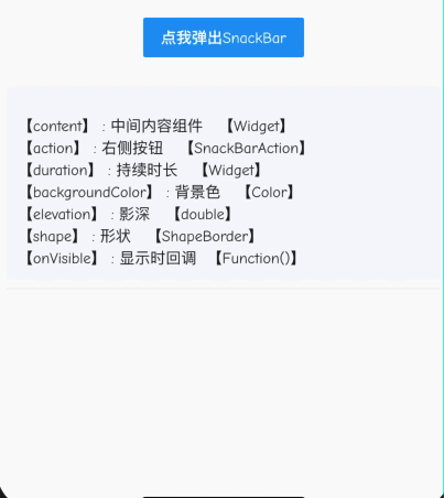
import 'package:flutter/material.dart';
class CustomSnackBar extends StatefulWidget {
  @override
  _CustomSnackBarState createState() => _CustomSnackBarState();
}

class _CustomSnackBarState extends State<CustomSnackBar> {
  @override
  Widget build(BuildContext context) {
    return Container(
        child: FlatButton(
            color: Colors.blue,
            onPressed: () =>
                Scaffold.of(context).showSnackBar(_buildSnackBar()),
            child: Text(
              '点我弹出SnackBar',
              style: TextStyle(color: Colors.white),
            )));
  }

  Widget _buildSnackBar() {
    return SnackBar(
      elevation: 3,
      shape: RoundedRectangleBorder(
          borderRadius: BorderRadius.only(
              topLeft: Radius.circular(10), topRight: Radius.circular(10))),
      content: Text('Wellcome to for join Flutter Unit!'),
      duration: Duration(seconds: 3),
      //持续时间
      backgroundColor: Colors.red,
      onVisible: () => print('onVisible'),
      action: SnackBarAction(
          textColor: Colors.white, label: '确定', onPressed: () {}),
    );
  }
}

若有收获,就点个赞吧
0 人点赞
