- SVG 指可伸缩矢量图形 (Scalable Vector Graphics)
- SVG 用于定义用于网络的基于矢量的图形
- SVG 使用 XML 格式定义图形
- SVG 图像在放大或改变尺寸的情况下其图形质量不会有损失
- SVG 是万维网联盟的标准
- 优势:
- SVG 图像可通过文本编辑器来创建和修改
- SVG 图像可被搜索、索引、脚本化或压缩
- SVG 是可伸缩的
- SVG 图像可在任何的分辨率下被高质量地打印
- SVG 可在图像质量不下降的情况下被放大
矢量图。放大不会失真,适合大面积的贴图,通常动画较少的或者简单,使用标签和css去画
Canvas:适合用于小面积的绘图,适合动画
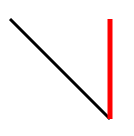
SVG 画线
使用
使用css(stroke: black;)渲染到页面上
<style>.line1{stroke: black;stroke-width: 3px;}.line2{stroke: red;stroke-width: 5px;}</style></head><body><svg width="500px" height="500px" style="border: 1px solid #000;" ><line x1="100" y1="100" x2="200" y2="200" class="line1"></line><line x1="200" y1="100" x2="200" y2="200" class="line2"></line></svg></body>
SVG画虚线
<style>.line1{stroke: black;stroke-width: 10;/* 画虚线 */stroke-dasharray: 10px 20px 30px;}</style></head><body><svg width="500px" height="500px" style="border: 1px solid #000;" ><line x1="100" y1="100" x2="250" y2="100" class="line1"></line></svg></body>
stroke-dasharray: 10px 20px 30px; 可以填多值 填进去的值就可以看做是一个数组,但是会一直循环数组的里的value
注意线是无限延长的 ,只是规定啦显示区域,故只能看到一部分
第一个虚线为10px 后面的空白为20px 第二虚线为30px 后面的空白为10px 第三个虚线为20px 后面的空白为30px ,
如果填入的是一个值,那就一直循环那一个值。
stroke-dashoffset : 偏移的像素值, 向左移动线条
简易动画demo
<style>@keyframes move{0%{stroke-dashoffset: 200px;}100%{stroke-dashoffset: 0px;}}.line1{stroke: black;stroke-width: 10;/* 画虚线 */stroke-dasharray: 200px;/* 线段偏移*/stroke-dashoffset: 200px;animation: move 1s linear infinite alternate;}</style></head><body><svg width="500px" height="500px" style="border: 1px solid #000;" ><line x1="100" y1="100" x2="250" y2="100" class="line1"></line></svg></body>
SVG画矩形
使用
在SVG中所有闭合的图形,默认是填充的
<svg width="500px" height="500px" style="border: 1px solid #000;" ><rect height='50' width="100" x="10" y="10" ry="10"></rect></svg>

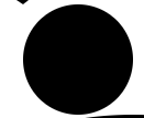
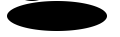
SVG画圆与画椭圆
r:半径
cx,cy: 圆心
rx:x轴半径
ry:y轴半径
<circle r="50" cx="100" cy="100"></circle><ellipse rx="100" ry="30" cx="150" cy="180"></ellipse>
SVG画折线
points = “第一个点的坐标 ,第二点的坐标,第三个点的坐标,……..”
点的坐标用空格隔开,线段用逗号隔开,最少填入三个点的坐标,填入一个和两个坐标默认情况下不会显示,假设css设置其填充颜色和线段的颜色后会显示
<style>polyline{fill: transparent; /*填充透明色*/stroke: red;/*设置线段的颜色*/}</style><polyline points="0 0 , 20 30 , 50 50 , 100 10"></polyline>
默认情况下会自动闭合,闭合图形就会触发填充 当其css设置其填充颜色与线条颜色后 此处线条是加粗过的默认线条太细啦不利与观察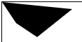
SVG画多边形
与
如图所示
示例图形的代码与
<polygon points="0 0 , 20 30 , 50 50 , 100 10"></polygon>
SVG文本
<text x="300" y="300" style="stroke:red" >text</text>
SVG 透明度与线段样式
stroke-opacity
线段的透明度 ,线段的透明度会以中线作为分割,造成两种颜色,线的加粗,中线会在图形的边在一起,会造成中线的两种颜色
代码如下
rect {stroke: red;stroke-width: 10px;stroke-opacity: 0.3;fill-opacity: 0.3;}<body><svg width="500px" height="500px" style="border: 1px solid #000;" ><rect height='50' width="100" x="10" y="10" ry="10"></rect></svg></body>
如图
fill-opacity
填充的透明度
stroke-linecap与**stroke-linejoin与canvas的线段样式一样**
SVG path元素
<svg width="500px" height="500px" style="border: 1px solid #000;" ><path d='M 100 100 L 200 100 l 100 100 ' style="stroke: red; stroke-width: 5px; fill: transparent;"></path></svg>
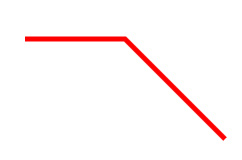
如以上代码 属性d 里的参数区分大小写,大写为绝对位置,小写为相对位置 相对于与上一点进行移动 例如上述代码中 l (100,100) 相对与上一点 L (200,100) 进行向x轴移动100 y轴移动100 故最后连接为一条斜线
M: 就是moveTo 区分大小写 小写 :相对与上一点移动多少距离
L : 就是lineTo 区分大小写 小写 :相对与上一点移动多少距离
H : 水平方向移动到指定位置 区分大小写 小写 :相对与上一点移动多少距离
V : 水平方向移动到指定位置 区分大小写 小写 :相对与上一点移动多少距离
z : 闭合 不区分大小写
**
使用path画圆弧
三点确定一个圆形,两点可以确定两个圆形和椭圆
平面三个点如何确定一个圆形 : 连接三点形成一个三角形,再做任意两边的垂直平分线,交于一点,该点即为圆心,且到三点的距离相等
代码如下
<path d='M 100 100 A 100 50 0 1 1 150 200 ' style="stroke: red; stroke-width: 5px; fill: transparent;"></path>
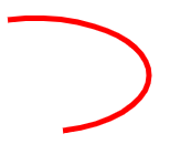
属性d的参数的意思为
第一与第二个参数为:**起始点坐标 M 100 100 :moveTo (100,100)
第三与第四个参数为 :x轴半径 y轴半径 **A 100 50
第五个参数为:**旋转角度: **0
第六与第七个参数 **1 1 如**图
图中将两个圆分成四个弧 分别为顺时针大弧,逆时针大弧,顺时针小弧,逆时针小弧
此处的两个参数 分别代**表 取大弧还是小弧 ,顺时针取弧度还是逆时针取弧度
图中 large-arc-flag = 0 or 1 **为零时取小弧 为1时取大弧 这对应第一个1也就是代码中第六个参数
sweep-flag = 0 or 1 为零时取逆时针的弧,为**1时取其顺时针的弧 这对应第二个1也就是代码中的第七个参数
最后两个为终止点的坐标 : 150 200 **
SVG渐变
<svg width="500px" height="500px" style="border: 1px solid #000000;"><defs><linearGradient id="bg1" x1="0" y1="0" x2="100%" y2="100%"><stop offset="0%" style="stop-color: yellow;"></stop><stop offset="100%" style="stop-color: green;"></stop></linearGradient></defs><rect x="100" y="100" height="100" width="100" style="fill: url(#bg1);"></rect></svg
所有的渐变都要写到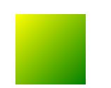
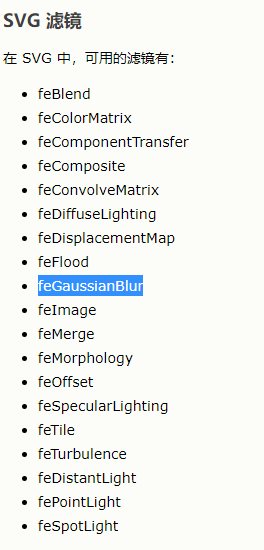
SVG高斯模糊
<svg width="500px" height="500px" style="border: 1px solid #000000;"><defs><!-- 渐变 --><linearGradient id="bg1" x1="0" y1="0" x2="100%" y2="100%"><stop offset="0%" style="stop-color: yellow;"></stop><stop offset="100%" style="stop-color: green;"></stop></linearGradient><!-- 滤镜 --><filter id="filter"><!-- 高斯模糊 --><feGaussianBlur in="SourceGraphic" stdDeviation="5"></feGaussianBlur></filter></defs><rect x="100" y="100" height="100" width="100" style="fill: url(#bg1); filter:url(#filter)"></rect></svg>

SVG viewBoxs属性
viewBoxs= “x,y,width,height”
比例尺
第一对参数: 起始位置
第二对参数:画布的大小
svg会规定画布的大小,假设规定一个500*500的画布,而viewBox=”0,0,250,250”那么现在画布的width为250 height为250但是实际width与实际height还是500
代码如下
<svg width="500px" height="500px" viewBox="0,0,250,250" style="border: 1px solid #000;" ><rect height="50" width='100' x='0' y='0' rx='10'></rect></svg>
效果图 没有设置viewBox的效果 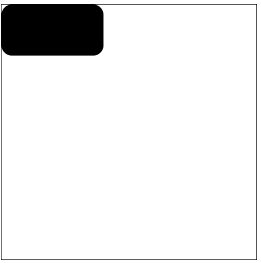
没有设置viewBox的效果 如下图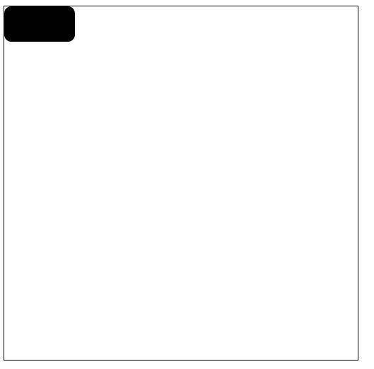

若有收获,就点个赞吧
0 人点赞
