text-shadow :x轴偏移量 y轴偏移量 模糊半径 颜色
<!DOCTYPE html><html lang="en"><head><meta charset="UTF-8"><meta name="viewport" content="width=device-width, initial-scale=1.0"><title>Document</title><style>body{background: #0ff;}div{width: 600px;font-size: 100px;margin: 100px auto;color: #ddd;/* 浮雕效果 文字上面为白色,因为上面会有光照到 */text-shadow: 3px 3px #000, -1px -1px #fff ;/* 镂刻效果 文字上面会有阴影 *//* text-shadow: -1px -3px #000; */}</style></head><body><div>This is a text</div></body></html>
浮雕效果图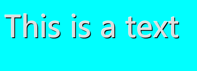
镂刻效果图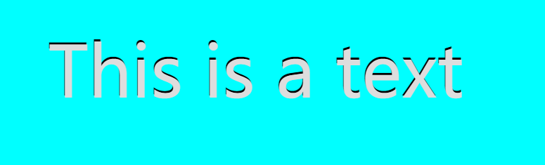
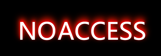
demo1
<!DOCTYPE html><html lang="en"><head><meta charset="UTF-8"><meta name="viewport" content="width=device-width, initial-scale=1.0"><title>Document</title><style>body{background: #000;}div{font-size: 100px;width: 540px;height: 100px;position: absolute;left: calc(50% - 350px);top: 100px;color: #fff;text-shadow: 0px 5px 10px #0f0,0px 10px 20px #0f0,0px 15px 30px #0f0;transition: all .3s;/* border: 1px solid #fff; */}div:hover{left: calc(50% - 270px);text-shadow: 0px -5px 10px #f00,0px -10px 20px #f10,0px -15px 30px #f20;}div::before{content: "NO";width: 380px;color: #fff;margin-right: 5px;text-shadow: 0px -5px 10px #f00,0px -10px 20px #f10,0px -15px 30px #f20;opacity: 0;}div:hover::before{opacity: 1;}</style></head><body><div>ACCESS</div></body></html>
效果图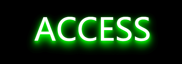
demo2
当text-shadow 与 -webkit-background-clip 一起设置时文字里的背景图不会出现
原因:shadow 的x与y轴偏移量为0时会挡住背景图,当把文字里设置背景图时文字就成啦背景图,背景图会在文字下面显示,而阴影则是文字内容
<!DOCTYPE html><html lang="en"><head><meta charset="UTF-8"><meta name="viewport" content="width=device-width, initial-scale=1.0"><title>Document</title><style>body{background: #000;}div{width: 600px;font-size: 100px;position: absolute;left: calc(50% - 300px);top: 100px;font-weight: bold;background-image: url(/2.jpg);background-position: -600px -62px;background-repeat: no-repeat;background-size: 600px 300px;-webkit-background-clip: text;background-clip: text;-webkit-text-fill-color: transparent;transition: all .3s;/* 当shadow 的x与y轴偏移量为0时会挡住背景图,当把文字里设置背景图时文字就成啦背景图,背景图会在文字下面显示,而阴影则是文字内容,也是文字的一部分,设置x与y轴偏移量为0时会遮挡背景图 */text-shadow: -5px -5px 3px rgba(255, 0, 255, .2),5px 5px 3px rgba(0, 255, 255, .3);}div:hover{background-position: 0px -62px;}</style></head><body><div>这是一段文字</div></body></html>
效果图

demo4
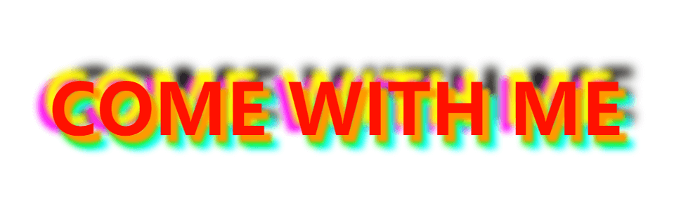
<!DOCTYPE html><html lang="en"><head><meta charset="UTF-8"><meta name="viewport" content="width=device-width, initial-scale=1.0"><title>Document</title><style>div{width: 900px;font-size: 100px;font-weight: bold;position: absolute;left: calc(50% - 450px);top: 100px;color: #f10;text-shadow: 0px 0px 5px #f10,0px 0px 10px #f20,0px 0px 15px #f30;}div:hover{text-shadow: 10px 10px 5px #f90,-10px -15px 10px #ff0,10px 15px 10px #0f0,20px 20px 10px #0ff,-20px -5px 10px #f0f,20px -20px 15px #000;}</style></head><body><div>COME WITH ME</div></body></html>
效果图

若有收获,就点个赞吧
0 人点赞
