- 1、解决 img 5px 间距的问题
- 2、元素的高度与 window 的高度相同
- 3、修改 input placeholder 样式
- 4、使用
:not选择器 - 5、使用 flex 布局将一个元素智能地固定在底部
- 6、使用 caret-color 来修改光标的颜色
- 7、删除
type="number"末尾的箭头 - 8、
outline:none删除输入状态线 - 9、解决iOS滚动条被卡住的问题
- 10、绘制三角形
- 11、绘制小箭头、
- 12、图像适配窗口大小
- 13、隐藏滚动条
- 14、自定义选定的文本样式
- 15、不允许选择文本
- 16、将一个元素在水平和垂直方向上居中
- 17、单行文本溢出时显示省略号
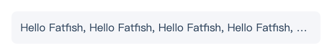
- 18、多行文本溢出时显示省略号
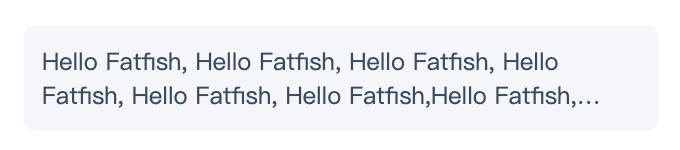
- 19、使用 “
filter:grayscale(1)“,使页面处于灰色模式。
1、解决 img 5px 间距的问题
是否经常遇到图片底部多出5px间距的问题?不用急,这里有4种方法可以解决。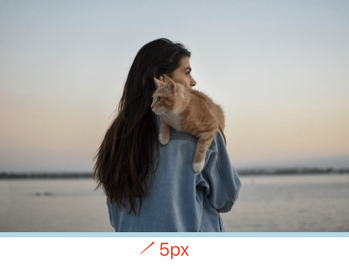
方案1:设置父元素字体大小为 0
关键代码:
.img-container{font-size: 0;}
事例地址:https://codepen.io/Fcant/pen/abVPEoO
点击查看【codepen】
方案2:将 img 元素设置为 display: block
关键代码:
img{display: block;}
事例地址:https://codepen.io/Fcant/pen/ZEaVagN
点击查看【codepen】
方案3:将 img 元素设置为 vertical-align: bottom
关键代码:
img{vertical-align: bottom;}
事例地址:https://codepen.io/Fcant/pen/wvPRPVm
点击查看【codepen】
解决方案4:给父元素设置 line-height: 5px
关键代码:
.img-container{line-height: 5px;}
事例地址:https://codepen.io/Fcant/pen/gOXZXVG
点击查看【codepen】
2、元素的高度与 window 的高度相同
如何使元素与窗口一样高?答案使用 height: 100vh;
事例地址:https://codepen.io/Fcant/pen/LYOMOwN
点击查看【codepen】
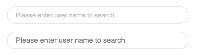
3、修改 input placeholder 样式
关键代码:
.placehoder-custom::-webkit-input-placeholder {color: #babbc1;font-size: 12px;}
事例地址:https://codepen.io/Fcant/pen/yLPGPdZ
点击查看【codepen】
4、使用 :not 选择器
除了最后一个元素外,所有元素都需要一些样式,使用 not 选择器非常容易做到。
如下图所示:最后一个元素没有底边。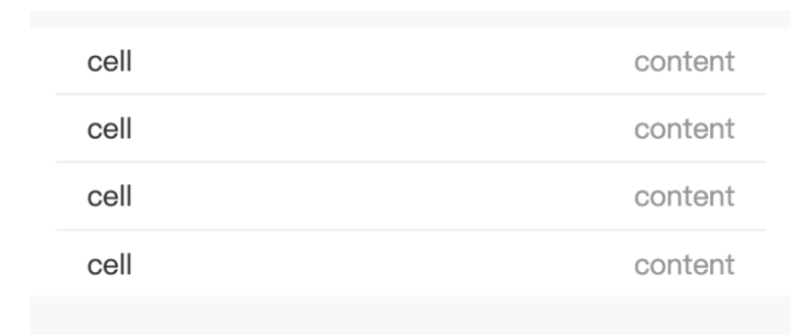
关键代码
li:not(:last-child) {border-bottom: 1px solid #ebedf0;}
事例地址:https://codepen.io/Fcant/pen/gOXZXNG
点击查看【codepen】
5、使用 flex 布局将一个元素智能地固定在底部
当内容不够时,按钮应该在页面的底部。当有足够的内容时,按钮应该跟随内容。当遇到类似的问题时,使用 flex 来实现智能的布局。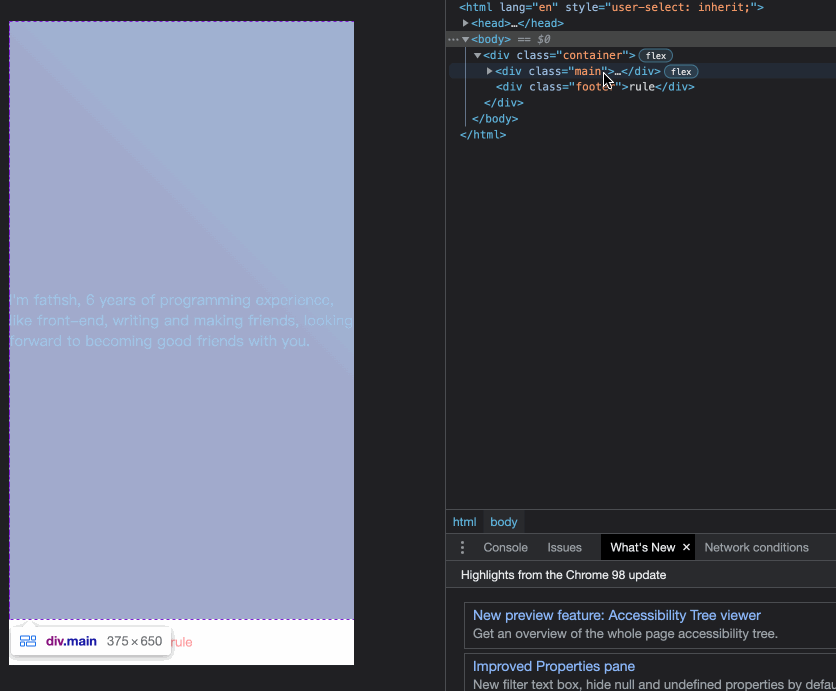
事例地址:https://codepen.io/Fcant/pen/dyZwZBp
点击查看【codepen】
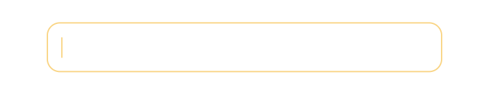
6、使用 caret-color 来修改光标的颜色
可以使用 caret-color 来修改光标的颜色,如下所示:
caret-color: #ffd476;
事例地址:https://codepen.io/Fcant/pen/rNYoYgE
点击查看【codepen】
7、删除 type="number" 末尾的箭头
默认情况下,在type="number"的末尾会出现一个小箭头,但有时需要将其删除。应该怎么做呢?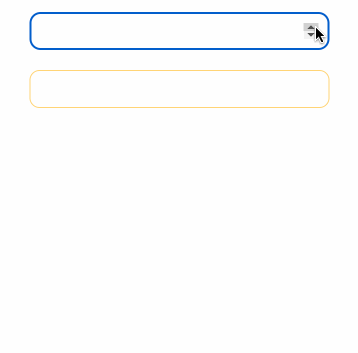
关键代码:
.no-arrow::-webkit-outer-spin-button,.no-arrow::-webkit-inner-spin-button {-webkit-appearance: none;}
事例地址:https://codepen.io/Fcant/pen/KKybyLr
点击查看【codepen】
8、outline:none 删除输入状态线
当输入框被选中时,它默认会有一条蓝色的状态线,可以通过使用 outline: none 来移除它。
如下图所示:第二个输入框被移除,第一个输入框没有被移除。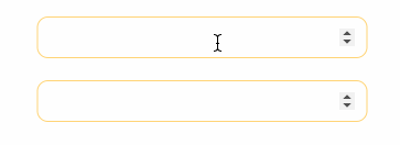
事件地址:https://codepen.io/Fcant/pen/gOXZXJG
点击查看【codepen】
9、解决iOS滚动条被卡住的问题
在苹果手机上,经常发生元素在滚动时被卡住的情况。这时,可以使用如下的 CSS 来支持弹性滚动。
body,html{-webkit-overflow-scrolling: touch;}
10、绘制三角形
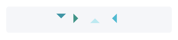
.box {padding: 15px;background-color: #f5f6f9;border-radius: 6px;display: flex;align-items: center;justify-content: center;}.triangle {display: inline-block;margin-right: 10px;/* Base Style */border: solid 10px transparent;}/*下*/.triangle.bottom {border-top-color: #0097a7;}/*上*/.triangle.top {border-bottom-color: #b2ebf2;}/*左*/.triangle.left {border-right-color: #00bcd4;}/*右*/.triangle.right {border-left-color: #009688;}
事例地址:https://codepen.io/Fcant/pen/dyZwZEp
点击查看【codepen】
11、绘制小箭头、

关键代码:
.box {padding: 15px;background-color: #ffffff;border-radius: 6px;display: flex;align-items: center;justify-content: center;}.arrow {display: inline-block;margin-right: 10px;width: 0;height: 0;/* Base Style */border: 16px solid;border-color: transparent #cddc39 transparent transparent;position: relative;}.arrow::after {content: "";position: absolute;right: -20px;top: -16px;border: 16px solid;border-color: transparent #fff transparent transparent;}/*下*/.arrow.bottom {transform: rotate(270deg);}/*上*/.arrow.top {transform: rotate(90deg);}/*左*/.arrow.left {transform: rotate(180deg);}/*右*/.arrow.right {transform: rotate(0deg);}
事例地址:https://codepen.io/Fcant/pen/qBVLVGb
点击查看【codepen】
12、图像适配窗口大小
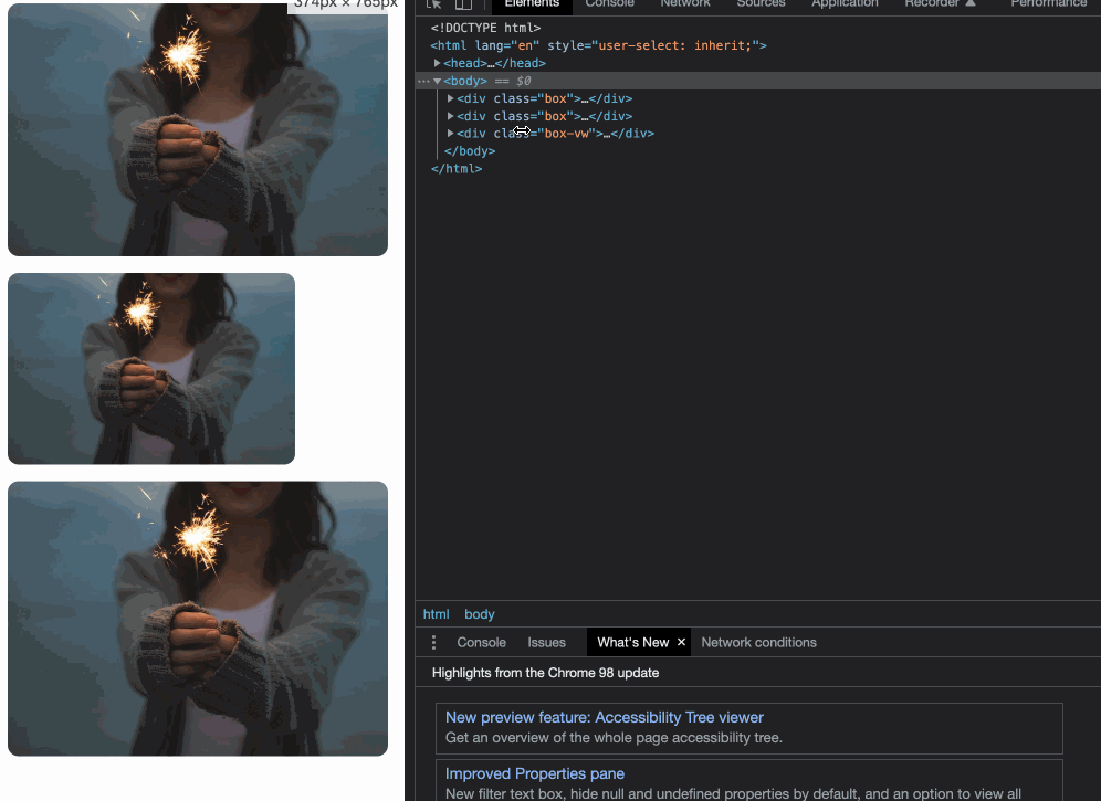
事例地址:https://codepen.io/Fcant/pen/rNYoYbE
点击查看【codepen】
13、隐藏滚动条
第一个滚动条是可见的,第二个滚动条是隐藏的。这意味着容器可以被滚动,但滚动条被隐藏起来,就像它是透明的一样。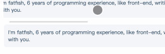
关键代码:
.box-hide-scrollbar::-webkit-scrollbar {display: none; /* Chrome Safari */}
事例地址:https://codepen.io/Fcant/pen/NWwewmM
点击查看【codepen】
14、自定义选定的文本样式
关键代码:
.box-custom::selection {color: #ffffff;background-color: #ff4c9f;}
事例地址:https://codepen.io/Fcant/pen/gOXZXyx
点击查看【codepen】
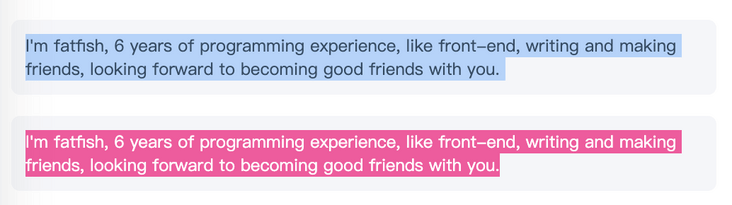
15、不允许选择文本
关键代码:
.box p:last-child {user-select: none;}
事例地址:https://codepen.io/Fcant/pen/YzEdEMp
点击查看【codepen】
16、将一个元素在水平和垂直方向上居中
关键代码:
display: flex;align-items: center;justify-content: center;
事例地址:https://codepen.io/Fcant/pen/ZEaVaPP
点击查看【codepen】
17、单行文本溢出时显示省略号
关键代码:
overflow: hidden;white-space: nowrap;text-overflow: ellipsis;max-width: 375px;
事例地址:https://codepen.io/Fcant/pen/NWwewJM
点击查看【codepen】
18、多行文本溢出时显示省略号
关键代码:
overflow: hidden;text-overflow: ellipsis;display: -webkit-box;/* set n lines, including 1 */-webkit-line-clamp: 2;-webkit-box-orient: vertical;
事例地址:https://codepen.io/Fcant/pen/RwjEjdp
点击查看【codepen】
19、使用 “filter:grayscale(1)“,使页面处于灰色模式。
关键代码:
body{filter: grayscale(1);}

若有收获,就点个赞吧
0 人点赞
