HTML CSS 烟熏效果
使用blur()函数对模糊效果进行动画处理。然后使用第n个子属性来应用动画延迟。
HTML代码
创建了一个div元素,并将加载文本字符包装在span元素内。
<!DOCTYPE html><html lang="en"><head><meta charset="UTF-8" /><meta name="viewport" content="width=device-width, initial-scale=1.0" /><title>GeeksforGeeks</title></head><body><div class="geeks"><span>G</span><span>e</span><span>e</span><span>k</span><span>s</span><span>f</span><span>o</span><span>r</span><span>G</span><span>e</span><span>e</span><span>k</span><span>s</span></div></body></html>
CSS代码
- 步骤1:将文本居中对齐作为背景。
- 步骤2:提供了一个线性动画,其关键帧标识符为animate。
- 步骤3:使用关键帧将模糊功能应用于动画的不同帧。
步骤4:最后一步是应用第n个子概念为每个角色提供动画延迟,以便在一个时间点只有一个角色变得模糊。
<style>body {margin: 0;padding: 0;background: green;}.geeks {position: absolute;top: 50%;left: 50%;transform: translate(-50%, -50%);font-size: 30px;font-weight: 800;letter-spacing: 5px;}.geeks span {animation: animate 3s linear infinite;}.geeks span:nth-child(1) {animation-delay: 0s;}.geeks span:nth-child(2) {animation-delay: 0.1s;}.geeks span:nth-child(3) {animation-delay: 0.2s;}.geeks span:nth-child(4) {animation-delay: 0.3s;}.geeks span:nth-child(5) {animation-delay: 0.4s;}.geeks span:nth-child(6) {animation-delay: 0.5s;}.geeks span:nth-child(7) {animation-delay: 0.6s;}.geeks span:nth-child(8) {animation-delay: 0.9s;}.geeks span:nth-child(9) {animation-delay: 0.8s;}.geeks span:nth-child(10) {animation-delay: 0.9s;}.geeks span:nth-child(11) {animation-delay: 1s;}.geeks span:nth-child(12) {animation-delay: 1.1s;}.geeks span:nth-child(13) {animation-delay: 1.2s;}@keyframes animate {0% {filter: blur(0);}40% {filter: blur(20px);}80% {filter: blur(0);}100% {filter: blur(0);}}</style>
完整的代码
```html <!DOCTYPE html>
G
e
e
k
s
f
o
r
G
e
e
k
s
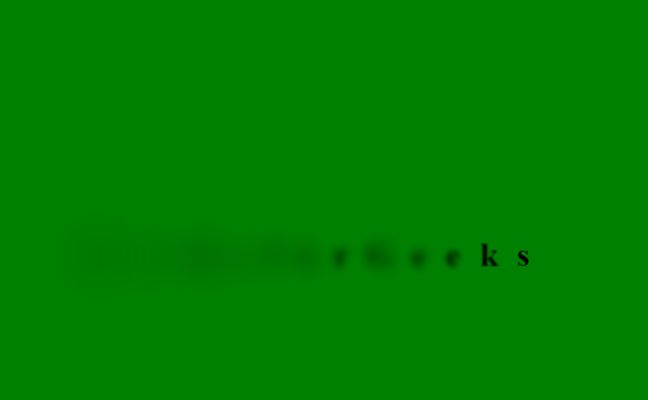
效果

若有收获,就点个赞吧
0 人点赞
