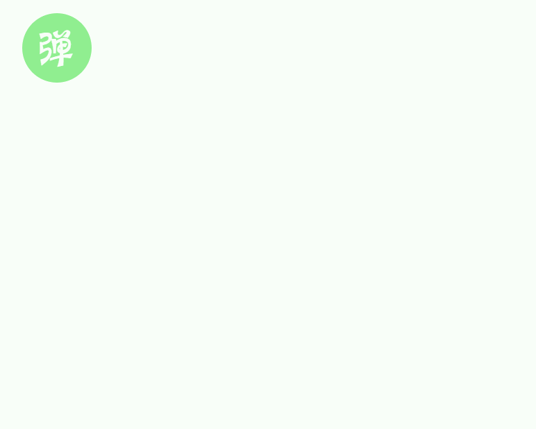
1、弹动效果实现
代码实现
<!DOCTYPE html><html lang="en"><head><meta charset="UTF-8" /><meta name="viewport" content="width=device-width, initial-scale=1.0" /><title>CSS个人博客样式特效实例</title><style>.shake{width:40px;height:40px;display:block;background:lightgreen;border-radius:50%;margin:5px;color:#fff;font-size:24px;text-align:center;line-height:40px;cursor:pointer;-webkit-transition:all 0.25s;}.shake:hover{-webkit-animation:shake 0.25s;background: lightblue;}@-webkit-keyframes shake{0%,10%,55%,90%,94%,98%,100%{-webkit-transform:scale(1,1);}30%{-webkit-transform:scale(1.14,0.86);}75%{-webkit-transform:scale(0.92,1.08);}92%{-webkit-transform:scale(1.04,0.96);}96%{-webkit-transform:scale(1.02,0.98);}99%{-webkit-transform:scale(1.01,0.99);}}</style></head><body><span class="shake">弹</span></body></html>
效果
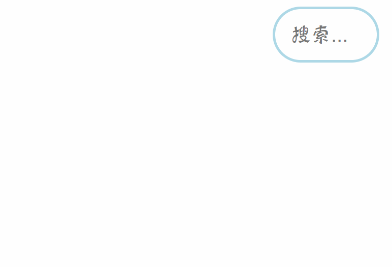
2、搜索框输入时拉伸
代码实现
<!DOCTYPE html><html lang="en"><head><meta charset="UTF-8" /><meta name="viewport" content="width=device-width, initial-scale=1.0" /><title>CSS个人博客样式特效实例</title><style>.search{width:80px;height:40px;border-radius:40px;border:2px solid lightblue;position: absolute;right:200px;outline:none;text-indent:12px;color:#666;font-size:16px;padding:0;-webkit-transition:width 0.5s;}.search:focus{width:200px;}</style></head><body><input class="search" type="text" placeholder="搜索..."></body></html>
效果
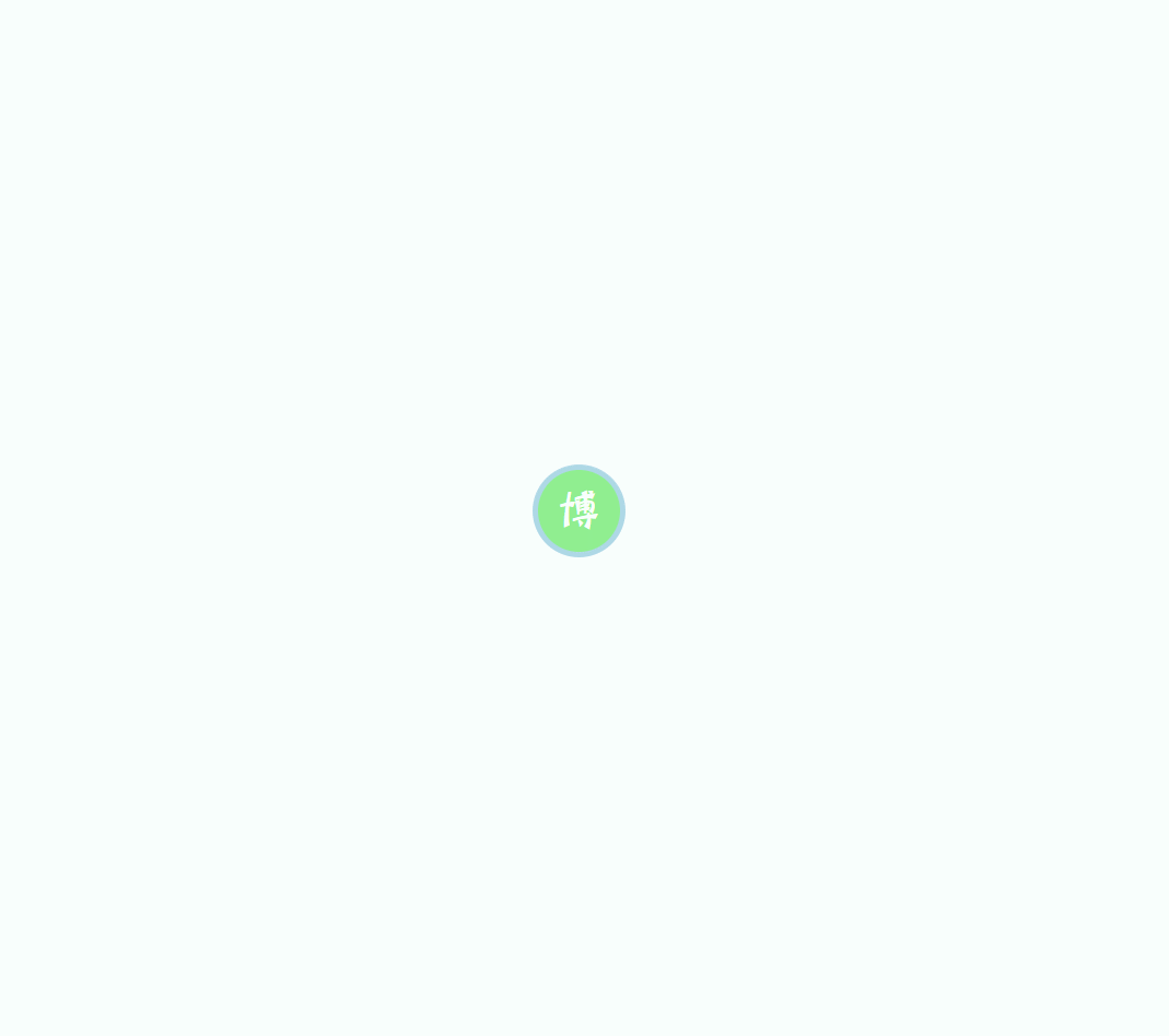
3、旋转条样式
代码实现
<!DOCTYPE html><html lang="en"><head><meta charset="UTF-8" /><meta name="viewport" content="width=device-width, initial-scale=1.0" /><title>CSS个人博客样式特效实例</title><style>.banner{width:234px;height:34px;border-radius:34px;position:absolute;top:400px;left:200px;}.banner a{display:inline-block;width:30px;height:30px;line-height:30px;border-radius:50%;border:2px solid lightblue;position:absolute;left:0px;top:0px;background:lightgreen;color:#fff;text-align:center;text-decoration:none;cursor:pointer;z-index:2;}.banner a:hover + span{-webkit-transform:rotate(360deg);opacity:1;}.banner span{display:inline-block;width:auto;padding:0 20px;height:34px;line-height:34px;background:lightblue;border-radius:34px;text-align: center;position:absolute;color:#fff;text-indent:25px;opacity:0;-webkit-transform-origin:8% center;-webkit-transition:all 1s;}</style></head><body><div class="banner"><a href="javascript:;">博</a><span>这是我的个人博客</span></div></body></html>
效果
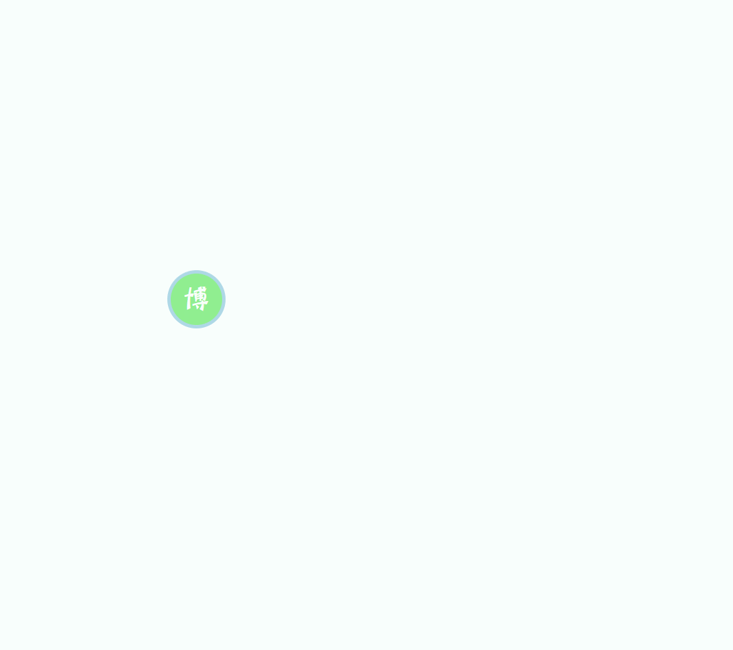
4、右进右出条样式
代码实现
<!DOCTYPE html><html lang="en"><head><meta charset="UTF-8" /><meta name="viewport" content="width=device-width, initial-scale=1.0" /><title>CSS个人博客样式特效实例</title><style>.banner{width:234px;height:34px;border-radius:40px;position:absolute;top:400px;left:600px;}.banner a{display:inline-block;width:30px;height:30px;line-height:30px;border-radius:50%;border:2px solid lightblue;position:absolute;left:0px;top:0px;background:lightgreen;color:#fff;text-align:center;text-decoration:none;cursor:pointer;z-index:2;}.banner a:hover + span{-webkit-transform:translateX(40px);opacity:1;}.banner span{display:inline-block;width:auto;padding:0 20px;height:30px;line-height:30px;background:lightblue;border-radius:30px;text-align: center;color:#fff;position:absolute;top:2px;opacity:0;-webkit-transition:all 1s;-webkit-transform:translateX(80px);}</style></head><body><div class="banner"><a href="javascript:;">博</a><span>这是我的个人博客</span></div></body></html>
效果
5、旋转标签
代码实现
<!DOCTYPE html><html lang="en"><head><meta charset="UTF-8" /><meta name="viewport" content="width=device-width, initial-scale=1.0" /><title>CSS个人博客样式特效实例</title><style>.wrapper{width:100px;height:100px;background:lightblue;border-radius:50%;border:2px solid lightgreen;position: absolute;top:200px;left:400px;cursor:pointer;}.wrapper:after{content:'你猜';display:inline-block;width:100px;height:100px;line-height:100px;border-radius:50%;text-align:center;color:#fff;font-size:24px;}.wrapper:hover .round{-webkit-transform:scale(1);opacity:1;-webkit-animation:rotating 6s 1.2s linear infinite alternate;}@-webkit-keyframes rotating{0%{-webkit-transform:rotate(0deg);}100%{-webkit-transform:rotate(180deg);}}.round{width:240px;height:240px;border:2px solid lightgreen;border-radius:50%;position: absolute;top:-70px;left:-70px;-webkit-transition:all 1s;-webkit-transform:scale(0.35);opacity:0;}.round span{width:40px;height:40px;line-height:40px;display:inline-block;border-radius:50%;background:lightblue;border:2px solid lightgreen;color:#fff;text-align:center;position:absolute;}.round span:nth-child(1){right:-22px;top:50%;margin-top:-22px;}.round span:nth-child(2){left:-22px;top:50%;margin-top:-22px;}.round span:nth-child(3){left:50%;bottom:-22px;margin-left:-22px;}.round span:nth-child(4){left:50%;top:-22px;margin-left:-22px;}</style></head><body><div class="wrapper"><div class="round"><span>东邪</span><span>西毒</span><span>南乞</span><span>北丐</span></div></div></body></html>
效果


若有收获,就点个赞吧
0 人点赞
