1、box-shadow的高级应用
利用css3的新特性可以实现各种意想不到的特效,接下来的几个案例来使用css3的box-shdow来实现,马上开始吧!
实现水波动画
知识点:box-shadow
想想如果不用css3,是怎么实现水波扩散的动画呢?想必一定是写一大堆的js才能实现如下的效果: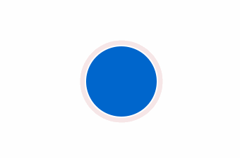
css3实现核心代码
<style>.wave {margin-left: auto;margin-right: auto;width: 100px;height: 100px;border-radius: 100px;border: 2px solid #fff;text-align: center;line-height: 100px;color: #fff;background: #06c url(http://p3g4ahmhh.bkt.clouddn.com/me.jpg) no-repeat center center;background-size: 100%;animation: wave 4s linear infinite;}@keyframes wave {0% {box-shadow: 0 0 0 0 rgba(245, 226, 226, 1), 0 0 0 0 rgba(250, 189, 189, 1);}50% {box-shadow: 0 0 0 20px rgba(245, 226, 226, .5), 0 0 0 0 rgba(250, 189, 189, 1);}100% {box-shadow: 0 0 0 40px rgba(245, 226, 226, 0), 0 0 0 20px rgba(245, 226, 226, 0);}}</style><div class="wave"></div>
这里主要使用了box-shadow的多级阴影来实现的,动画部分使用的@keyframes,是不是感觉还行?
实现加载动画
知识点:box-shadow多阴影
加载动画大家想必也不陌生,虽然可以用很多方式实现加载动画,比如用伪元素,用gif,用js,但是更优雅的实现还是直接上css: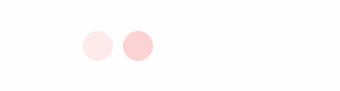
核心代码如下:
<style>.loading {margin-left: auto;margin-right: auto;width: 30px;height: 30px;border-radius: 30px;background-color: transparent;animation: load 3s linear infinite;}@keyframes load {0% {box-shadow: -40px 0 0 rgba(250, 189, 189, 0),inset 0 0 0 15px rgba(250, 189, 189, 0),40px 0 0 rgba(250, 189, 189, 0);}30% {box-shadow: -40px 0 0 rgba(250, 189, 189, 1),inset 0 0 0 15px rgba(250, 189, 189, 0),40px 0 0 rgba(250, 189, 189, 0);}60% {box-shadow: -40px 0 0 rgba(250, 189, 189, 0),inset 0 0 0 15px rgba(250, 189, 189, 1),40px 0 0 rgba(250, 189, 189, 0);}100% {box-shadow: -40px 0 0 rgba(250, 189, 189, 0),inset 0 0 0 15px rgba(250, 189, 189, 0),40px 0 0 rgba(250, 189, 189, 1);}}</style><div class="loading"></div>
这里也是采用box-shadow多背景来实现,也是当时思考的一个方向,至于其他的css方案,欢迎交流。
实现对话框及对话框的不规则投影
知识点:filter和伪元素
这里涉及到css滤镜的知识,不过也很简单,大家在css3官网上看看就理解了,直接看效果: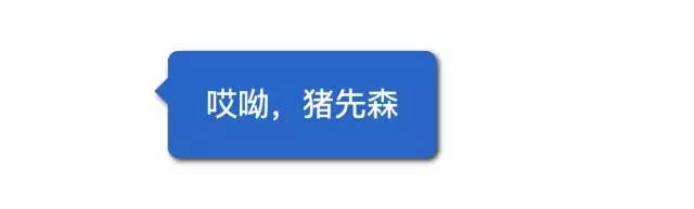
会通过filter的drop-shadow来实现不规则图形的阴影,然后利用伪元素和border来实现头部三角形:
<style>.odd-shadow{margin-left: auto;margin-right: auto;width: 200px;height: 80px;border-radius: 8px;color: #fff;font-size: 24px;text-align: center;line-height: 80px;background: #06c;filter: drop-shadow(2px 2px 2px rgba(0,0,0,.8))}.odd-shadow::before{content: '';position: absolute;display: block;margin-left: -20px;transform: translateY(20px);width:0;height: 0;border: 10px solid transparent;border-right-color: #06c;}</style><div class="odd-shadow">哎呦,猪先森</div>
模糊效果
知识点:filter
这个比较简单,这里直接上图和代码: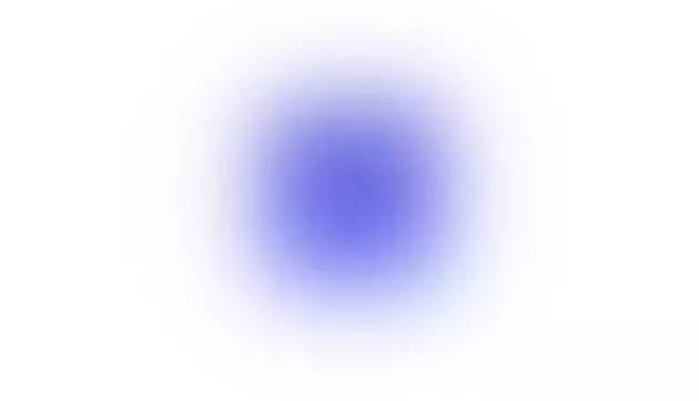
filter: blur(20px)
2、制作自适应的椭圆
border-radius的出现可以实现圆角效果提供了极大的便利,还可以通过对Border-radius特性的进一步研究来实现各种图形效果,接下来就看看它的威力吧!
知识点:border-radius: a / b; //a,b分别为圆角的水平、垂直半径,单位若为%,则表示相对于宽度和高度进行解析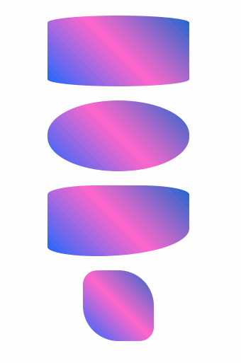
核心代码:
<style>.br-1{width: 200px;height: 100px;border-radius: 50% /10%;background: linear-gradient(45deg,#06f,#f6c,#06c);}.br-2{width: 100px;border-radius: 20% 50%;}.ani{animation: skew 4s infinite;}.ani1{animation: skew1 4s infinite 2s;}.ani2{animation: skew2 4s infinite 3s;}@keyframes skew{to{border-radius: 50%;}}@keyframes skew1{to{border-radius: 20px 20px 100%;}}@keyframes skew2{to{transform: rotate(360deg);}}</style><div class="br-1 black-theme"></div><div class="br-1 black-theme ani"></div><div class="br-1 black-theme ani1"></div><div class="br-1 br-2 black-theme ani2"></div>
这里主要使用了背景渐变来实现华而不实的背景,用border-radius实现各种规格的椭圆图案。
3、纯css3实现饼图进度动画
知识点:border-radius: a b c d / e f g h; animation多动画属性;
效果如下: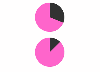
核心代码:
<style>.br-31{width: 100px;height: 100px;border-radius: 50%;background: linear-gradient(to right,#f6c 50%,#333 0);}.br-31::before{content: '';display: block;margin-left: 50%;height: 100%;border-radius: 0 100% 100% 0 / 50%;background-color: #f6c;transform-origin: left;animation: skin 4s linear infinite,bg 8s step-end infinite;}@keyframes skin{to{transform: rotate(.5turn);}}@keyframes bg{50%{background: #333;}}.br-32::before{animation-play-state: paused;animation-delay: inherit;}</style><div class="br-31 black-theme"></div><div class="br-31 br-32 black-theme" style="animation-delay:-1s"></div>
这块的实现主要用了渐变背景,也是实现扇形进度的关键,包括代码中的如何遮挡半圆,如何对半圆做动画,如何改变旋转原点的位置等,这些虽然技巧性很强,但是稍微画一画,也可以实现的。
4、css3伪元素实现自定义复选框
都知道原生的复选框控件样式极难自定义,这对于工程师实现设计稿的难度加大了一大截。css3的出现,增加了:checked选择器,因此可以利用:checked和label来实现各式各样的表单选择控件,接下来看看如何实现吧!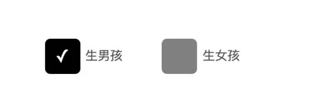
来看看如何实现上述自定义的复选框:
<style>.check-wrap{text-align: center;}.checkbox{position: absolute;clip: rect(0,0,0,0);}.checkbox[type="checkbox"]:focus + label::before{box-shadow: 0 0 .6em #06c;}.checkbox[type="checkbox"] + label::before{content: '\a0'; /* 不换行空格 */display: inline-block;margin-right: .3em;width: 2em;height: 2em;border-radius: .3em;vertical-align: middle;line-height: 2em; /* 关键 */font-size: 20px;text-align: center;color: #fff;background: gray;}.checkbox[type="checkbox"]:checked + label::before{content: '\2713'; /* 对勾 */background: black;}label{margin-right: 40px;font-size: 20px;}</style><div class="check-wrap"><input type="checkbox" class="checkbox" id="check-1" /><label for="check-1">生男孩</label><input type="checkbox" class="checkbox" id="check-2" /><label for="check-2">生女孩</label></div>
这里为了隐藏原生的checkbox控件,用了clip: rect(0,0,0,0)进行截取,然后使用checkbox的伪类:checked来实现交互。
接下来扩展一下,来实现自定义开关: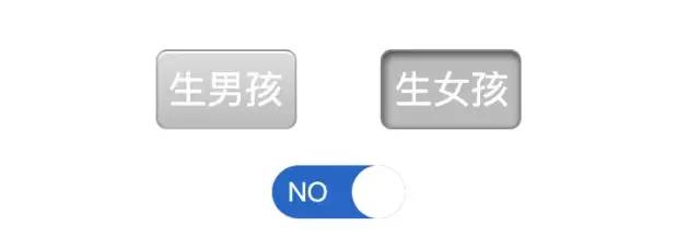
这里原理是一样的,只不过样式做了改动,直接上代码:
<style>.check-wrap{margin-bottom: 20px;text-align: center;}.switch{position: absolute;clip: rect(0,0,0,0);}.switch[type="checkbox"] + label{width: 6em;height: 3em;padding: .3em;border-radius: .3em;border: 1px solid rgba(0,0,0,.2);vertical-align: middle;line-height: 2em; /* 关键 */font-size: 20px;text-align: center;color: #fff;box-shadow: 0 1px white inset;background-color: #ccc;background-image: linear-gradient(#ddd,#bbb);}.switch[type="checkbox"]:checked + label{box-shadow: 0.05em .1em .2em rgba(0,0,0,.6) inset;border-color: rgba(0,0,0,.3);background: #bbb;}label{margin-right: 40px;font-size: 14px;}.switch-an{position: absolute;clip: rect(0,0,0,0);}.switch-an[type="checkbox"] + label{position: relative;display: inline-block;width: 5em;height: 2em;border-radius: 1em;color: #fff;background: #06c;text-align: left;}.switch-an[type="checkbox"] + label::before{content: '';width:2em;height: 2em;position: absolute;left: 0;border-radius: 100%;vertical-align: middle;background-color: #fff;transition: left .3s;}.switch-an[type="checkbox"] + label::after{content: 'OFF';margin-left: 2.6em;}.switch-an[type="checkbox"]:checked + label::before{transition: left .3s;left: 3em;}.switch-an[type="checkbox"]:checked + label::after{content: 'NO';margin-left: .6em;}</style><div class="check-wrap"><input type="checkbox" class="switch" id="switch-1" /><label for="switch-1">生男孩</label><input type="checkbox" class="switch" id="switch-2" /><label for="switch-2">生女孩</label></div><div class="check-wrap"><input type="checkbox" class="switch-an" id="switch-an-1" /><label for="switch-an-1"></label></div>
是不是感觉css3提供了更强大的动画和自定义功能呢?其实可以实现更酷炫更实用的效果。
5、在线制作css3动画的利器
最后推荐一个在线制作各种贝塞尔曲线的工具: cubic-bezier。
地址:https://cubic-bezier.com/#.17,.67,.83,.67

若有收获,就点个赞吧
0 人点赞
