1、边框条纹效果
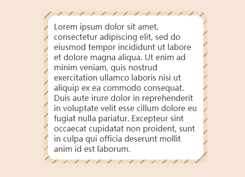
代码思路
在原先的元素下方创建一个有条纹背景的伪元素,并保证原先元素覆盖住它就行,这样就模拟了边框的效果。
可以使用 repeating-linear-gradient 来实现条纹背景。
HTML 代码
<div class="card w-80"><div class="border-stripe rounded-xl">Lorem ipsum...</div></div>
CSS 代码
.border-stripe {--stripe-width: 0.5rem;--stripe-deg: -45deg;--stripe-color-1: var(--grey-color-1);--stripe-offset-1: 2px;--stripe-color-2: var(--skin-color-2);--stripe-offset-2: 1rem;--stripe-radius: 15px;--stripe-inset: calc(var(--stripe-width) * -1);&::before {@include inset(var(--stripe-inset));content: "";z-index: -1;background: repeating-linear-gradient(var(--stripe-deg),var(--stripe-color-1) 0 var(--stripe-offset-1),var(--stripe-color-2) 0 var(--stripe-offset-2));border-radius: var(--stripe-radius);}}
2、不规则形状
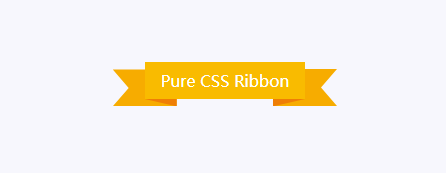
代码思路
中间是一个矩形,矩形下方有 2 个三角形,左右 2 侧各有一个被裁切过的矩形。使用 clip-path 这个属性就可以了。
HTML 代码
<div class="ribbon">Pure CSS Ribbon<div class="block"></div><div class="block"></div><div class="block"></div><div class="block"></div></div>
CSS 代码
.ribbon {--ribbon-color-1: var(--yellow-color-1);--ribbon-color-2: var(--yellow-color-2);--ribbon-color-3: var(--yellow-color-3);position: relative;padding: 0.5rem 1rem;color: white;background: var(--ribbon-color-1);.block {&:nth-child(1),&:nth-child(2) {position: absolute;bottom: -20%;width: 20%;height: 20%;background: var(--ribbon-color-2);clip-path: polygon(0 0, 100% 100%, 100% 0);}&:nth-child(1) {left: 0;}&:nth-child(2) {right: 0;transform: scaleX(-1); //这起到了水平翻转的作用,它可以防止再写一遍clip-path}&:nth-child(3),&:nth-child(4) {position: absolute;z-index: -1;top: 20%;width: 40%;height: 100%;background: var(--ribbon-color-3);clip-path: polygon(0 0, 25% 50%, 0 100%, 100% 100%, 100% 0);}&:nth-child(3) {left: -20%;}&:nth-child(4) {right: -20%;transform: scaleX(-1);}}}
3、浮雕效果
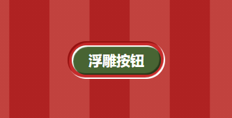
代码思路
这是由 2 个同心的元素组成的,于是自然就想到了 inset 这个 Mixin。光泽可以用 box-shadow 来实现,通过叠加多重阴影,就可以模拟出浮雕的效果了。
HTML 代码
<div class="px-6 py-2 text-xl embossed cursor-pointer" data-text="浮雕按钮" style="--emboss-radius: 1.5rem">浮雕按钮</div>
CSS 代码
:root {--red-color-1: #af2222;--red-color-2: #c1423e;--red-color-3: #c62a2a;--red-color-4: #951110;--green-color-1: #486433;--green-color-2: #2b361a;--red-grad-1: linear-gradient(to right,var(--red-color-1) 50%,var(--red-color-2) 0);}.embossed {--emboss-radius: 1rem;--emboss-out: 6px;--emboss-out-minus: calc(var(--emboss-out) * -1);--emboss-inset: 2px;--emboss-inset-minus: calc(var(--emboss-inset) * -1);--emboss-blur: 1px;--emboss-bg-1: var(--red-color-3);--emboss-bg-2: var(--green-color-1);--emboss-color-1: white;--emboss-color-2: var(--red-color-4);--emboss-color-3: var(--green-color-2);position: relative;box-sizing: border-box;white-space: nowrap;&::before {@include inset(var(--emboss-out-minus));content: "";background: var(--emboss-bg-1);box-shadow: inset var(--emboss-inset-minus) var(--emboss-inset-minus)var(--emboss-blur) var(--emboss-color-1),inset var(--emboss-inset) var(--emboss-inset) var(--emboss-blur)var(--emboss-color-2);border-radius: calc(var(--emboss-radius) + var(--emboss-out));}&::after {@include inset;@include flex-center;content: attr(data-text);color: white;font-weight: bold;background: var(--emboss-bg-2);box-shadow: inset var(--emboss-inset) var(--emboss-inset) var(--emboss-blur)var(--emboss-color-1),inset var(--emboss-inset-minus) var(--emboss-inset-minus)var(--emboss-blur) var(--emboss-color-3);border-radius: var(--emboss-radius);}}

若有收获,就点个赞吧
0 人点赞
