HTML代码
<!DOCTYPE html><html lang="en"><head><meta charset="UTF-8"><meta name="viewport" content="width=device-width, initial-scale=1.0"><title>Animated loader</title><link rel="stylesheet" href="style.css"></head><body><div class="pieces"></div><div class="one"></div><div class="two"></div><div class="eye"></div><p>GeeksforGeeks loading...</p></body></html>
CSS代码
卡通加载器的设计是通过CSS属性实现的。
通过逐渐从一组样式更改为另一组样式来创建动画。更改以百分比或关键字“ from”和“ to”为单位,分别与0%和100%相同。
可以根据需要多次更改CSS样式集。
@keyframes animationname {keyframes-selector {css-styles;}}
body{display: flex;justify-content: center;align-items: center;min-height: 100vh;background: #202020;}.pieces{padding: 10px;border-radius: 50%;background: #ffcc00;position: absolute;right: 40%;animation: pieces 1s linear infinite;}.one{position: absolute;top: 50.5%;left: 30%;background: yellowgreen;border-radius: 0 0 125px 125px;height: 125px;width: 250px;animation: anim1 1s linear infinite;}.two{position: absolute;top: 36.5%;left: 30%;background: yellowgreen;border-radius: 125px 125px 0 0;height: 125px;width: 250px;animation: anim2 1s linear infinite;}.eye{position: absolute;right: 60%;top: 40%;background: #202020;padding: 12px;border-radius: 50%;animation: eye 1s linear infinite;}p{position: absolute;font-weight: bold;text-transform: uppercase;font-size: 25px;letter-spacing: 2px;top: 53%;right: 30%;font-family: arial;color: green;}@keyframes anim1{0%{transform: rotate(0deg);}50%{transform: rotate(20deg);}100%{transform: rotate(0deg);}}@keyframes anim2{0%{transform: rotate(0deg);}50%{transform: rotate(-20deg);}100%{transform: rotate(0deg);}}@keyframes eye{0%{top: 40%;right: 60%;}50%{top: 40.3%;right: 60.3%;}100%{top: 40%;right: 60%;}}@keyframes pieces{0%{right: 40%;}100%{right: 60%;}}
完整代码
<!DOCTYPE html><html lang="en"><head><meta charset="UTF-8"><meta name="viewport" content="width=device-width, initial-scale=1.0"><title>Animated loader</title><style>body {display: flex;justify-content: center;align-items: center;min-height: 100vh;background: #202020;}.pieces {padding: 10px;border-radius: 50%;background: #ffcc00;position: absolute;right: 40%;animation: pieces 1s linear infinite;}.one {position: absolute;top: 50.5%;left: 30%;background: yellowgreen;border-radius: 0 0 125px 125px;height: 125px;width: 250px;animation: anim1 1s linear infinite;}.two {position: absolute;top: 36.5%;left: 30%;background: yellowgreen;border-radius: 125px 125px 0 0;height: 125px;width: 250px;animation: anim2 1s linear infinite;}.eye {position: absolute;right: 60%;top: 40%;background: #202020;padding: 12px;border-radius: 50%;animation: eye 1s linear infinite;}p {position: absolute;font-weight: bold;text-transform: uppercase;font-size: 25px;letter-spacing: 2px;top: 53%;right: 30%;font-family: arial;color: green;}@keyframes anim1 {0% {transform: rotate(0deg);}50% {transform: rotate(20deg);}100% {transform: rotate(0deg);}}@keyframes anim2 {0% {transform: rotate(0deg);}50% {transform: rotate(-20deg);}100% {transform: rotate(0deg);}}@keyframes eye {0% {top: 40%;right: 60%;}50% {top: 40.3%;right: 60.3%;}100% {top: 40%;right: 60%;}}@keyframes pieces {0% {right: 40%;}100% {right: 60%;}}</style></head><body><div class="pieces"></div><div class="one"></div><div class="two"></div><div class="eye"></div><p>GeeksforGeeks loading...</p></body></html>
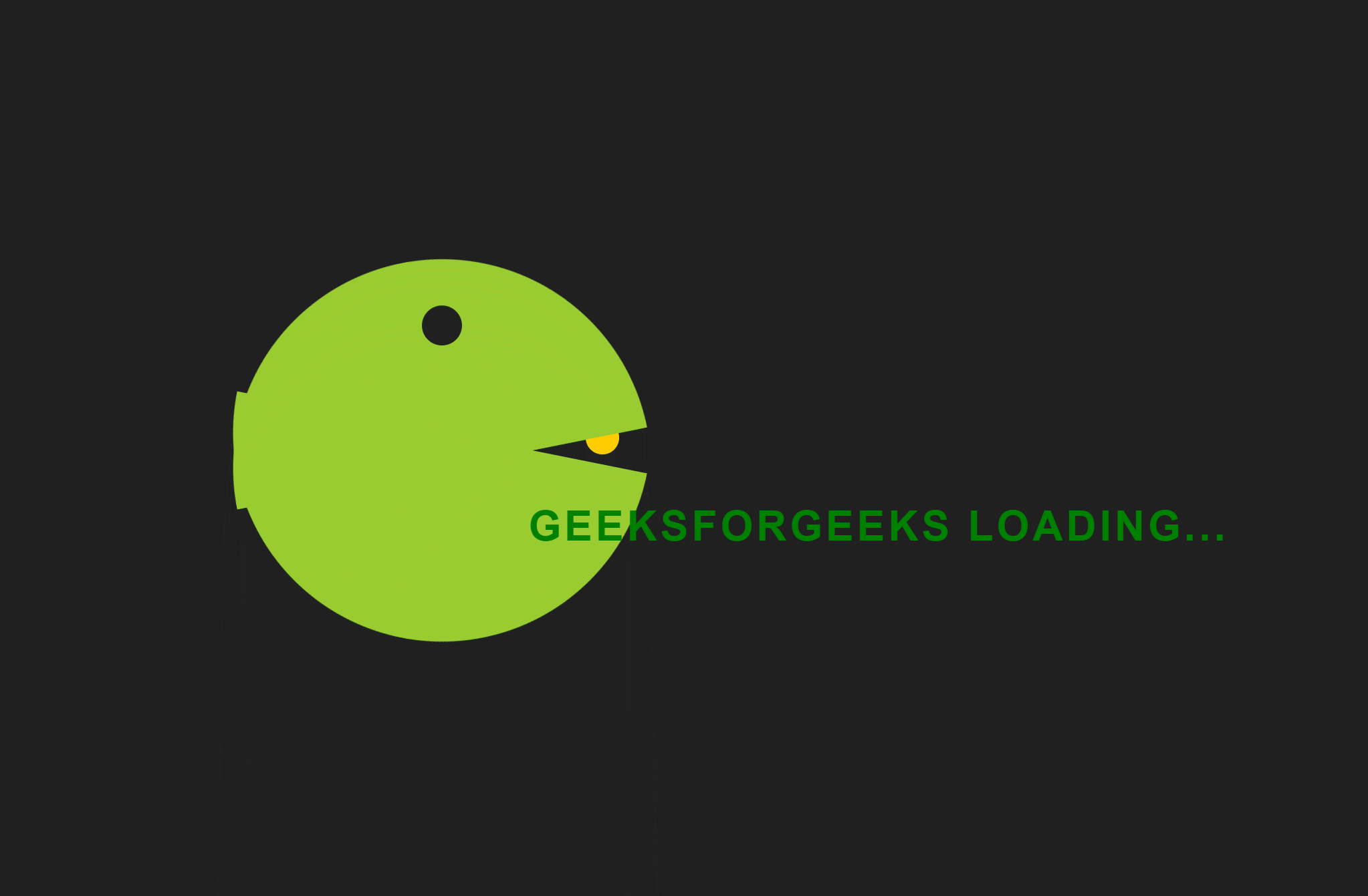
实现效果

若有收获,就点个赞吧
0 人点赞
