一、@container
@container 是一个容器查询方法,正如它的名字一样,它是用来支持根据当前元素所在容器的大小来进行动态修改添加样式的,这跟 @media 基于视口大小是不一样的。
来举个🌰
先创建一个侧边栏和一个主内容
<body><aside class="sidebar"><div class="card"><h4>侧边栏</h4><p>To the world you may be one person, but to one person you may be the world.</p></div></aside><main class="content"><div class="card"><h4>主内容</h4><p>To the world you may be one person, but to one person you may be the world.</p></div></main></body>
让这两个元素横向布局,且侧边栏宽度占 30%,主内容宽度占 70%
body {display: flex;color: white;}h4 {color: black;}.sidebar {width: 30%;}.content {width: 70%;background: #f0f5f9; /* 给个底色,与侧边栏区分 */}.card {background: lightpink;box-shadow: 3px 10px 20px rgba(0, 0, 0, 0.2);border-radius: 8px;}
目前为止是这样的效果: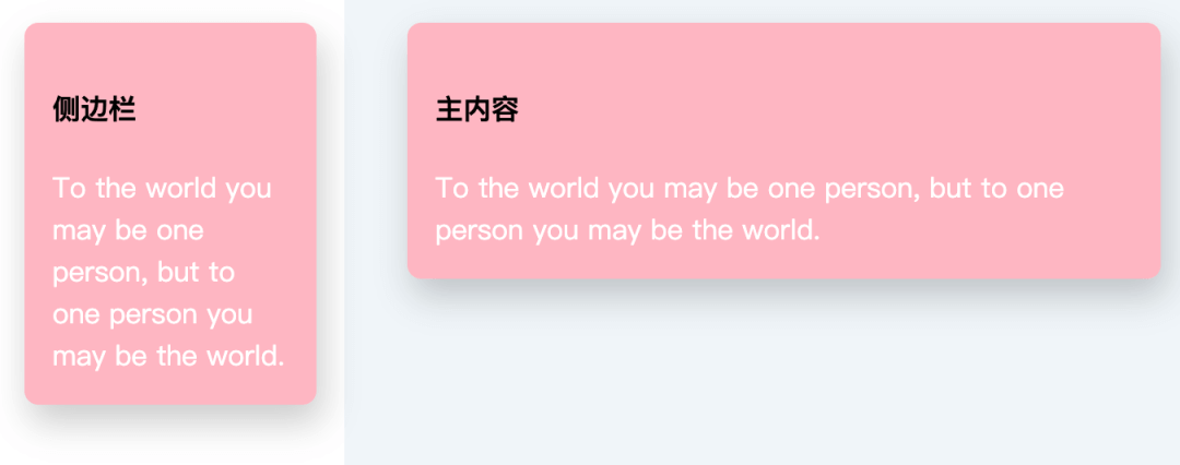
现在可以发现主内容这块儿空间很富余,便想改变一下标题和内容文字的布局,此时就可以用上 @container 了,直接让主内容在当前容器宽度大于 400px 时变成横向布局
@container (min-width: 400px) {.content .card {display: flex;}}
此时效果如下: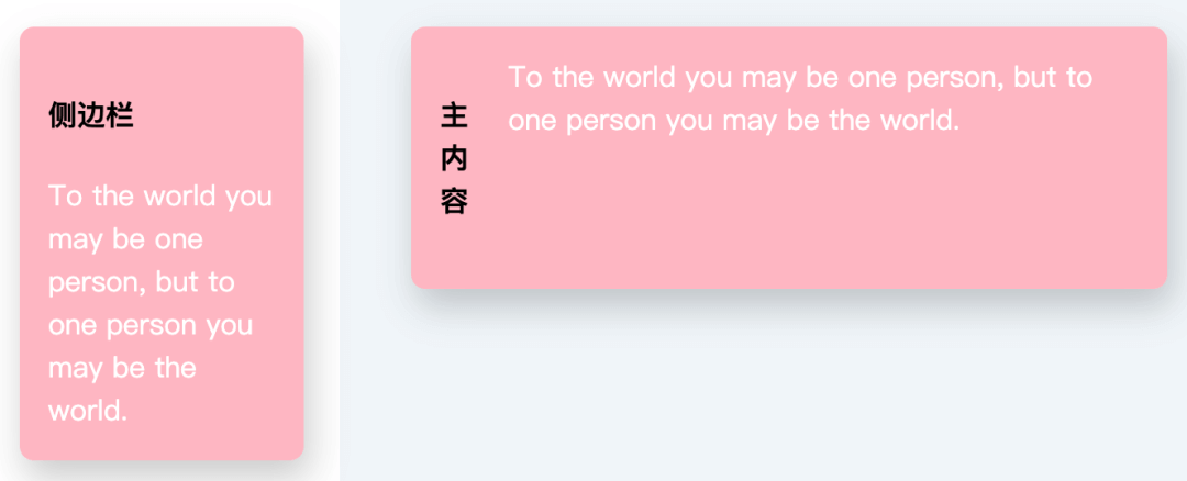
是不是很酷 😎
基于这点,还想到了一个之前做过的需求中很头疼的需求,就是字体大小随着容器宽高的改变而动态改变,如果支持了这个特性,那这个需求也就很简单了
二、object-view-box
object-view-box 属性就类似于 SVG 中的 viewBox 属性。它允许您使用一行 CSS 来平移、缩放、裁剪 图像。
对这张图来动动刀子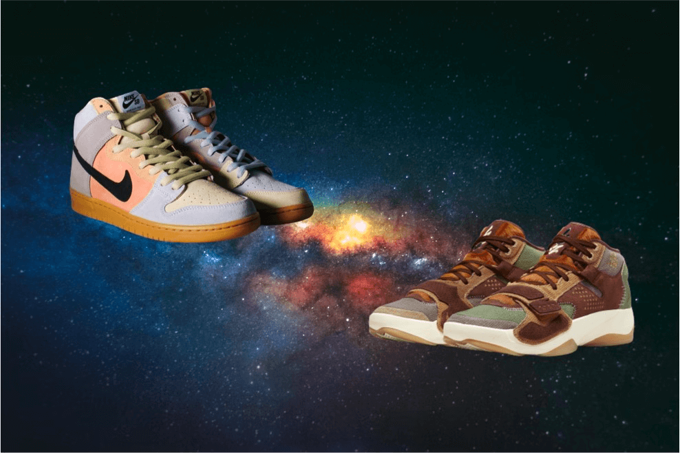
加一行代码
.crop {object-view-box: inset(10% 50% 35% 5%);}
实现的效果就是这样: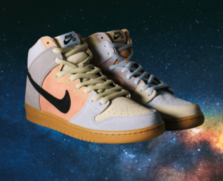
跟原图对比一下就是这样: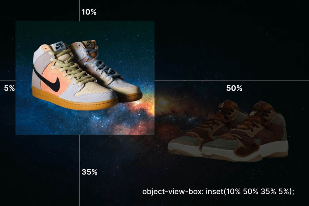
除了简单的裁剪,还能基于它实现一些好玩的效果,例如:
三、animation-timeline
animation-timeline 相比前两个就更好玩了!它允许基于容器滚动的进度来对动画进行处理,简而言之就是页面滚动了百分之多少,动画就执行百分之多少。而且动画也能根据页面倒着滚动而倒着播放
.shoes {animation-name: Rotate;animation-duration: 1s;animation-timeline: scrollTimeline;}@scroll-timeline scrollTimeline {source: selector('#container');orientation: "vertical";}@keyframes Rotate {from {transform: translate(-200px, -200px) rotate(0deg);}to {transform: translate(100vw, 100vh) rotate(720deg);}}
使用起来很简单,就是在本身的基础动画上,新增一个 animation-timeline 属性即可,也可以对这个 timeline 定义是基于哪个容器,滚动方向是水平还是竖直
大致效果就是:

若有收获,就点个赞吧
0 人点赞
