前端工程师最常见且最具挑战性的问题之一是 CSS 命名约定。随着 Block Element Modifier(BEM)方法的流行,许多人习惯于按照一种可维护的模式组织他们的样式。
即将在 Chrome 浏览器中实施的 @scope 允许在样式表中对样式进行块级作用域划分,从而进一步提高了 BEM 的性能。这将使样式表更易于维护,同时对 CSS 级联进行更严格的控制。
在这里将展示如何在 Chrome 中使用 @scope 特性,以及如何使用它来替换前端项目中的 BEM。通过几个例子进行讲解,可以在 GitHub 上的示例项目中查看并跟随操作。
CSS @scope 是什么?
在即将发布的 Chrome 118 版本中,@scope 特性创建了 CSS 样式的块级作用域。这给了开发者对 CSS 样式更多的控制权,因为现在可以在 CSS 文件中直接为视图的不同部分明确定义作用域。
请看下面的 HTML 示例:
<main className="sample-page"><h1>With Scope</h1><section className="first-section"><p>some text</p><p>some text and then a <a href="/">back link</a></p></section><section className="second-section"><h2>Dog Picture</h2><div><p>second section paragraph text</p></div><img src={'./DOG_1.jpg'} alt="dog" /></section></main>
在此 HTML 中,可以使用以下方法对 second-section 样式区域内的元素进行样式设置:
.second-section {display: flex;flex-direction: column;border: solid;padding: 40px;margin: 20px;}@scope (.second-section) {h2 {text-align: center;}img {max-width: 400px;max-height: 100%;}div {display: flex;justify-content: center;margin: 20px;}p {max-width: 200px;text-align: center;background-color: pink;color: forestgreen;padding: 10px;border-radius: 20px;font-size: 24px;}}
使用 @scope 时,还可以创建一个 “甜甜圈 “作用域,为一组样式及其中的元素定义起始和结束部分。使用上述相同的 HTML,甜甜圈作用域可以定义从 sample-page 的起始区域到 second-section 样式区域的样式:
/* donut scope */@scope (.sample-page) to (.second-section) {p {font-size: 24px;background-color: forestgreen;color: pink;text-align: center;padding: 10px;}a {color: red;font-size: 28px;text-transform: uppercase;}}
最棒的是,它的功能与使用 BEM 造型非常相似,但代码量更少。
浏览器支持 CSS @scope
截至2023年10月2日,CSS @scope 还未正式发布,因此需要开启实验性网络功能标志来使用它。要做到这一点,首先在 Chrome 中打开一个标签页,前往 chrome://flags/,然后搜索并启用“实验性网络平台功能”标志:
什么是 BEM
BEM 是一种在HTML视图中分组样式的方式,可以轻松地进行导航。
考虑到一个大型 HTML 页面有许多具有不同样式的元素。在设置了几个初始样式名称后,随着页面的扩展,要保持样式就会变得很困难。BEM 试图通过围绕实际样式来构建样式名来缓解这一问题。
block 是一个包含 HTML 元素。考虑一下类似这样的 HTML
<main className="sample-page"><h1 className="sample-page__title">With BEM</h1><section className="sample-page__first-section"><p className="sample-page__first-section--first_line">some text</p><p className="sample-page__first-section--second-line">some text and then a{' '}<aclassName="sample-page__first-section--second-line-link"href="/">back link</a></p></section></main>
在此 HTML 中
- 块 = sample-page 样式就是 block 样式,因为它包裹了一组元素
- 元素 = 在为
<h1>元素设计样式时,该元素被视为 element ,因此会在样式名称中添加额外的 ,从而创建 sample-pagetitle 。 sample-page__first-section 也是如此。
修改器 = 当在 <section> 元素中为
元素设计样式时,样式名称会多出一个 —first-line ,从而创建 sample-page__first-section—first-line ,所以:
- 块为 sample-page
- 元素是 first-section
- 修饰词是 first-line
BEM 的扩展性很好,尤其是在使用 SASS 将样式分组并使用 & 操作符创建类似内容时:
.sample-page {display: flex;flex-direction: column;margin-top: 10px;&__title {font-size: 48px;color: forestgreen;}&__first-section {font-size: 24px;border: solid;padding: 40px;margin: 20px;&--first-line{font-size: 24px;background-color: forestgreen;color: pink;text-align: center;padding: 10px;}}}
难点在于,在一个大型项目中,这会产生非常大的 CSS 或 SASS 文件,而这些文件仍然很难进行大规模管理。可以使用 @scope 替换 BEM 样式,使样式定义更小、更易于管理。
使用@scope重构BEM
展示使用 @scope 的优势的最佳方式是在使用 React 等主流框架或库的应用程序中使用 @scope。在 GitHub 上的示例应用程序中, react-example 文件夹中有一个项目,其中的页面首先使用 BEM 进行了样式设计,然后使用 @scope 进行了重构。
可以运行应用程序并单击 WithBEM 或 WithScope 按钮来查看具体实现。组件和样式表都有相应的名称,前缀为 WithBEM 或 WithScope ,分别位于 pages 和 styles 文件夹中。
从 BEM 样式组件 WithBEMPage.tsx 开始,首先看到了用 BEM 方法设计的 HTML 样式:
<main className="sample-page"><h1 className="sample-page__title">With BEM</h1><section className="sample-page__first-section"><p className="sample-page__first-section--first_line">some text</p><p className="sample-page__first-section--second-line">some text and then a{' '}<aclassName="sample-page__first-section--second-line-link"href="/">back link</a></p></section><section className="sample-page__second-section"><h2 className="sample-page__second-section--title">Dog Picture</h2><div className="sample-page__second-section--div"><p className="sample-page__second-section--div-paragraph">second section paragraph text</p></div><imgclassName="sample-page__second-section--image"src={'./DOG_1.jpg'}alt="dog"/></section></main>
在组件 WithScopePage.tsx 中,可以通过以下内容看到重构是多么干净利落:
<main className="sample-page"><h1>With Scope</h1><section className="first-section"><p>some text</p><p>some text and then a <a href="/">back link</a></p></section><section className="second-section"><h2>Dog Picture</h2><div><p>second section paragraph text</p></div><img src={'./DOG_1.jpg'} alt="dog" /></section></main>
要将 BEM 重构为 @scope ,只需找到样式组,然后适当添加作用域样式。先来看看标题部分。在原始的 WithBEMPage.tsx 文件中,每个部分都定义了不同的样式。而在 @scope 版本中,则为特定元素定义了更简洁的样式:
.sample-page {display: flex;flex-direction: column;margin-top: 10px;}/* replaced *//* .sample-page__title {font-size: 48px;color: forestgreen;} *//* donut scope */@scope (.sample-page) to (.first-section) {h1 {font-size: 48px;color: forestgreen;}}
同样,在第一部分内容中,原始 BEM 风格如下:
.sample-page__first-section {font-size: 24px;border: solid;padding: 40px;margin: 20px;}.sample-page__first-section--first_line {font-size: 24px;background-color: forestgreen;color: pink;text-align: center;padding: 10px;}.sample-page__first-section--second-line {font-size: 24px;background-color: forestgreen;color: pink;text-align: center;padding: 10px;}.sample-page__first-section--second-line-link {color: red;font-size: 28px;text-transform: uppercase;}
用 @scope 重构第一部分,现在就有了一个更简洁的样式定义:
.first-section {font-size: 24px;border: solid;padding: 40px;margin: 20px;}/* donut scope */@scope (.sample-page) to (.second-section) {p {font-size: 24px;background-color: forestgreen;color: pink;text-align: center;padding: 10px;}a {color: red;font-size: 28px;text-transform: uppercase;}}
这样做的另一个好处是,HTML 视图更小,更容易阅读。考虑到之前
<section className="sample-page__first-section"><p className="sample-page__first-section--first_line">some text</p><p className="sample-page__first-section--second-line">some text and then a{' '}<aclassName="sample-page__first-section--second-line-link"href="/">back link</a></p></section>
然后
<section className="first-section"><p>some text</p><p>some text and then a <a href="/">back link</a></p></section>
通过这两个示例组件,可以对每个部分进行重构。最终注意到它是如何使样式更简洁、更易读的。
@scope 与 BEM 相比的其他优势
除了将 BEM 重构为 @scope 的优势外,使用 @scope 还可以更好地控制 CSS 级联。CSS 级联是一种算法,它定义了网络浏览器如何处理组成 HTML 页面上元素的样式条件。
在处理任何前端项目时,开发者可能需要处理由于样式层叠而产生的奇怪结果。通过使用@scope,可以通过紧密限定元素范围来控制层叠的副作用。
文件 no_scope.html 的样式和一些元素定义如下:
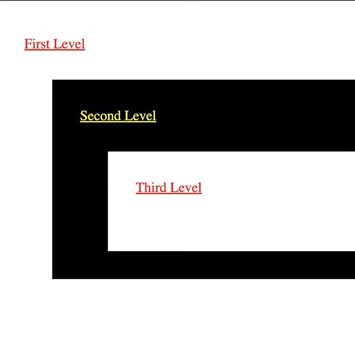
<!DOCTYPE html><html><head><title>Plain HTML</title><style>.light {background: #ccc;}.dark {background: #333;}.light a {color: red;}.dark a {color: yellow;}div {padding: 2rem;}div > div {margin: 0 0 0 2rem;}p {margin: 0 0 2rem 0;}</style></head><body><div class="light"><p><a href="#">First Level</a></p><div class="dark"><p><a href="#">Second Level</a></p><div class="light"><p><a href="#">Third Level</a></p></div></div></div></body></html>
结果如下: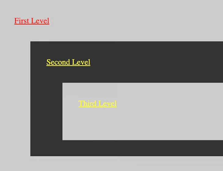
这里的问题是,根据已定义的 CSS, Third Level 应为红色文本,而不是黄色。这是 CSS 级联的副作用,因为页面样式是根据外观顺序来解释的,因此 Third Level 被认为是黄色而不是红色。通过 Bram.us 原文中的图表,可以看到 CSS 级联评估选择器和样式的顺序: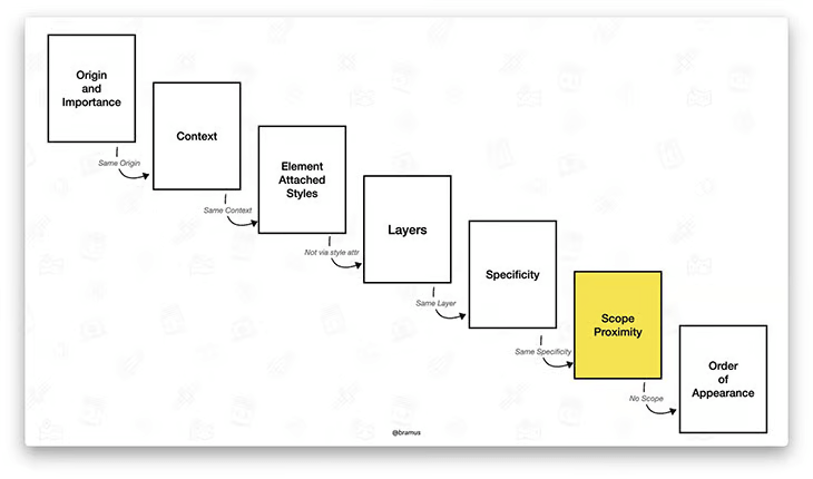
如果不使用 @scope ,CSS 级联将直接从 “特定性 “转为 “外观顺序”。使用 @scope 后,CSS 级联将首先考虑 @scope 元素。可以通过在示例中为 .light 和 .dark 样式添加 @scope 来了解其效果。
首先,将原始 HTML 和 CSS 修改如下:
<!DOCTYPE html><html><head><title>Plain HTML</title><style>.light {background: #ccc;}.dark {background: #333;}div {padding: 2rem;}div > div {margin: 0 0 0 2rem;}p {margin: 0 0 2rem 0;}@scope (.light) {:scope {background: white;}a {color: red;}}@scope (.dark) {:scope {background: black;}a {color: yellow;}}</style></head><body><div class="light"><p><a href="#">First Level</a></p><div class="dark"><p><a href="#">Second Level</a></p><div class="light"><p><a href="#">Third Level</a></p></div></div></div></body></html>
总结
在本文中,探讨了将 BEM 风格应用程序重构为使用 Chrome 浏览器中新推出的 @scope 功能的方法。介绍了 @scope 的工作原理,然后将一个简单的页面从 BEM 重构为 @scope 。
新的 @scope 功能有可能成为前端开发人员的一大优势。不过,其他浏览器也必须实现支持,这可能需要时间。在此之前,这绝对是一个有趣的功能,对前端项目的样式设计可能会有很大帮助。

若有收获,就点个赞吧
0 人点赞
