HTML CSS 液体填充效果
液体填充文字动画可以使用CSS | ::before选择器。使用关键帧设置动画每一帧的高度。最主要的是关键帧。对于上半部分的百分比,增加高度,而对于下半部分百分比,减小高度。使用25%作为高度的最小值。可以使用百分比值来更改,以根据需要更改动画的最小和最大高度以及外观。创建将在其中应用液体填充效果的文本。要创建结构,将需要标准的HTML。
HTML代码
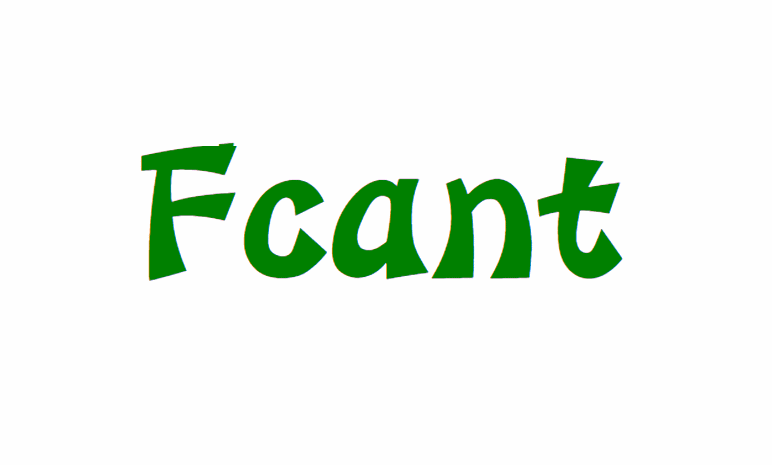
<!DOCTYPE html><html lang="en"><head><meta charset="UTF-8" /><meta name="viewport"content="width=device-width, initial-scale=1.0" /><title>用HTML和CSS在文本上如何创建液体填充动画效果</title></head><body><center><h1>Fcant</h1></center></body></html>
CSS代码
<style>body {margin: 0;padding: 0;}h1 {margin: 200px 0;padding: 0;font-size: 80px;position: relative;color:green;}h1:before {content: "Fcant";position: absolute;top: 0;left: 0;width: 100%;height: 100%;color:white;overflow: hidden;animation: animate 6s infinite;}@keyframes animate {0% {height: 25%;}25% {height: 50%;}50% {height: 65%;}75% {height: 40%;}100% {height: 25%;}}</style>
实现填充效果的完整代码
<!DOCTYPE html><html lang="en"><head><meta charset="UTF-8" /><meta name="viewport" content="width=device-width, initial-scale=1.0" /><title>用HTML和CSS在文本上如何创建液体填充动画效果?</title><style>body {margin: 0;padding: 0;}h1 {margin: 200px 0;padding: 0;font-size: 80px;position: relative;color:green;}h1:before {content: "Fcant";position: absolute;top: 0;left: 0;width: 100%;height: 100%;color:white;overflow: hidden;animation: animate 6s infinite;}@keyframes animate {0% {height: 25%;}25% {height: 50%;}50% {height: 65%;}75% {height: 40%;}100% {height: 25%;}}</style></head><body><center><h1>Fcant</h1></center></body></html>
实现的效果

若有收获,就点个赞吧
0 人点赞
