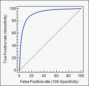
ROC (Receiver Operating Characteristics) curves: for visual comparison of probablistic classification models and selection of a decision threshold. Also for visually comparing tradeoffs in performance for alternative deterministic classifiers.
- Basic idea: a probabilistic classifier returns a probability of a tuple being in the positive class. What if we consider a probability threshold for positive classification being somewhere in the range [0,1] instead of using the simple 0.5 (majority vote for the class)? This is a way to recognise that the cost of errors (ie FP vs FN) may not be equal for each class.
- Shows the trade-off between the true positive rate (TPR) and the false positive rate (FPR)
- TPR ( = sensitivity) is the proportion of positive tuples that are correctly labelled by the model: TP/P
- FPR (= 1- specificity) is the proportion of negative tuples that are mislabelled as positive: FP/N
- A deterministic classifier (which assigns classes without probabilities) can be plotted as a single point on the ROC chart (the point is (FPR, TPR)).
- A probablistic classifer is plotted as a ROC curve on the chart (see below).
- TPR ( = sensitivity) is the proportion of positive tuples that are correctly labelled by the model: TP/P
- Use the ROC curve to choose a decision threshold for your probablistic classifier that reflects the tradeoff you need, ideally the probability corresponding to an inflexion point where the curve turns from vertical to horizontal, so that you are getting the benefit of near-maximal TPs with near-minimal FPs. Selection and use of the decision threshold at this point turns your probablistic classifier into a deterministic one plotted at that point.
- The area under a ROC curve (ROC-AUC) is often used to measure the performance of a probablistic model.
- The area under a ROC curve (ROC-AUC) can also be computed for a _deterministic _model as the area under the curve constructed by drawing a line from (0,0) to (FPR,TPR) and another from (FPR,TPR) to (1,1). By geometric analysis, it is easy to see that this equates to the average of sensitivity and specificity, i.e. (TP/P + TN/N) /2 .
- The diagonal line on the graph represents a model that randomly labels the tuples according to the distribution of labels in the data. This line has AUC of 0.5. A model better than random should appear above the diagonal. The closer a model is to random (i.e., the closer it’s ROC-AUC is to 0.5), the poorer is the model. A model falling below the diagonal line is worse than random (which is very, very poor, but hopefully you are building better models than that!).
- Many deterministic models with distinct (FPR, TPR) points on the graph share the same ROC-AUC, falling on an isometric line parallel to the AUC=0.5 diagonal. While these models have different performance on P and N examples, ROC-AUC alone does not distingush them. A visual study of the chart might be helpful.
- For a probablistic model, the ROC curve may cross the diagonal line for some probabilities; but it may still be a good model if the ROC-AUC is high.
- A ROC-AUC of 1 indicates a perfect classifier for which all the actual P tuples have a higher probability of being labelled P than all the actual N tuples. A ROC-AUC of 0 is the reverse situation: all the actual Ps are less likely to to be labelled P than all the actual Ns, denoting a worst case model.
- The ROC-AUC represents the proportion of randomly drawn pairs (one from each of the two classes) for which the model correctly classifies both tuples in the random pair. In contrast to accuracy or error rate, ROC-AUC allows for unbalanced datasets by counting the performance over the subsets T (on the
 axis) and N (on the
  axis) independently, valuing errors in each class of the dataset independently of the proportion of each class in the dataset as a whole.
 - Instead of probabilities generated by a probablistic classifier, the ROC can also be used to choose a cost or risk function to be used with a deterministic classifier.
- The ROC may be used together with cross-validation so it is not overly influenced by a particular training set.
Plotting ROC curve for a probablistic classifier
- ROC curve can be plotted with a probabilistic classifier (e.g. naive Bayes, some decision trees, neural nets)
- The vertical
 axis of an ROC curve represents TPR. The horizontal
  axis represents FPR.
- Rank the test tuples in decreasing order: the one that is most likely to belong to the positive class (highest probability) appears at the top of the list.
- Starting at the bottom left corner (where TPR = FPR = 0), we check the tuple’s actual class label at the top of the list. If we have a true positive (i.e., a positive tuple that was correctly classified), then true positive (TP) and thus TPR increase.
- On the graph, we move up and plot a point.
- If, instead, the model classifies a negative tuple as positive, we have a false positive (FP), and so both FP and FPR increase.
- On the graph, we move right and plot a point.
- This process is repeated for each of the test tuples in ranked order, each time moving up on the graph for a true positive or toward the right for a false positive.
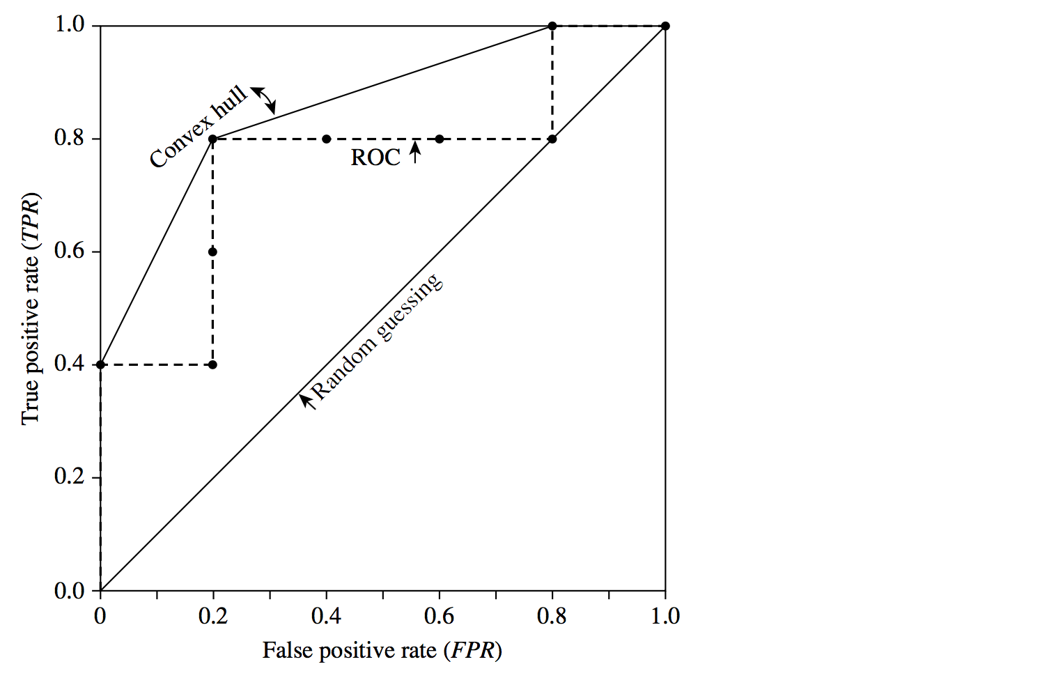
Example 1
The following table shows the probability value of being in the positive class that is returned by a probabilistic classifier (column 3), for each of the 10 tuples in a test set. Column 2 is the actual class label of the tuple. There are five positive tuples and five negative tuples, thus P = 5 and N = 5. As we examine the known class label of each tuple, we can determine the values of the remaining columns, TP, FP, TN, FN, TPR, and FPR. 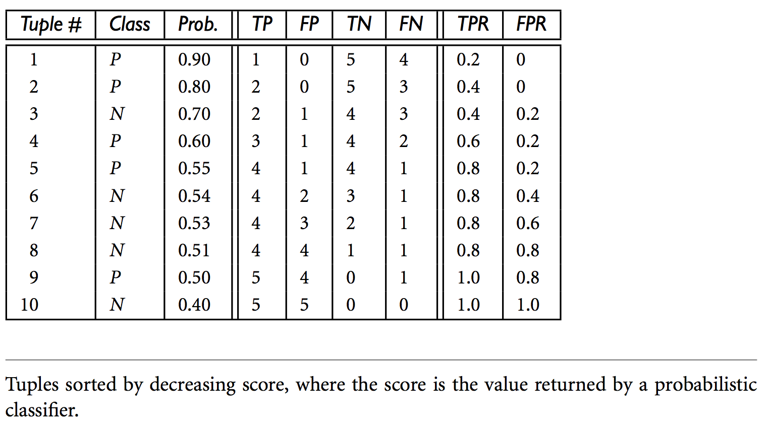
We start with tuple 1, which has the highest probability score and take that score as our threshold, that is, t = 0.9. Thus, the classifier considers tuple 1 to be positive, and all the other tuples are considered negative. Since the actual class label of tuple 1 is positive, we have a true positive, hence TP = 1 and FP = 0. Among the remaining nine tuples, which are all classified as negative, five actually are negative (thus, TN = 5). The remaining four are all actually positive, thus, FN = 4. We can therefore compute TPR = TP = 1 = 0.2, while FPR = 0. Thus, we have the point (0.2, 0) for the ROC curve.
Next, threshold t is set to 0.8, the probability value for tuple 2, so this tuple is now also considered positive, while tuples 3 through 10 are considered negative. The actual class label of tuple 2 is positive, thus now TP = 2. The rest of the row can easily be computed, resulting in the point (0.4, 0). Next, we examine the class label of tuple 3 and let t be 0.7, the probability value returned by the classifier for that tuple. Thus, tuple 3 is considered positive, yet its actual label is negative, and so it is a false positive. Thus, TP stays the same and FP increments so that FP = 1. The rest of the values in the row can also be easily computed, yielding the point (0.4,0.2). The resulting ROC graph, from examining each tuple, is the jagged line as follows. A convex hull curve is then fitted to the jagged line as shown.
Example 2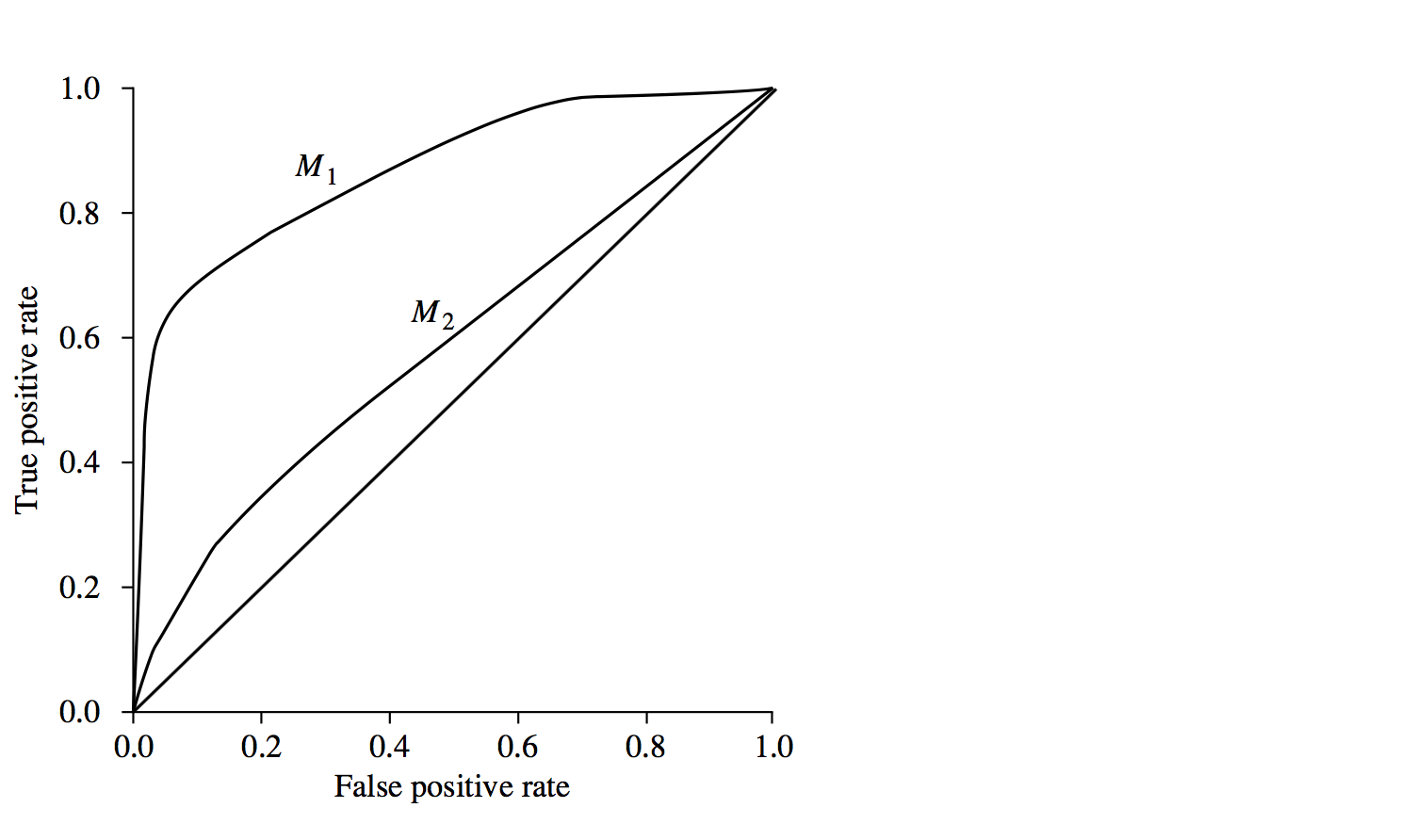
ROC curves of two probablistic classification models, M1 and M2. The diagonal shows where, for every true positive, we are equally likely to encounter a false positive. The closer a ROC curve is to the diagonal line, the less accurate the model is. Thus M1 is more accurate here. If the ROC curves for M1 and M2 cross over then varying the threshold selection will vary which is more accurate for binary classification.

若有收获,就点个赞吧
0 人点赞
