容器属性
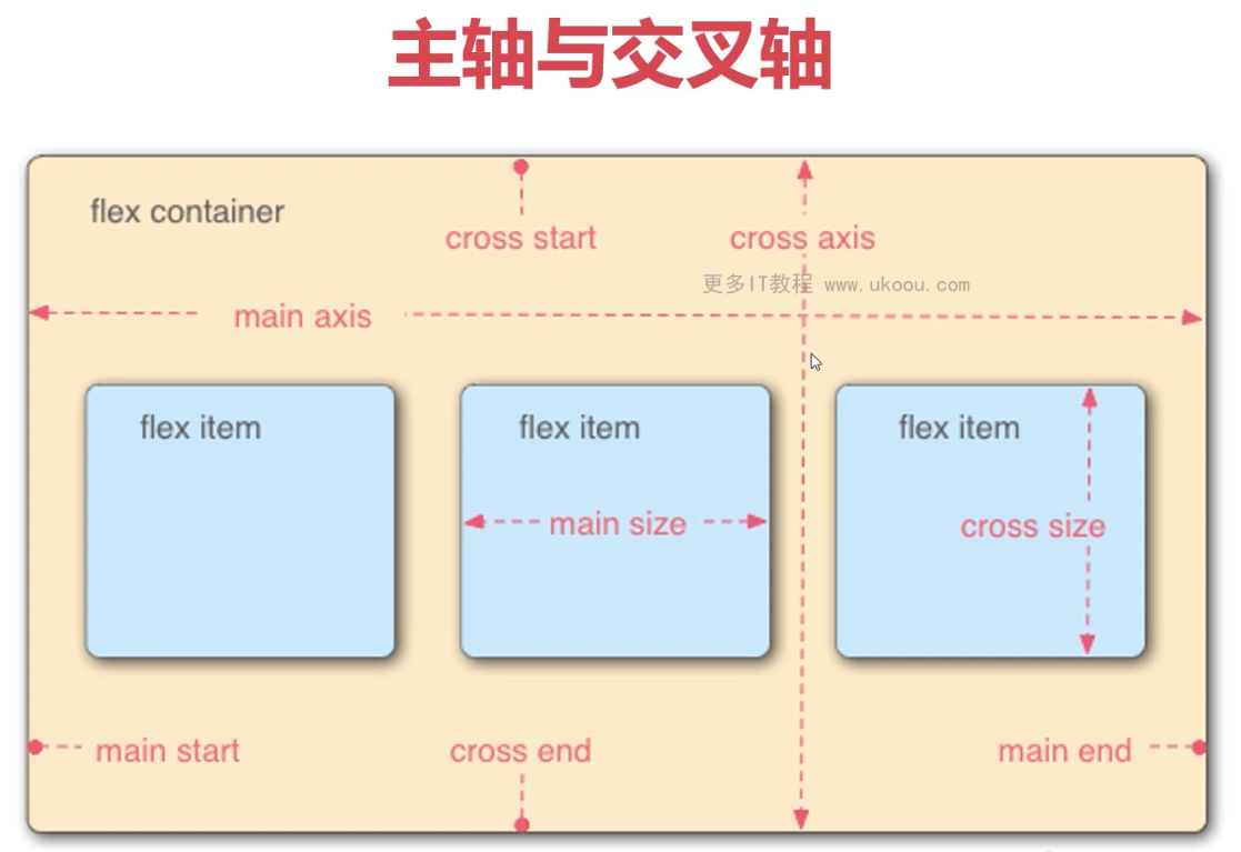
主轴和交叉轴
flex-direction
flex弹性盒子内分主轴和交叉轴,每个轴都有起点和终点
改变轴的方向
display: flex;
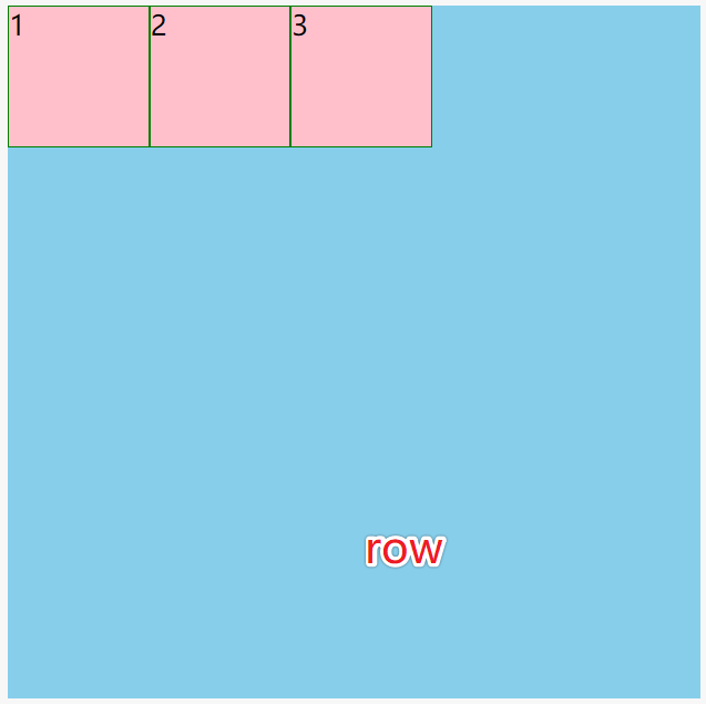
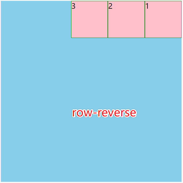
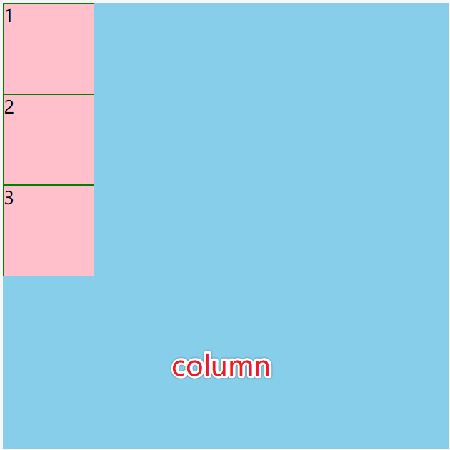
flex-direction:
- row
- row-reverse
- column
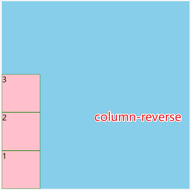
- column-reverse
换行和缩写
flex-wrap
盒子内的元素如果不写width和height, 则width由内容决定,height撑满(stretch)整个盒子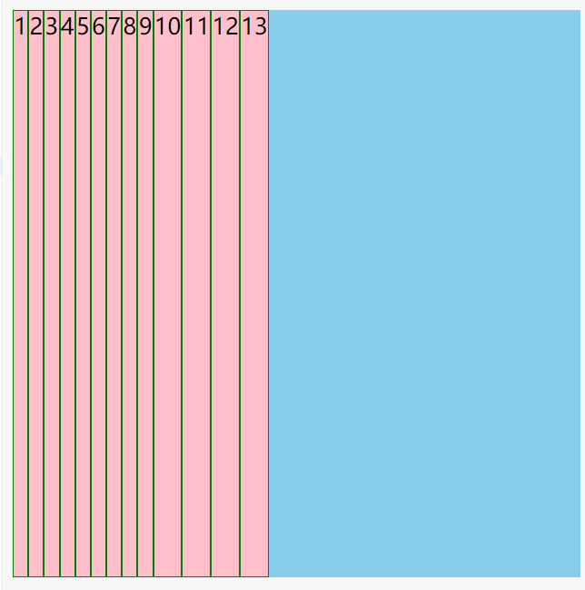
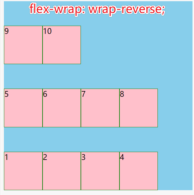
使用flex-wrap: wrap或flex-wrap: wrap-reverse换行
盒子会根据子元素的多少平居分成N等分,元素都排在每部分的最上面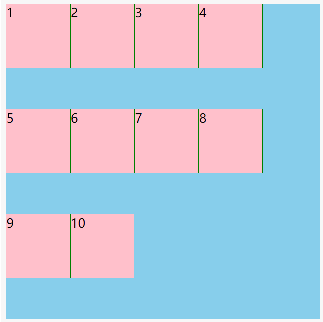
flex-flow
flex-flow是flex-direction和flex-wrap的缩写
flex-flow: column wrap;
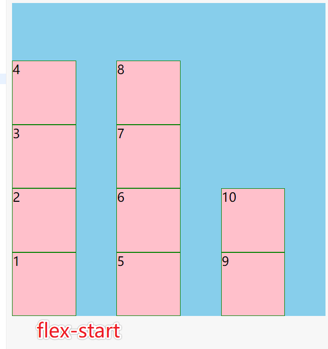
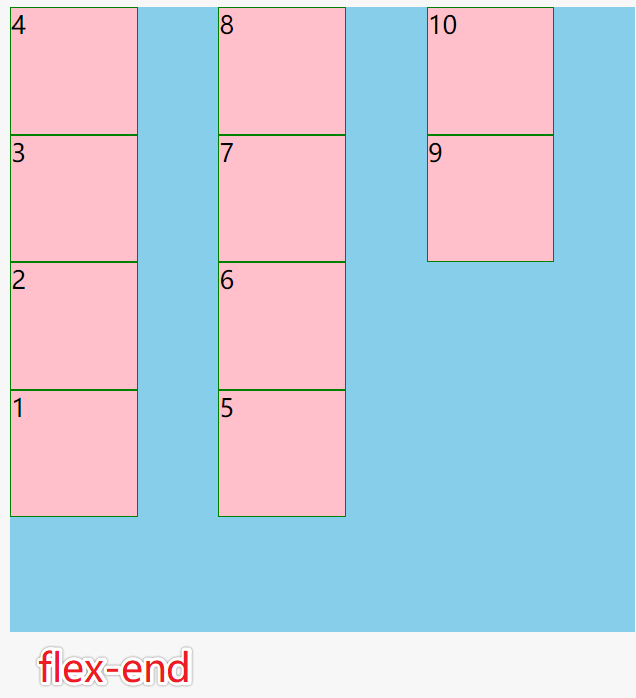
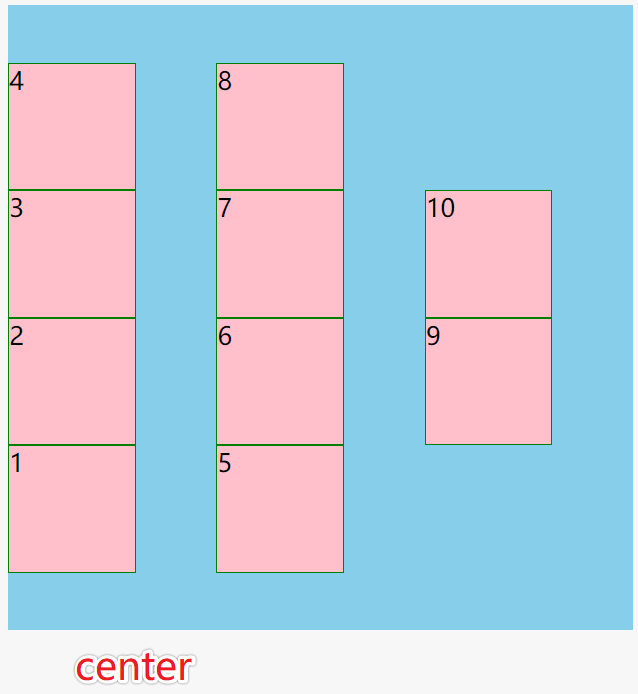
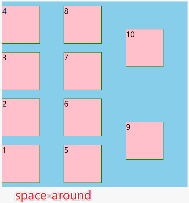
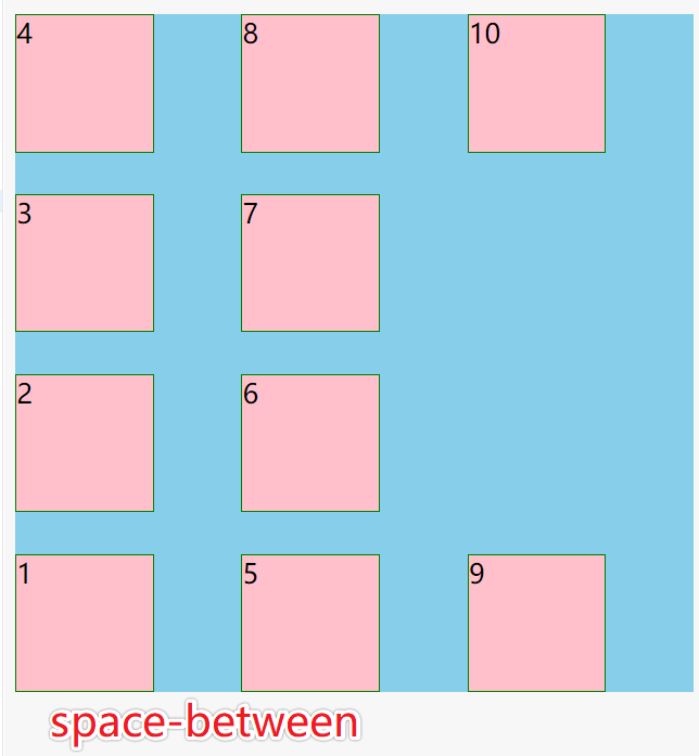
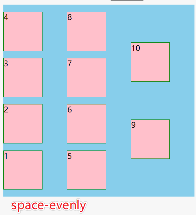
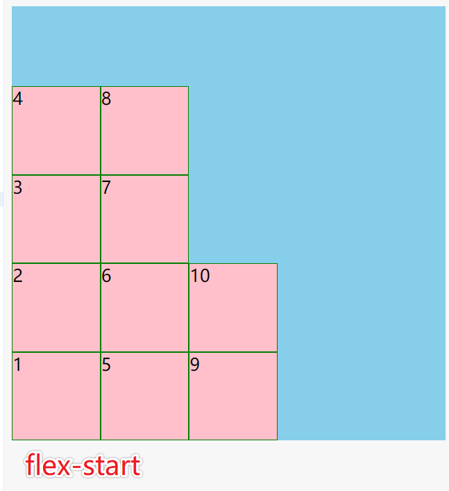
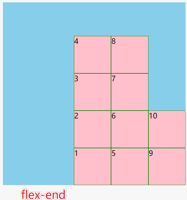
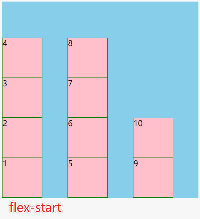
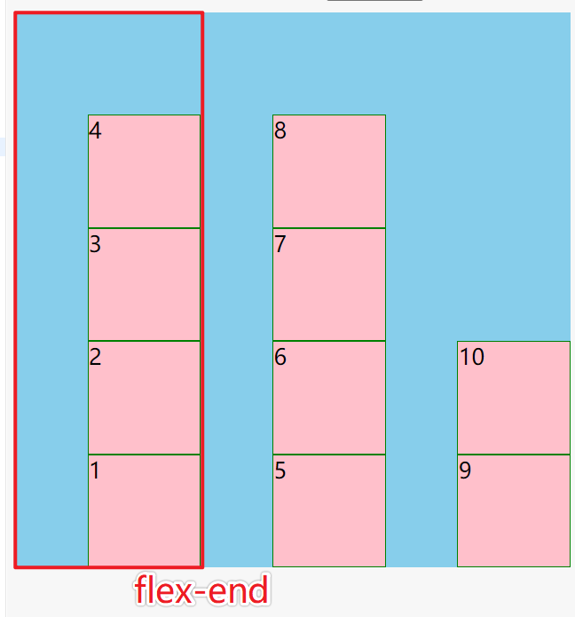
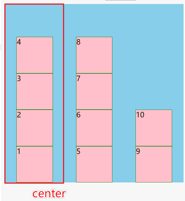
主轴对齐
justify-content
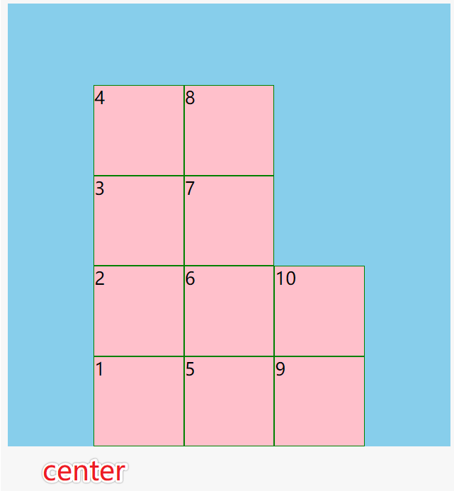
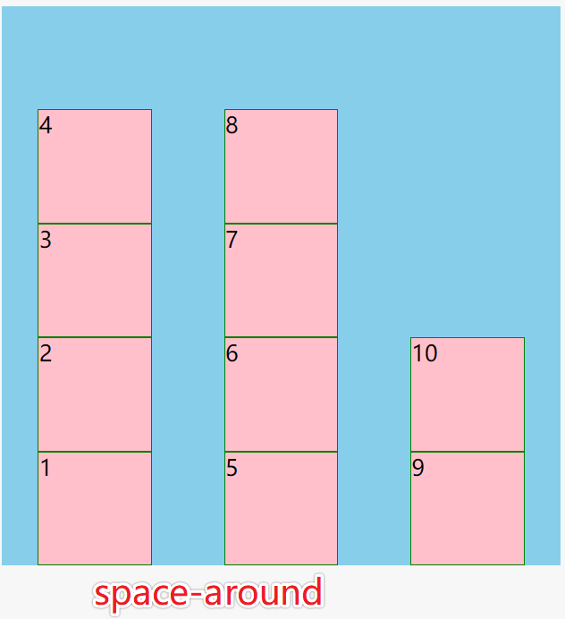
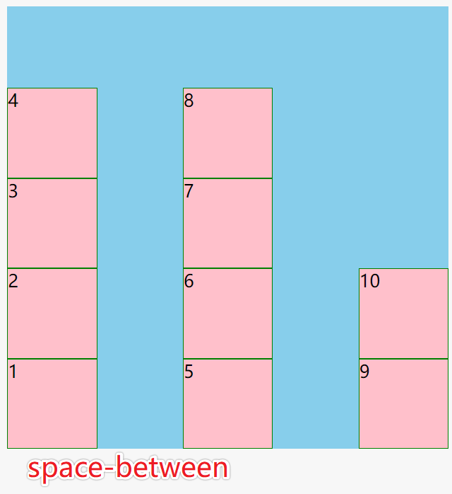
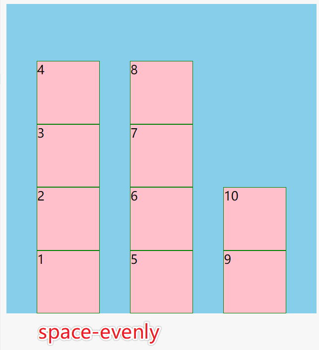
flex-start沿主轴start位置对齐flex-end沿主轴end位置对齐center沿主轴居中对齐space-around子元素两侧空间相等space-between子元素之间空间相等space-evenly空间平均分配display: flex;flex-wrap: wrap;flex-direction: column-reverse;
交叉轴对齐
align-content
align-content 交叉轴整体方向上的对齐,必须配合flex-wrap: wrap才能生效
stretch 默认值
- flex-start
- flex-end
- center
- space-around
- space-between
- space-evenly
注意:align-content 只对多行有效,单行无效
display: flex;flex-wrap: wrap;flex-direction: column-reverse;
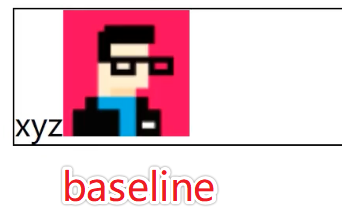
align-items
align-items指定交叉轴方向每一行内的对齐方式
如果交叉轴方向只有一行,那么align-items比align-content用的更多
- stretch 默认
- flex-start
- flex-end
- center 相当于align-content: space-around
- baseline 与小写字母x对齐
display: flex;flex-wrap: wrap;flex-direction: column-reverse;
应用
内联与块的上下左右居中布局
文字居中
line-height
单行文字可以用line-height.box {background: skyblue;width: 500px;height: 500px;line-height: 500px;text-align: center;}
display: table-cell;
多行文字.box {display: table-cell;vertical-align: middle;}
display: flex
.box {display: flex;align-items: center;}
块居中
方法1:
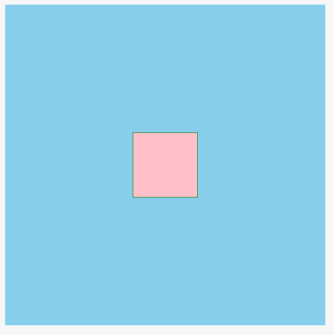
.box {display: flex;justify-content: center;align-items: center;}
方法2:display: flex; +margin: auto; 触发BFC
```css .box { display: flex; }
.child { margin: auto; }
<a name="bUY5C"></a>##### 方法3:```css.box {position: relative}.child {position: absolute;left: 0;right: 0;top: 0;bottom: 0;margin: auto;}
方法4:
.box {position: relative}.child {position: absolute;left: 50%;top: 50%;transform: translate(-50%, -50%)}
不定项居中布局
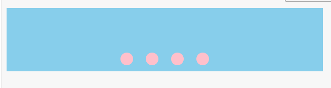
flex实现
<div class="box"><div class="child"></div><div class="child"></div><div class="child"></div><div class="child"></div></div>
.box {background: skyblue;width: 500px;height: 100px;display: flex;justify-content: center;align-items: flex-end;}.box > div {width: 20px;height: 20px;background: pink;border-radius: 50%;margin: 10px;}
传统方式实现
<div class="box"><section><div class="child"></div><div class="child"></div><div class="child"></div><div class="child"></div></section></div>
.box {background: skyblue;width: 500px;height: 100px;position: relative;}section {position: absolute;bottom: 0;text-align: center;width: 100%;}section > div {width: 20px;height: 20px;background: pink;border-radius: 50%;margin: 10px;display: inline-block;}
均分列布局
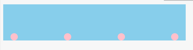
flex实现
<div class="box"><div class="child"></div><div class="child"></div><div class="child"></div><div class="child"></div></div>
.box {box-sizing: border-box;background: skyblue;height: 100px;display: flex;justify-content: space-between;align-items: flex-end;padding: 0 20px;}.box > div {width: 20px;height: 20px;border-radius: 50%;background: pink;}
float实现
用float时,父组件必须固定宽度,margin要计算出确定的值,可以看出用浮动要麻烦很多,还有局限性
<div class="box"><section><div class="child"></div><div class="child"></div><div class="child"></div><div class="child"></div></section></div>
* { box-sizing: border-box;}.box {background: skyblue;width: 320px;height: 100px;overflow: hidden;padding: 0 20px;position: relative;}section {width: 400px;position: absolute;bottom: 0;}section::after {content: '';display: block;clear: both;}section > div {width: 20px;height: 20px;border-radius: 50%;background: pink;float: left;margin-right: 65px;}
子项分组布局
使用margin:auto让margin自适应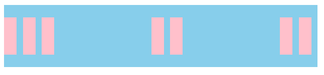
<div class="box"><div class="child"></div><div class="child"></div><div class="child"></div><div class="child"></div><div class="child"></div><div class="child"></div><div class="child"></div></div>
.box {background: skyblue;width: 500px;height: 100px;display: flex;align-items: center;}.box > div {width: 20px;height: 60px;background: pink;margin-right: 10px;}.child:nth-of-type(5) {margin-right: auto;}.child:nth-of-type(3) {margin-right: auto;}

若有收获,就点个赞吧
0 人点赞
