移动div
方案一
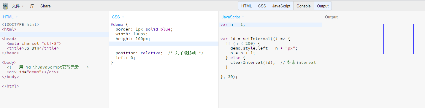
间隔函数:setInterval(函数,间隔时间)
箭头函数:()=>{ do something }
方案二
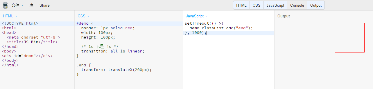
延时函数:setTimeout(函数,间隔时间)
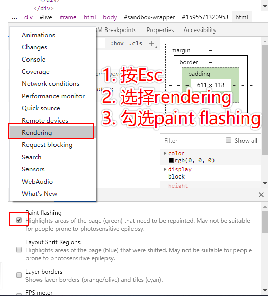
调出rendering(渲染)
浏览器渲染原理
渲染步骤
- 根据HTML构建HTML树(DOM)
- 根据CSS构建CSS树(CSSOM)
- 将两棵树合并成一颗渲染树(render tree)
- Layout布局(文档流、盒模型、计算大小和位置)
- Paint绘制(把边框颜色、文字颜色、阴影等画出来)
- Composite合成(根据层叠关系展示画面)
用JS更新样式
- div.style.background = ‘red’
- div.style.background = ‘none’
- div.classList.add(‘red’) // 推荐
- div.remove() // 删掉节点
三种渲染更新方式
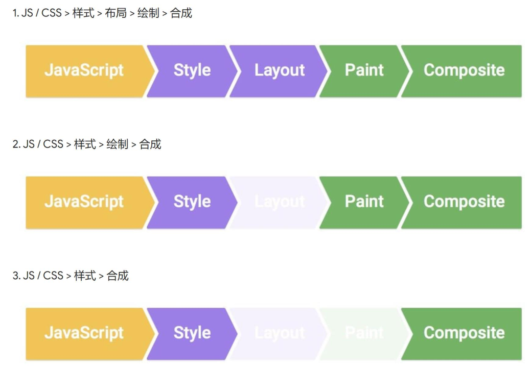
- div.remove()触发当前消失,其他元素relayout,全走
- 改变背景色,跳过layout
- 改变transform, 跳过layout和paint
CSS动画优化
- JS: 使用requestAnimationFram代替setTimeout或setInterval
- CSS: 使用will-change或translate
transform
translate 位移
transform: translateX(100px);transform: translateY(100px);transform: translateZ(100px);/* Z轴位移要配合父元素上加上perspective透视点 */.wrapper{perspective: 100px} /* 透视点在父元素中心距屏幕向内100px *//* 简写 */transform: translate(100px, 100px);transform: translate3d(100px, 100px, 100px); /* x, y, z *//* 也可用百分数,表示自身宽度/高度的百分比 */transform: translate(50%, 60%);
transform: translate(-50%, -50%)用于居中定位
#demo {border: 1px solid red;width: 100px;height: 100px;position: absolute;left: 50%;top: 50%;transform: translate(-50%, -50%)}.wrapper {border: 1px solid blue;height: 500px;position: relative;}
scale 缩放
transform: scale(1.2); /* 放大 */transform: scaleX(1.2);transform: scaleY(1.2);
rotate 旋转
transform: rotate(45deg); /* 默认绕Z轴 */transform: rotateX(45deg); /* 绕X轴 */transform: rotateY(45deg);
skew 变形
transform: skew(45deg);
综合使用
transform: translate(50%) skew(45deg) rotate(30deg);
制作红心
demo1: http://js.jirengu.com/nosic/2/edit?html,css,output
demo2: http://js.jirengu.com/namuh/5/edit?html,css,output
transition 过渡
transition CSS 属性是 transition-property,transition-duration,transition-timing-function 和 transition-delay 的一个简写属性。
transition: width 1s linear 100ms; /* linear 匀速 ease 先快后慢 */transition: all 1s;
display:none到block不能过渡
visibility:hidden; 到 visibility: visible; 可以
opacity透明度不推荐
animation
CSS animation 属性是 animation-name,animation-duration, animation-timing-function,animation-delay,animation-iteration-count,animation-direction,animation-fill-mode 和 animation-play-state 属性的一个简写属性形式。
step1:设置关键帧@keyframes
/* 方法一 */@keyframes xxx {0% {transform: scale(1.0);}100% {transform: scale(1.5);}}/* 方法二 */@keyframes xxx {from {transform: margin-left: -20%;}to {transform: margin-left: 100%;}}
step2: 添加animation
.className {animation: xxx 800ms infinite alternate forwards;}

若有收获,就点个赞吧
0 人点赞
