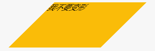
skew
div {width: 200px;height: 100px;background: #fabc08;margin-left: 100px;transform: skew(-45deg);}
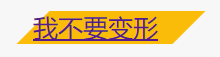
使用嵌套
<a href="#" class="button"><div>我不要变形</div></a>
对内容进行反向skew
.button {width: 100px;margin-left: 100px;background: #fabc08;display: block;transform: skew(-45deg);}.button > div {transform: skew(45deg);}
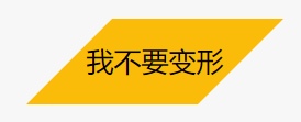
使用伪元素
div {width: 100px;height: 50px;margin-left: 100px;position: relative;line-height: 50px;text-align: center;}div::before {content: '';position: absolute;left: 0;top: 0;bottom: 0;right: 0; /* 变成和div一样大小 */background: #fabc08;z-index: -1;transform: skew(-45deg)}
菱形
把正方形skew,再rotate就得到菱形了

若有收获,就点个赞吧
0 人点赞
