比定位更方便的叠加布局
通过设置grid-area,使各子项在同一个网格,以达到叠加效果
.box {display: grid;width: 500px;height: 300px;}img {grid-area: 1/1/1/1;}span {grid-area: 1/1/1/1;justify-self: end;align-self: start;background: greenyellow;margin-top: 20px;}p {margin: 0;padding: 0 20px 0 0;align-self: end;grid-area: 1/1/1/1;background: rgba(0,0,0,.5);color: white;}
多重组合布局
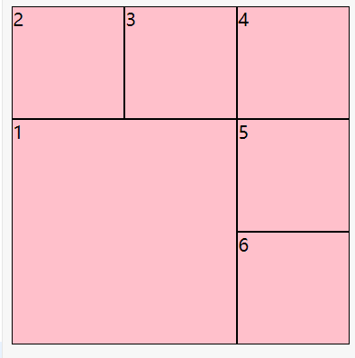
设置最大子项的grid-area, 其他子项自动重排
.box {background: skyblue;width: 300px;height: 300px;display: grid;grid-template-columns: repeat(auto-fill, 100px);grid-template-rows: repeat(auto-fill, 100px);}div:nth-of-type(1) {grid-area: 2/1/span 2/span 2;}.box > div {background: pink;border: 1px solid;}
栅格布局
将一行平均分成12份
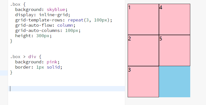
grid-area设置auto使子项自适应排列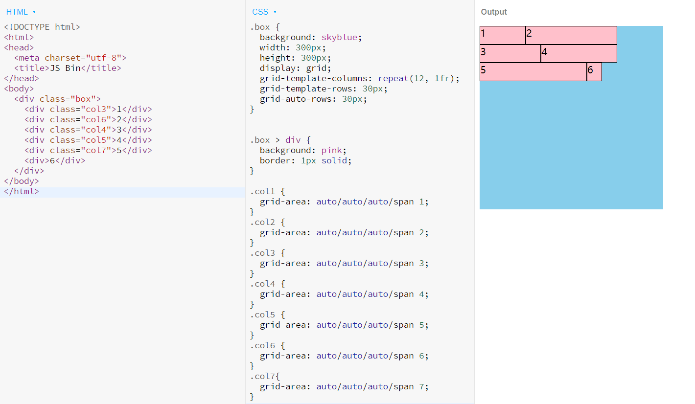
容器自适应行列布局
百度热词风云榜
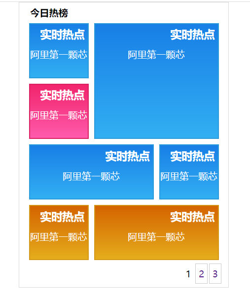
<!DOCTYPE html><html lang="en"><head><meta charset="UTF-8"><meta http-equiv="X-UA-Compatible" content="IE=edge"><meta name="viewport" content="width=device-width, initial-scale=1.0"><title>百度热榜</title><link rel="stylesheet" href="../reset.css"><style>* {margin:0;padding: 0;box-sizing: border-box;}.top {width: 310px;border: 1px #dadadc solid;margin: 0 auto;font-size: 14px;}.title {height: 30px;line-height: 30px;font-weight: bold;margin-left: 16px;}.list {height: 350px;margin: 0 14px;display: grid;grid-template-columns: repeat(3, 1fr);grid-template-rows: repeat(4, 1fr);grid-template-areas:"a1 a2 a2""a3 a2 a2""a4 a4 a5""a6 a7 a7";gap: 8px 8px;}.list div:nth-of-type(1) {grid-area: a1;}.list div:nth-of-type(2) {grid-area: a2;}.list div:nth-of-type(3) {grid-area: a3;}.list div:nth-of-type(4) {grid-area: a4;}.list div:nth-of-type(5) {grid-area: a5;}.list div:nth-of-type(6) {grid-area: a6;}.list div:nth-of-type(7) {grid-area: a7;}.theme1 {background-image: linear-gradient(#187fe6, #32aff2);border: 2px solid #299bda;}.theme2 {background-image: linear-gradient(#f2246c, #fe5bac);border: 2px solid #dc1f61;}.theme3 {background-image: linear-gradient(#d46300, #e5ad1c);border: 2px solid #d39818;}.page {height: 40px;padding-right: 10px;display: flex;justify-content: flex-end;align-items: center;}.page span {padding: 4px;}.page a {text-decoration: none;display: block;border: 1px solid #cccccc;padding: 5px 4px;margin-left: 2px;}.list a {text-decoration: none;display: block;color: white;width: 100%;height: 100%;line-height: 30px;}.list a > h3 {margin-right: 4px;text-align: right;}.list a > p {text-align: center;}</style></head><body><div class="top"><div class="title">今日热榜</div><div class="list"><div class="theme1"><a href="#"><h3>实时热点</h3><p>阿里第一颗芯</p></a></div><div class="theme1"><a href="#"><h3>实时热点</h3><p>阿里第一颗芯</p></a></div><div class="theme2"><a href="#"><h3>实时热点</h3><p>阿里第一颗芯</p></a></div><div class="theme1"><a href="#"><h3>实时热点</h3><p>阿里第一颗芯</p></a></div><div class="theme1"><a href="#"><h3>实时热点</h3><p>阿里第一颗芯</p></a></div><div class="theme3"><a href="#"><h3>实时热点</h3><p>阿里第一颗芯</p></a></div><div class="theme3"><a href="#"><h3>实时热点</h3><p>阿里第一颗芯</p></a></div></div><div class="page"><span>1</span><a href="#">2</a><a href="#">3</a></div></div></body></html>
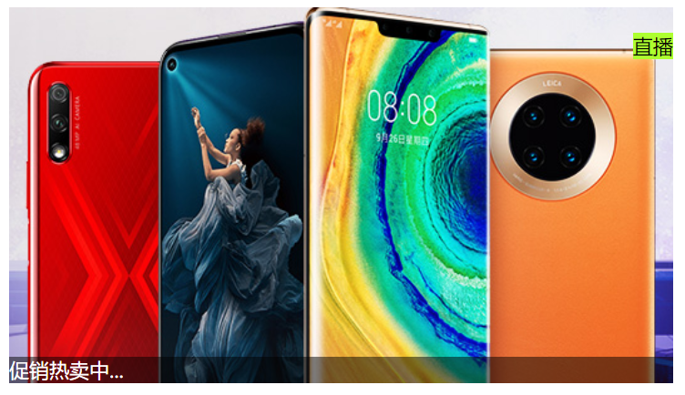
小米商品导航菜单
右边的弹出面板使用绝对定位
.panel {display: none;position: absolute;height: 460px;background: white;left: 100%;top: 0;border: 1px solid #e0e0e0;padding: 0 26px;color: black;grid-template-columns: 305px;grid-template-rows: repeat(6, 1fr);grid-auto-flow: column;grid-auto-columns: 305px;justify-items: start;}
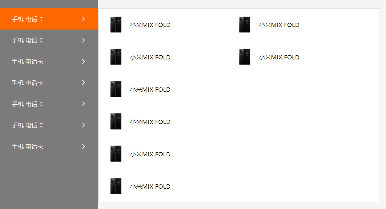
<!DOCTYPE html><html lang="en"><head><meta charset="UTF-8" /><meta http-equiv="X-UA-Compatible" content="IE=edge" /><meta name="viewport" content="width=device-width, initial-scale=1.0" /><title>小米导航</title><linkrel="stylesheet"href="//at.alicdn.com/t/font_2941503_ny0b8aku22.css"/><style>* {margin: 0;padding: 0;box-sizing: border-box;}a {text-decoration: none;color: inherit;}ul {list-style: none;}.mall {height: 100vh;background: #f5f5f5;}.sidebar {width: 233px;background: #7b7b7b;height: 100%;color: white;padding-top: 20px;}.sidebar > li {display: flex;justify-content: space-between;align-items: center;padding: 16px 28px;position: relative;font-size: 14px;}.panel {display: none;position: absolute;height: 460px;background: white;left: 100%;top: 0;border: 1px solid #e0e0e0;padding: 0 26px;color: black;grid-template-columns: 305px;grid-template-rows: repeat(6, 1fr);grid-auto-flow: column;grid-auto-columns: 305px;justify-items: start;}.panel > li {display: flex;justify-content: center;align-items: center;cursor: auto;}.panel span {margin-left: 20px;}.sidebar > li:hover .panel {display: grid;}.sidebar > li:hover {background: #ff6801;cursor: pointer;}</style></head><body><div class="mall"><ul class="sidebar"><li><div class="items"><a href="#">手机</a><a href="#">电话卡</a></div><i class="iconfont icon-youjiantou1"></i><ul class="panel"><li><img src="./phone.png" alt="" /><span>小米MIX FOLD</span></li><li><img src="./phone.png" alt="" /><span>小米MIX FOLD</span></li><li><img src="./phone.png" alt="" /><span>小米MIX FOLD</span></li><li><img src="./phone.png" alt="" /><span>小米MIX FOLD</span></li><li><img src="./phone.png" alt="" /><span>小米MIX FOLD</span></li><li><img src="./phone.png" alt="" /><span>小米MIX FOLD</span></li><li><img src="./phone.png" alt="" /><span>小米MIX FOLD</span></li><li><img src="./phone.png" alt="" /><span>小米MIX FOLD</span></li></ul></li><li><div class="items"><a href="#">手机</a><a href="#">电话卡</a></div><i class="iconfont icon-youjiantou1"></i><ul class="panel"><li><img src="./phone.png" alt="" /><span>小米MIX FOLD</span></li><li><img src="./phone.png" alt="" /><span>小米MIX FOLD</span></li><li><img src="./phone.png" alt="" /><span>小米MIX FOLD</span></li><li><img src="./phone.png" alt="" /><span>小米MIX FOLD</span></li><li><img src="./phone.png" alt="" /><span>小米MIX FOLD</span></li><li><img src="./phone.png" alt="" /><span>小米MIX FOLD</span></li><li><img src="./phone.png" alt="" /><span>小米MIX FOLD</span></li><li><img src="./phone.png" alt="" /><span>小米MIX FOLD</span></li><li><img src="./phone.png" alt="" /><span>小米MIX FOLD</span></li><li><img src="./phone.png" alt="" /><span>小米MIX FOLD</span></li><li><img src="./phone.png" alt="" /><span>小米MIX FOLD</span></li><li><img src="./phone.png" alt="" /><span>小米MIX FOLD</span></li><li><img src="./phone.png" alt="" /><span>小米MIX FOLD</span></li></ul></li><li><div class="items"><a href="#">手机</a><a href="#">电话卡</a></div><i class="iconfont icon-youjiantou1"></i></li><li><div class="items"><a href="#">手机</a><a href="#">电话卡</a></div><i class="iconfont icon-youjiantou1"></i></li><li><div class="items"><a href="#">手机</a><a href="#">电话卡</a></div><i class="iconfont icon-youjiantou1"></i></li><li><div class="items"><a href="#">手机</a><a href="#">电话卡</a></div><i class="iconfont icon-youjiantou1"></i></li><li><div class="items"><a href="#">手机</a><a href="#">电话卡</a></div><i class="iconfont icon-youjiantou1"></i></li></ul></div></body></html>
练习题
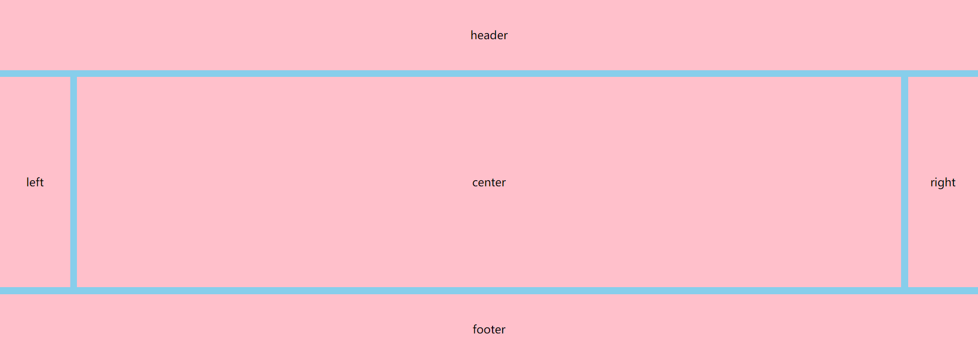
<!DOCTYPE html><html lang="en"><head><meta charset="UTF-8"><meta http-equiv="X-UA-Compatible" content="IE=edge"><meta name="viewport" content="width=device-width, initial-scale=1.0"><title>练习题</title><style>* {margin: 0;}.main {display: grid;grid-template-columns: 100px 1fr 100px;grid-template-rows: 100px 300px 100px;gap: 10px 10px;background: skyblue;}.main > div {background: pink;display: flex;align-items: center;justify-content: center;}div:nth-of-type(1) {grid-area: 1/1/2/4;}div:nth-of-type(5) {grid-area: 3/1/4/4;}</style></head><body><div class="main"><div>header</div><div>left</div><div>center</div><div>right</div><div>footer</div></div></body></html>

若有收获,就点个赞吧
0 人点赞
