box-shadow
box-shadow: 0 1px 5px 3px gray /* x轴偏移 y轴偏移 blur模糊半径 spread扩散半径 颜色 *//* spread参数直接扩展阴影的边缘,然后blur再以这个新边缘为标准进行前面介绍的模糊效果 */
text-shadow
text-shadow: 0 -1px 1px #335166 /* x y blur color */
line-height
line-height: 1.5 /* 字体倍数(推荐) */line-height: 32pxline-height: 32% /* 乘以字体大小 */
Gradients
gradients are background-image
参考:https://css-tricks.com/css3-gradients/
工具:https://cssgradient.io/
.gradient {/* can be treated like a fallback */background-color: red;/* will be "on top", if browser supports it */background-image: linear-gradient(red, orange);/* 合并 */background: red linear-gradient(red, orange);}
linear-gradient
background-image: linear-gradient(red, #f06d06); /* 默认从上到下 */background: linear-gradient(to right, red, blue) /* 用to指定方向 从左到右 */background: linear-gradient(to right top, red, blue)background: linear-gradient(45deg, red, blue) /* 角度 0度是从下到上,顺时针增加*/background: linear-gradient(to right, #f06d06, rgb(255, 255, 0), green) /* 多个颜色 */background-image:linear-gradient(to right,red,yellow 10% /* 指定停止渐变 */);
HSLA v.s. RGBA
HSLA
H 0-360 颜色 0/360 red, 120 green, 240 blueS 0%-100% 灰度L 0%-100% 亮度A 0-1 透明度background-color: hsla(170, 50%, 45%, 1);
RGBA
RGB 0-255A 0-1background-color: rgba(30, 0, 255, 1);
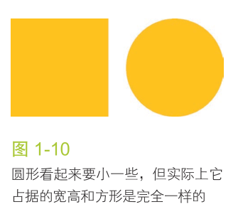
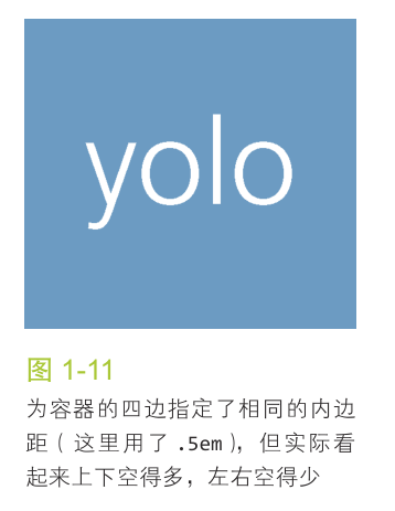
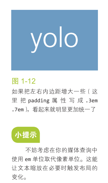
相信你的眼睛,而不是数字

tips
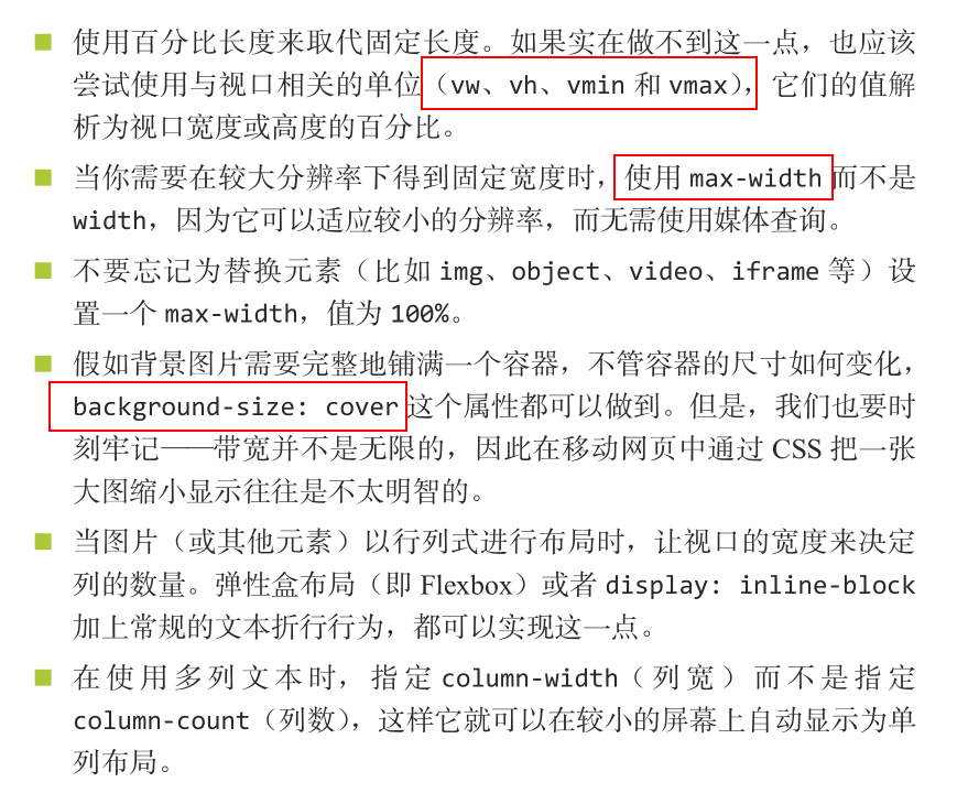
background-size
background-size: cover; /* 覆盖背景区 */background-size: contain; /* 包含于背景区 */background-size: 25px 50px; /* width height */
background: url(tr.png) top right, /* url position */url(br.png) bottom right,url(bl.png) bottom left;background-size: 2em 2em;background-repeat: no-repeat;

若有收获,就点个赞吧
0 人点赞
