transition VS animation
transition 是指从一种状态到另一种状态(A 到 B)的变化,通常是由某种“动作”触发,比如鼠标悬停,或者用 JavaScript 添加或删除样式类。
animation 更加复杂一些,它允许你按照实际需求添加很多的 keyframes 来创建动画。它可以自动触发,并且可以循环。
transition
button悬浮变形
button {transition-property: all;transition-duration: 0.4s;transition-timing-function: ease-out;}
这里有一点要注意,transition 属性的位置要放到 button 中。这样会告诉浏览器,不光按钮从初始状态变成悬停(hover)的时候要添加过渡效果,当从悬停状态变回初始状态时也要添加过渡效果。
如果我们把 transition: background 0.5s linear; 这句放到下面 button:hover 里,那么当按钮从初始状态变成悬停状态时会有过渡效果,但当从悬停变回初始状态时,就立刻改变了 background,而没有过渡的效果。
简写
transition: all 0.5s 1s linear;
transition 的简写形式对应各属性含义如下:
transition: [property] [duration] [delay] [timing-function];
transition-delay 表示过渡效果的延迟时间(效果开始前的等待时间)
timing-function
时间函数(timing function)是用来描述过渡过程中,属性值变化速度的。linear 表示属性值按照一个固定的速度线性的变化;ease-in 表示属性值先以较慢速度变化,然后速度越来越快;ease-out 刚好跟 ease-in 相反,一开始速度快,然后速度越来越慢。ease-in-out 是上面两个的合成,一开始慢,然后变快,然后又变慢。
贝塞尔曲线
上面所讲的时间函数本质上都是贝塞尔曲线。利用 cubic-bezier 我们可以自定义具体的变化曲线。cubic-bezier 有4个参数,代表两个控制点的坐标。把控制点坐标设置大于1,看看会有啥效果。
transition-timing-function: cubic-bezier(1,-0.49,.13,1.09);
在线工具:cubic-bezier.com
steps
steps() 定义了一个以等距步长划分值域的步长函数。这个阶跃函数的子类有时也称为阶梯函数。
语法:steps(number_of_steps, direction)
where :
number_of_steps 是整数,代表划分的步数
direction 代表左连续还是右连续,默认是end:
start代表在动画开始时,我们需要立即开始第一段的动画。end代表改变不应该在最开始的时候发生,而是发生在每一段的最后时刻。
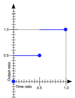 steps(2, start)
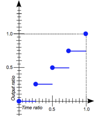 steps(4, end)
示例:https://codepen.io/donovanh/pen/dYqxNb
hover父元素,设置子元素样式
.card:hover .info {height: 12em;}.card:hover .info p {opacity: 1;transform: translateY(0);}
在一个元素上使用多个translation
用逗号分隔
transition: background 1s ease-out, border 0.5s linear;
animation
简写
animation: change-background 4s linear infinite;
分开写
animation-name: change-background;animation-duration: 4s;animation-timing-function: linear;animation-repeat: infinite;
属性
amimation-delay表示动画开始的等待时间,如果值为-1s,则直接从1s开始执行animation-direction表示动画方向,值有normal,reverse,alternate,alternate-reverseanimation-duration表示完成一个周期需要的时间animation-fill-mode定义元素在动画结束或开始前的状态。使用forwards表示当动画完成后,元素属性保持最后一个关键帧的值。使用backwards表示动画完成后,元素属性变成第一帧(这个第一帧不是关键帧的第一帧)的值。(用了infinite时,该属性无效)animation-iteration-count这是动画播放的次数。默认情况下,它将播放一次。也可以指定一个数字,或指定 “infinite” 以使其永久循环。animation-namekeyframes的名字animation-play-state如果您需要暂停或恢复动画,则可以使用此属性执行操作。值为running或paused,默认为running。animation-timing-function此属性与 transitions 中定时函数属性的值相同,但略有不同。在transition里时间函数(例如ease-out)是作用于整个 transition,但animation里是作用于关键帧之间。
我们通常会将动画的计时功能定义为 linear,然后在每个关键帧上控制速度:
@keyframes my-animation {0%{...animation-timing-function: linear;}50%{...animation-timing-function: ease-out;}}
在这种情况下,动画的前半部分将是线性的,而后半部分将使用 ease-out 计时功能。
示例
给animation设置ease-out作为默认, keyframes里设置其他timing-function会覆盖默认值
.box {/* 中间省略 */animation: up 5s ease-out infinite;}@keyframes tilt {0%{transform: none;animation-timing-function: cubic-bezier(.57,-0.5,.43,1.53);}6%,10% {transform: rotate(-45deg);}/* 0% 到 6% timing-function为 cubic-bezier(.57,-0.5,.43,1.53) *//* 中间省略, timing-function为ease-out*/25% {transform: rotate(-42deg);animation-timing-function: cubic-bezier(.57,-0.5,.43,1.53);}35%, 100% {transform: none;}/* 25% 到 30% timing-function为 cubic-bezier(.57,-0.5,.43,1.53) */
用from/to只有2个状态,0%到100%
@keyframes name {from {...}to {...}}
逗号分隔,暂停效果
@keyframes name {0%, 20% {opacity: 0;}100% {opacity: 1;}}
可以忽略0%关键帧,浏览器会使用元素默认的样式
@keyframes name {100% {opacity: 0;}}
perspective和transform-style
.starwars-demo {perspective: 800px;transform-style: preserve3d;}
这两个属性告诉浏览器指定子元素定位在三维空间内,而不是平面。
calc()
为避免transform和animation冲突,居中对齐时使用calc,或者手动计算出位移
+/-两边必须有空格
.ripple {width: 100px;height: 100px;background: white;border-radius: 50%;position: absolute;left: calc(50% - 50px);top: calc(50% - 50px);animation: centre 2s ease-out infinite;}

若有收获,就点个赞吧
0 人点赞
