弧形渐变背景
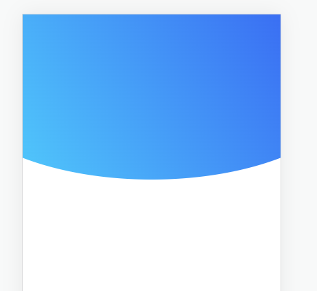
<div class="blue-bg"></div>
.blue-bg {height: 240px;background-image: linear-gradient(239deg, #3A6FF3 0%, #50C7FB 100%);clip-path: ellipse(80% 60% at 50% 40%);}
clip-path影响z-index
当我把下方的元素通过负margin往上移动,发现被上面的元素遮住了,设置了z-index也不起作用,
这是因为上面的元素使用了clip-path, 要使下面的元素 z-index 生效, 需要在 css 中加上 position
参考
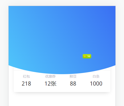
.blue-bg {height: 240px;background-image: linear-gradient(239deg, #3A6FF3 0%, #50C7FB 100%);clip-path: ellipse(80% 60% at 50% 40%);}.info {margin: -140px 18px 0;background: white;border-radius: 4px;box-shadow: 0px 6px 15px -6px rgba(0,0,0, .2);padding-top: 59px;z-index: 10;position: relative;}
圆形头像
img 可以设置 border-radius
如果图片不是正方形,设置方形会变形,设置 object-fit: cover; 让图片等比缩放,设置 object-position: center;让图片居中对齐
参考
> img {display: block;width: 94px;height: 94px;object-fit: cover;object-position: center;border-radius: 50%;position: absolute;top: 0;left: 50%;transform: translate(-50%, -50%)}
在 vue 中本地图片需要用 require 引入, 文档
单边阴影
原理: 将模糊半径设置为负值,阴影就会往内缩,再设置 x 轴或 y 轴偏移即可在指定方向显示阴影
.info {box-shadow: 0px 3px 15px -6px rgba(0,0,0, .2);}

若有收获,就点个赞吧
0 人点赞
