环形图
具体实现看代码中的注释
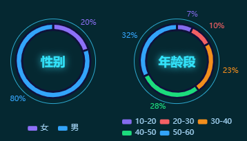
import React, { useEffect, useRef } from 'react'import * as echarts from 'echarts'import { createEchartsOptions } from '../shared/create-echart-options'import { px } from '../shared/px'export const Chart7 = () => {const divRef = useRef(null)useEffect(() => {console.log(divRef.current)var myChart = echarts.init(divRef.current)const color = ['#8D70F8', '#33A4FA']myChart.setOption(createEchartsOptions({color: color,xAxis: { show: false },yAxis: { show: false },legend: {bottom: px(10),itemWidth: px(20),itemHeight: px(10),itemGap: px(20),textStyle: {fontSize: px(16),lineHeight: px(16),color: '#a1d1f1',},},series: [{name: '访问来源',type: 'pie',radius: ['50%', '60%'],center: ['50%', '45%'], // 设置图例的位置avoidLabelOverlap: false,labelLine: { show: false },label: {distanceToLabelLine: -px(20), // label距离引导线的距离show: true,position: 'outside',textStyle: { color: '#a1d1f1', fontSize: px(16) },formatter(options) {return options.value * 100 + '%'},},itemStyle: {borderColor: '#0F113A',borderWidth: px(4),},data: [{ value: 0.2, name: '女' },{ value: 0.8, name: '男' },].map((item, index) => {return { ...item, label: { color: color[index] } } // 设置label的颜色}),},],}))}, [])return (<div className="年龄段-图1"><div className="chart"><div className="main" ref={divRef} /><div className="text">性别</div></div></div>)}
自定义环形图
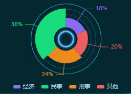
option = {color: color,xAxis: { show: false },yAxis: { show: false },legend: {bottom: px(4),itemWidth: px(20),itemHeight: px(10),itemGap: px(20),textStyle: {fontSize: px(16),lineHeight: px(16),color: '#a1d1f1',},data: ['经济','民事', '刑事', '其他']},series: [{name: '访问来源',type: 'pie',radius: ['25%', '65%'],// 图例位置center: ['50%', '42%'],avoidLabelOverlap: false,labelLine: {show: true,length: px(15) // 设置指示线的长度},label: {show: true,position: 'outside',textStyle: { color: '#a1d1f1', fontSize: px(16) },formatter(options) {return options.value * 100 + '%'},},itemStyle: {shadowBlur: 200,shadowColor: 'rgba(0, 0, 0, 0.5)'},data: [{ value: 0.24, name: '刑事' },{ value: 0.36, name: '民事' },{value: 0.18, name: '经济'},{value: 0.20, name: '其他'}].sort((a, b) => a.value - b.value).map((item, index) => {return { ...item, label: { color: color[index] } }}),roseType: 'radius', // 半径按数值大小成锯齿状},],}
饼图
饼图和环形图的区别是饼图的 radius 只有一个值, 环形图的 radius 有2个值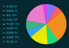
import React, { useEffect, useRef } from 'react'import * as echarts from 'echarts'import { createEchartsOptions } from '../shared/create-echart-options'import { px } from '../shared/px'export const Chart12 = () => {const divRef = useRef(null)useEffect(() => {const data = [{ value: 0.08, name: '东岗路' },{ value: 0.06, name: '段家滩' },{ value: 0.26, name: '雁北' },{ value: 0.09, name: '五泉山' },{ value: 0.15, name: '中山路' },{ value: 0.06, name: '庆阳路' },{ value: 0.08, name: '武都路' },{ value: 0.19, name: '酒泉路' },{ value: 0.03, name: '天水路' },]var myChart = echarts.init(divRef.current)const color = ['#8d70f8','#f46064','#f38e1c','#1adc7d','#e8e800','#34a3f9','#40b27d','#ea7ccc','#ff33ef',]myChart.setOption(createEchartsOptions({color: color,xAxis: { show: false },yAxis: { show: false },grid: { x: 0, x2: 0, y: 0, y2: 0, containLabel: true },legend: {orient: 'vertical',left: px(20),top: 'center',icon: 'line', // 形状itemWidth: px(10),itemGap: px(10),textStyle: {fontSize: px(12),lineHeight: px(12),color: '#6ca8ed',},formatter(name) {const value =data.filter((i) => i.name === name)[0]?.value * 100 + '%'return name + ' ' + value},},series: [{name: '访问来源',type: 'pie',radius: '75%',// 图例位置center: ['60%', '50%'],avoidLabelOverlap: false,labelLine: {show: false,},label: {show: false,},data: data.map((item, index) => {return { ...item, label: { color: color[index] } }}),},],}))}, [])return <div className="chart" ref={divRef} />}

若有收获,就点个赞吧
0 人点赞
