容器属性
grid-template-columns/rows
用来指定列和行的尺寸
可用的数值: 100px 20% 0.3fr auto
fr代表fraction,和flex-grow类似,当数值之和小于1时,按数值分配剩余空间,数值之和大于1时,按比例分配剩余空间
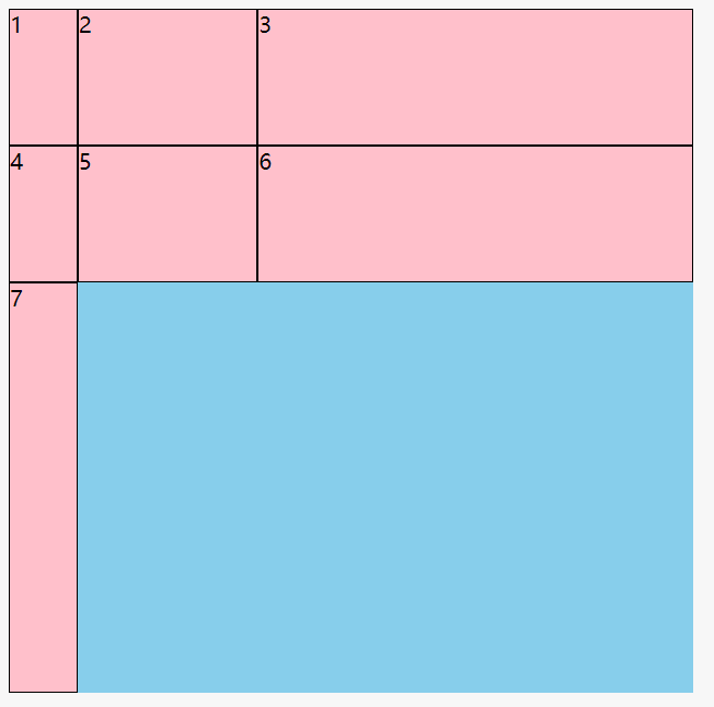
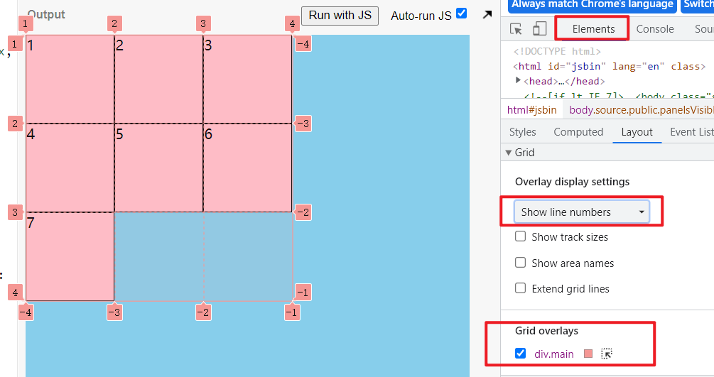
.container {width: 500px;height: 500px;background: skyblue;display: grid;grid-template-columns: 50px 0.3fr auto;grid-template-rows: 100px 100px;}.container > div {background: pink;border: 1px solid;}
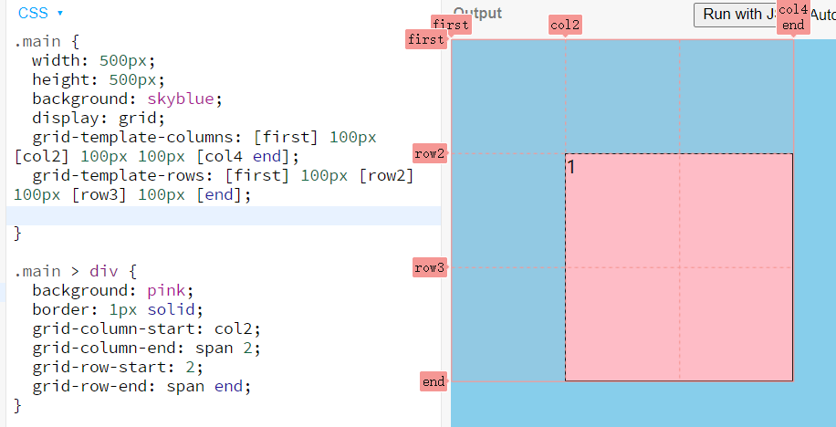
也可以用[]给每条线命名, 定义每条线之间的大小
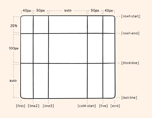
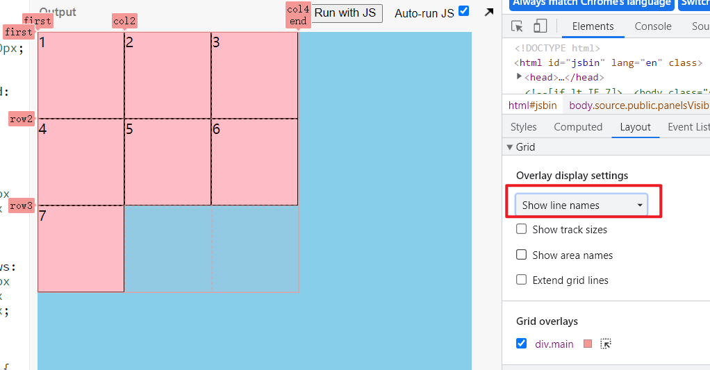
.container {grid-template-columns: [first] 40px [line2] 50px [line3] auto [col4-start] 50px [five] 40px [end];grid-template-rows: [row1-start] 25% [row1-end] 100px [third-line] auto [last-line];}
每条线可以有不止一个名字
.container {grid-template-rows: [row1-start] 25% [row1-end row2-start] 25% [row2-end];}
如果多个地方相同,可以用repeat定义
.container {grid-template-columns: repeat(3, 20px [col-start]);}
等价于
.container {grid-template-columns: 20px [col-start] 20px [col-start] 20px [col-start];}
如果线的名字相同,可以用线的序号来区分
.item {grid-column-start: col-start 2;}
grid-template-areas
grid-template-areas可以给每个区块定义一个名字,子元素通过grid-area设置对应的名字则占有对应的区块
可用于单元格合并
- grid-area名称不能加冒号
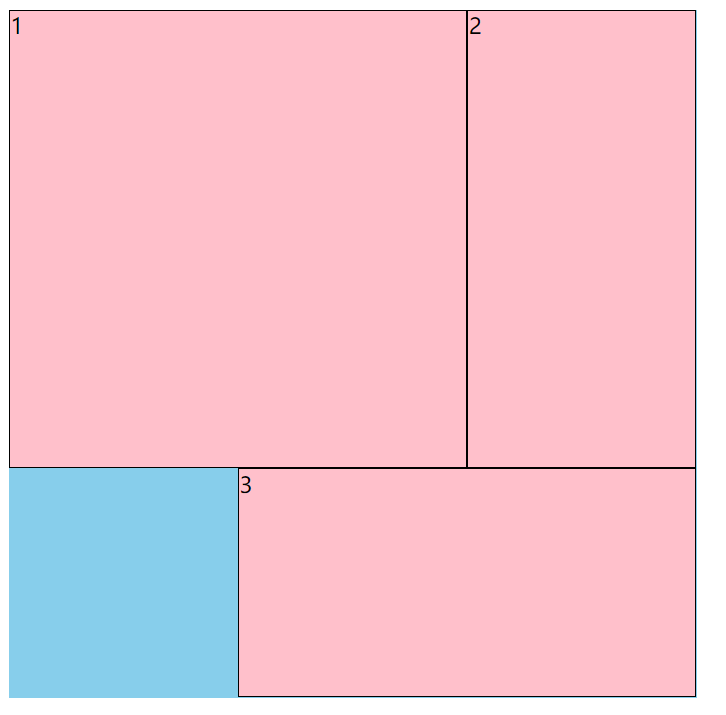
- 区块合并后必须是矩形,不能是不规则图形 ```css .container { width: 500px; height: 500px; background: skyblue; display: grid; grid-template-columns: 1fr 1fr 1fr; grid-template-rows: 1fr 1fr 1fr; grid-template-areas: “a1 a1 a2” “a1 a1 a2” “. a3 a3” ; }
.container > div { background: pink; border: 1px solid; box-sizing: border-box; }
.container div:nth-of-type(1){ grid-area: a1; } .container div:nth-of-type(2) { grid-area: a2 } .container div:nth-of-type(3) { grid-area: a3; }
<a name="swnzD"></a>### grid-templategrid-template是grid-template-columns/rows和grid-template-areas的缩写:<br />"grid-area" rows<br />"grid-area" rows<br />/ columns```cssgrid-template:"a1 a1 a2" 1fr"a1 a1 a2" 1fr". a3 a3" 1fr/ 1fr 1fr 1fr;
gap
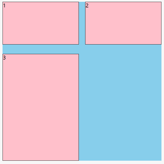
column-gap/row-gap给区块加间隙(gutter), flex和grid布局都适用
.main {width: 500px;height: 500px;background: skyblue;display: grid;grid-template-columns: 1fr 1fr;grid-template-rows: 0.3fr auto;column-gap: 20px;row-gap: 30px;}.main > div {background: pink;border: 1px solid;}
gap是row-gap和column-gap的简写
gap: 30px 20px;
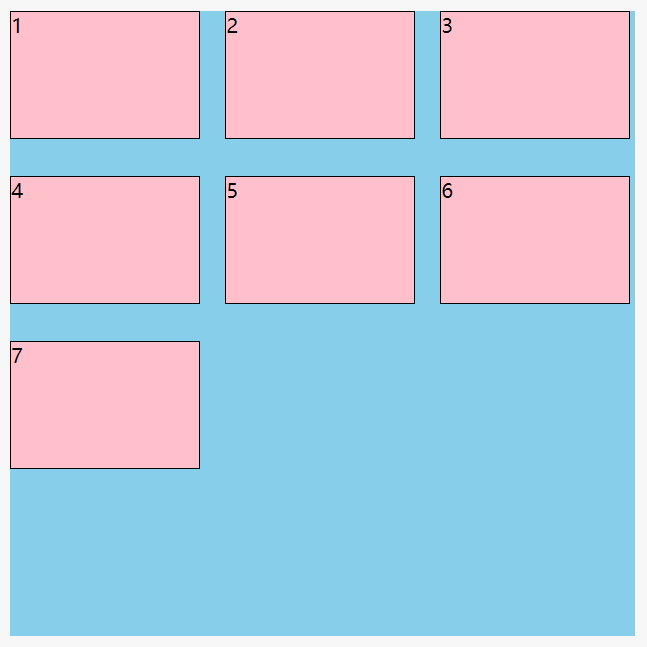
在flex中使用gap
.main {width: 500px;height: 500px;background: skyblue;display: flex;flex-wrap: wrap;align-content: flex-start;column-gap: 20px;row-gap: 30px;}.main > div {width: 30%;height: 20%;background: pink;border: 1px solid;}
子项在网格内对齐方式
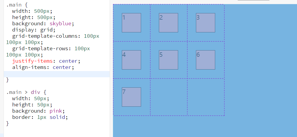
justify-items和align-items定义子项在网格内的对齐方式,前提是子项小于所在网格
默认都是stretch
.container {justify-items: start | end | center | stretch;}
.container {align-items: start | end | center | stretch | baseline;}
place-items是align-item和justify-items的缩写
.center {display: grid;place-items: center;}
网格在容器内对齐方式
jusity-content和align-content定义网格在容器内的对齐方式,前提是网格整体小于容器
.container {justify-content: start | end | center | stretch | space-around | space-between | space-evenly;}
.container {align-content: start | end | center | stretch | space-around | space-between | space-evenly;}
place-content是align-content和justify-content的缩写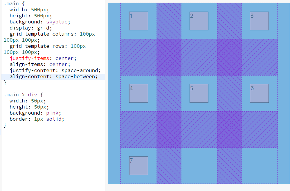
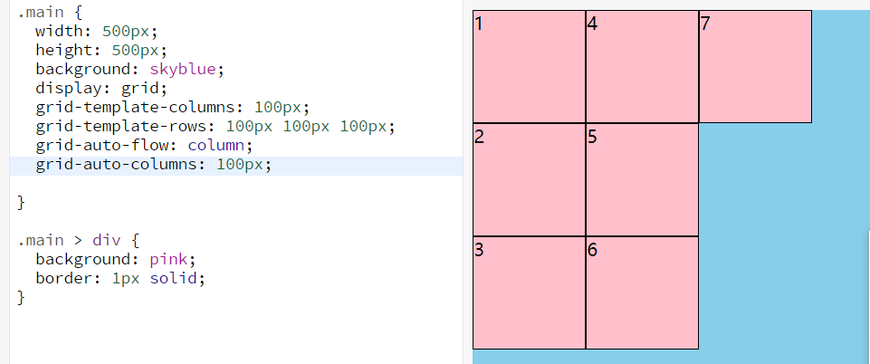
隐式网格
当子项的数量大于网格的数量,多余的子项自动排列,就产生了隐式网格
grid-auto-flow定义产生隐式网格的方向
默认值为row,另一个值为column
还可以添加第二个值dense,让子项自动填补前面的空余的网格
grid-auto-rows和grid-auto-columns定义隐式网格的大小
子项属性
基于线的元素放置
grid-column-start / grid-column-end / grid-row-start / grid-row-end
这一组分别用来定义行和列的结束位置
可用的值:
– 线的序号或名字 - span
– 数字是几就跨越几个区块 - span
– 跨越到对应的线名处位置 - auto – 默认跨越一格
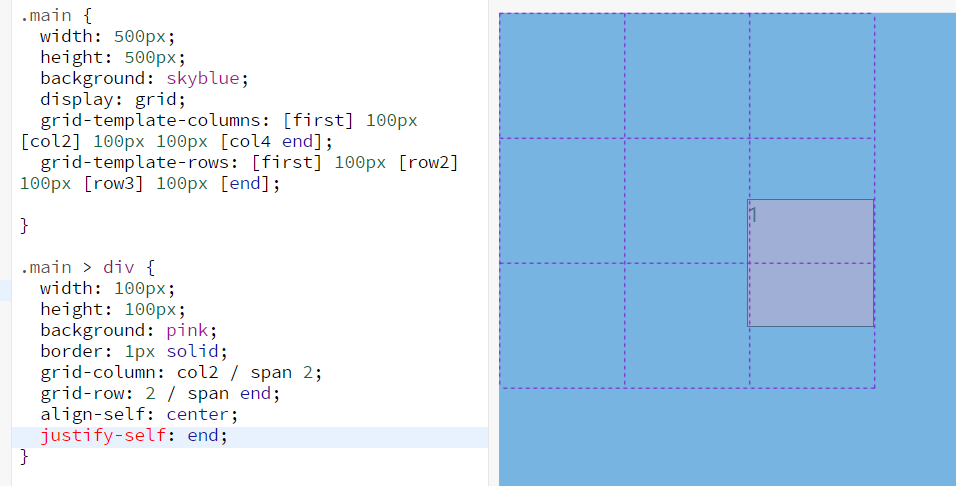
grid-column/grid-row
grid-column和grid-row是上面的简写
.item {grid-column: <start-line> / <end-line> | <start-line> / span <value>;grid-row: <start-line> / <end-line> | <start-line> / span <value>;}
.item-c {grid-column: 3 / span 2;grid-row: third-line / 4;}
grid-area
grid-area可以用来指定子项和区块对应的名字,或者是上面四组的简写
.item {grid-area: <name> | <row-start> / <column-start> / <row-end> / <column-end>;}
.item-d {grid-area: header;}
.item-d {grid-area: 1 / col4-start / last-line / 6;}
单独指定子项在网格内对齐方式
justify-self, align-self, place-self和justify-items,align-items, place-items的作用一样,只不过作用于单独一个网格内的子项
.item {justify-self: start | end | center | stretch;}
.item {align-self: start | end | center | stretch;}
place-self:
.item-a {place-self: center;}
辅助函数
repeat
如果有重复的区块参数,可以使用repeat简写,auto-fill会根据剩余空间自动填充
grid-template-columns: 150px repeat(auto-fill, 100px);
minmax
用于指定区块的最小值和最大值
grid-template-columns: 100px minmax(100px, 1fr) 100px;
配合repeat使用
grid-template-columns: repeat(auto-fill, minmax(200px, 1fr));

若有收获,就点个赞吧
0 人点赞
