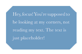
linear-gradient
background: #58a;background:linear-gradient(135deg, transparent 15px, #58a 0)top left,linear-gradient(-135deg, transparent 15px, #58a 0)top right,linear-gradient(-45deg, transparent 15px, #58a 0)bottom right,linear-gradient(45deg, transparent 15px, #58a 0)bottom left;background-size: 50% 50%;background-repeat: no-repeat;
radical-gradient
background: #58a;background:radial-gradient(circle at top left,transparent 15px, #58a 0) top left,radial-gradient(circle at top right,transparent 15px, #58a 0) top right,radial-gradient(circle at bottom right,transparent 15px, #58a 0) bottom right,radial-gradient(circle at bottom left,transparent 15px, #58a 0) bottom left;background-size: 50% 50%;background-repeat: no-repeat;
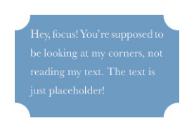
clip-path
background: #58a;clip-path: polygon(20px 0, calc(100% - 20px) 0, 100% 20px,100% calc(100% - 20px), calc(100% - 20px) 100%,20px 100%, 0 calc(100% - 20px), 0 20px);
未来可以使用border-corner-shape
border-corner-shape: curve | bevel | notch | scoop
.box {background-color: #3498DB;border-corner-shape: bevel;border-radius: 50% 50% 0% 50%;width: 200px;height: 200px;}


若有收获,就点个赞吧
0 人点赞
