一、引入第三方依赖
Use this package as a library
Depend on it
Run this command:
With Flutter:
$ flutter pub add flutter_swiper
This will add a line like this to your package’s pubspec.yaml (and run an implicit flutter pub get):
dependencies: flutter_swiper: ^1.1.6
Alternatively, your editor might support or flutter pub get. Check the docs for your editor to learn more.
Import it
Now in your Dart code, you can use:
import ‘package:flutter_swiper/flutter_swiper.dart’;
二、使用组件
创建一个Swiper组件
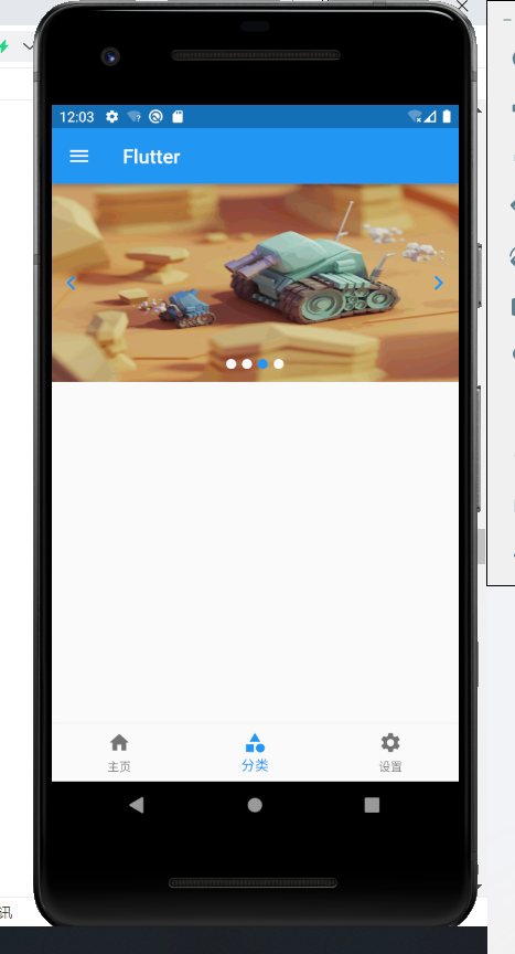
// ignore_for_file: file_namesimport 'package:flutter/material.dart';import 'package:flutter_swiper/flutter_swiper.dart';class Cate extends StatefulWidget {const Cate({ Key? key }) : super(key: key);@override_CateState createState() => _CateState();}class _CateState extends State<Cate> {List<Map> imgList = [{"url": "https://www.itying.com/images/flutter/1.png"},{"url": "https://www.itying.com/images/flutter/2.png"},{"url": "https://www.itying.com/images/flutter/3.png"},{"url": "https://www.itying.com/images/flutter/4.png"}];@overrideWidget build(BuildContext context) {return Container(height: 200,child: Swiper(itemBuilder: (BuildContext context,int index) => Image.network(imgList[index]["url"],fit: BoxFit.fill),itemCount: imgList.length,pagination: const SwiperPagination(),autoplay: true,control: SwiperControl( // 指示器iconNext: Icon(Icons.navigate_next).icon,iconPrevious: Icon(Icons.navigate_before).icon),));}}
效果图:
三、Swiper的常见属性
Constructor (构造函数)
Basic
| Parameter | Default | Description |
|---|---|---|
| scrollDirection | Axis.horizontal | If Axis.horizontal, the scroll view’s children are arranged horizontally in a row instead of vertically in a column. |
| loop | true | Set to false to disable continuous loop mode. |
| index | 0 | Index number of initial slide. |
| autoplay | false | Set to true enable auto play mode. |
| onIndexChanged | void onIndexChanged(int index) | Called with the new index when the user swiped or autoplay |
| onTap | void onTap(int index) | Called when user tap ui. |
| duration | 300.0 | The milliscends of every transaction animation costs |
| pagination | null | set new SwiperPagination() to show default pagination |
| control | null | set new SwiperControl() to show default control buttons |
Pagination(分页器)
The pagination extends from SwiperPlugin,the SwiperPlugin provides extra ui for Swiper.Set new SwiperPagination() to show default pagination.
| Parameter | Default | Description |
|---|---|---|
| alignment | Alignment.bottomCenter | Change this value if you what to put pagination in other place |
| margin | const EdgeInsets.all(10.0) | The distance between inner side of the parent container. |
| builder | SwiperPagination.dots | There are two default styles SwiperPagination.dots and SwiperPagination.fraction,both can be customized. |
Control buttons(左右切换的按钮)
The control also extends from SwiperPlugin,set new SwiperControl() to show default control buttons.
| Parameter | Default | Description |
|---|---|---|
| iconPrevious | Icons.arrow_back_ios | The icon data to display previous control button |
| iconNext | Icons.arrow_forward_ios | The icon data to display next. |
| color | Theme.of(context).primaryColor | Control button color |
| size | 30.0 | Control button size |
| padding | const EdgeInsets.all(5.0) | Control button padding |

若有收获,就点个赞吧
0 人点赞
