table的 props参考 antd Table,Pagination,和 ProTable的 props
- ProTable https://procomponents.ant.design/components/table
- Table https://ant-design.gitee.io/components/table-cn/#API
- Pagination https://ant-design.gitee.io/components/pagination-cn/#API
- Toolbar 列表和表格的工具栏配置属性
- Search 搜索表单
- TableDropdown https://procomponents.ant.design/components/table/#tabledropdown
- 数据驱动 界面渲染
- 字段绑定,动态计算
- 前端校验,后端校验
- 数据转换,构建
表格、表单、列表、图表和布局
布局组件
表格组件
导入 Excel 、语雀表格的数据
表格数据的智能 mock填充,支持文本、编号、数据、时间、地址 e
father 打包覆盖 esm、cjs 和 umd
Islands 架构, astro
Table 的状态就是 Editor 的 config 字段,当 Table 改时,会触发 Editor 的 config 字段同步更新。当 Editor 更新时,也会触发该数据更新
支持撤销重做、快捷键等能力
store
- api
- table
- columns
- search
- toolbar
- pagination
const store = {defaultConfig: {},columns: [{"dataIndex": "name","valueType": "text","fieldType": "string"}],dataSource: [],table: {rowKey: 'id',bordered: false,showHeader: true,footer: true,size: 'middle',"primaryColor": "","showRowSelection": false,"rowSelectionType": "checkbox", // radio, ''"enableScroll": false,scrollToFirstRowOnChange: true,widthType: 'auto',widthNumber: 1360,primaryColor: '#f90',},api: {type: 'restful',url: '',method: 'POST',params: {},},search: {collapsed: true,filterType: 'query'},toolbar: {actionGroups: [],setting: true,reload: true,fullScreen: true,density: true,showOptions: 'auto',headerTitle: '表格标题'},pagination: {current: 1,pageSize: 10,size: 'small',"enabled": false,},}
ProTable
<ProTableheaderTitle=''tooltip=''search={} // false// 不显示右侧操作按钮options={false}toolBarRender={false}/>
request
page,pageNumber,pageSize 是表格常用的 state状态参数
ProTable 会将 props.params 中的数据默认带入到请求中
request,使用的是 umi-request
https://www.npmjs.com/package/umi-request
约定 request 拥有三个参数
- params 会自带 pageSize 和 current , 并且将 props 中的 params 也会带入其中,
- sort 用与排序,
- filter 用于筛选。自定义的参数通过 params 参数 传入 ProTable,会合并到 request 中的 params 中
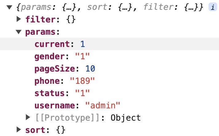
const params = {current: number, // 当前页码pageSize: number // 每页多少条数据...params // 你传入的其他查询数据}import request from 'umi-request';const fetchData = (params, sort, filter) =>request('https://proapi.azurewebsites.net/github/issues', {params,sort,filter,});function App() {return (<ProTableparams={{ keyWords }}request={fetchData}columns={columns}search={{labelWidth: 200}}/>)}
request 和 params文档
https://procomponents.ant.design/components/schema/#request-%E5%92%8C-params
实际业务中,后端定义接口常常与我们需求的不同,可以做自定义转换,
比方说下面是一段在项目中实际使用的代码,后端代码
request={async (params = {}) => {const { current, pageSize } = params;const { data, success } = await fetchData({page: current,limit: pageSize,});return {data: data?.list,total: data?.total,success,};}}
单独一次的转换可能成本不算什么,每个接口都转一遍成本就比较大了
解决:让后端在定义接口时可以与组件定义的数据结构保持一致
请求回来的结果的 ProTable 也有一些约定
interface RequestData {data: Data[];success: boolean;total: number;}
columns
查询表单与表格共用 [columns 列定义的数据,查询表单根据表格项的类型生成对应类型的表单
https://procomponents.ant.design/components/table#columns-%E5%88%97%E5%AE%9A%E4%B9%89
通过切换 [valueType 值的类型切换表格项的展示形式以及表单项的选择形式。
如将创建时间的 valueType 从 dateTime 改为 date ,表格中和搜索表单项都会相应变化
某些表单你希望它在另外一些表单的前面,你可以通过指定 order 来进行排序,权重大排序靠前
const columns: ProColumns<API.fetchData>[] = [{title: '序号',dataIndex: 'index',// 可以通过 valueType 指定值的格式化方式valueType: 'indexBorder',width: 72,},// column 的 title 属性支持传入一个函数{title: (_, type) => {if( type === 'form') return '用户名称';return '这是一个超长的用户名称';},dataIndex: 'name',width: 100,}{title: '用户账号',dataIndex: 'account',renderFormItem: () => <UserSearch />,width: 100,},{title: '创建时间',dataIndex: 'createDt',width: 200,valueType: 'date',// 将列数设置为 4 列,创建时间的表单项占据 2 列colSize: 2,renderFormItem: () => <RangePicker showTime style={{ width: '100%'}} />},]
在 columns 中可以同时配置这两方面的显示隐藏
hideInSearch: true,在 查询表单中不展示此项
hideInTable: true 在 Table中不展示此列
search 查询表单
查询表单项的宽度
体调整表单项的 labelWidth ,默认为 80
<ProTablesearch={{labelWidth: 100,span: 12,// 收起状态下能够多展示一些表单项,因为重置查询按钮固定占一列,所以设置为 5 时只会展示 4 个表单项defaultColsNumber: 5,}}request={const res = { total: 200, data: [], success: true }return Promise.resolve(res)}/>
有些自定义的表单项可能会比较长,需要占据多列,比方说日期的范围输入
- 调整 labelWidth
- search 调整配置查询表单的列数 span,这里遵循 antd 的24栅格系统,即列数 = 24 / span ,如下是 12 即展示位 2列。
- columns 调整让该表单项占据更多的 colSize ,即一个表单项占用的格子数量
自定义查询按钮组
<ProTablesearch={{defaultCollapsed: false,optionRender: ({ searchText, resetText }, { form }) => [<Buttonkey="search"type="primary"onClick={() => {form?.submit();}}>{searchText}</Button>,<Buttonkey="rest"onClick={() => {form?.resetFields();}}>{resetText}</Button>,<Button key="out">导出</Button>,],}}/>
简单查询
简单的表格需求中,我们要的可能不是一个查询表单,而是一个简单的查询输入
只有一个 input框
方法一:通过 options 中的 search 选项设置为 true ,默认变量为 keyword ,
你也可以传入 name 自定义变量名,或者传入更多搜索表单的相关选项,如 placeholder
<ProTablerequest={async (params) => {console.log(params);// {current: 1, pageSize: 20, keyword: "123"}}}search={false} // search 用于控制查询表单不显示options={{search: true, // 打开搜索功能表单。// search: {// name: 'userName',// placeholder: '请输入用户名'// }}}headerTitle="toolbar 中搜索"/>
toolBarRender
通过 `toolBarRender 自定义搜索项
export default () => {const actionRef = useRef();const [keyWord, setKeyWord] = useState();return (<ProTableparams={{keyWord}}request={async (params = {}) => {console.log('params', params);// {current: 1, pageSize: 20, keyWord: "1111"}}}toolBarRender={() => [<Input.Searchstyle={{width: 350,}}onSearch={(value) => setKeyWord(value)}placeholder="按数据名称搜索"/>,<ProForm tableRef={actionRef} />,]}/>);};
自定义表单
自定义的表单项都要能够接受 value 和 onChange
通常直接传的表单项如 Input, Select 等都是支持 value 和 onChange 的
如果是项目中又封装了一层,记得要传入 {…props}
自定义列表工具栏
在表格中进行 tab 切换等,用 ListToolBar 列表工具栏进行高级定制:
https://procomponents.ant.design/components/table#%E5%88%97%E8%A1%A8%E5%B7%A5%E5%85%B7%E6%A0%8F
在 ProTable 的 params 中添加 activeKey,就会在 request 的时候自动带上该参数啦
function App() {const [activekey, setActiveKey] = useState('tab1');return (<ProTableparams={{activekey}}request={async (params = {}) => {console.log('params', params);// {current: 1, pageSize: 20, keyWord: "1111"}}}toolbar={{menu: {type: 'tab',activeKey: activekey, // 'tab1'items: [{key: 'tab1',label: '普通用户'},{key: 'tab2',label: '氪金用户'},{key: 'tab3',label: '管理员'},],onChange: (key) => {setActiveKey(key as string);},},}}/>)}
{"table": {"showHeader": true,"footer": true,"size": "middle","bordered": false,"primaryColor": "","rowKey": "id","showRowSelection": false,"rowSelectionType": "checkbox", // radio, ''"enableScroll": false,},"columns": [{"dataIndex": "name","valueType": "text","fieldType": "string"}],"pagination": {"enabled": false,},"toolBar": {}}<ProTableheaderTitle=''tooltip=''search={} // false// 不显示右侧操作按钮options={false}toolBarRender={false}/>
https://github.com/arvinxx
https://arvinxx.github.io/microwave/component.html
ProTable问题
options配置错误
Argument appears to not be a ReactComponent. Keys: forceAlign,forcePopupAlign
原因:options配置错误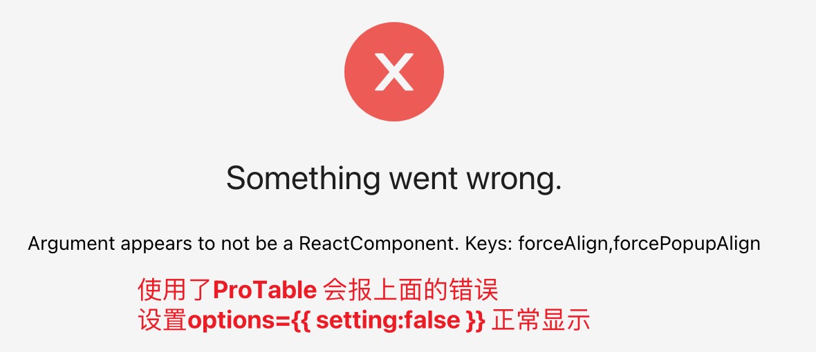
正确的设置
options={{setting: false,}}// 报错的配置options={{setting: {listsHeight: 400,},}}

若有收获,就点个赞吧
0 人点赞
