antd v5 https://ant.design/theme-editor-cn
主题颜色参考
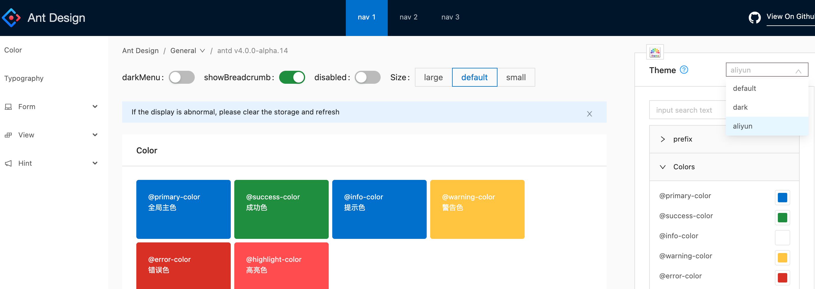
- antd v4 https://theme.antd.group/aliyun
- antd-design-aliyun-theme https://github.com/ant-design/ant-design-aliyun-theme
- TDesign https://tdesign.tencent.com/design/color
antd v5 token design 主题
Antd5 主题编辑 https://ant-design.antgroup.com/theme-editor-cn
// 绿色主题{"token": {"colorPrimary": "#52C41A","fontSize": 12,"borderRadius": 0,"wireframe": false}}// 深蓝主题{"token": {// "#0070cc", aliyun"colorPrimary": "#0052d9", // Tdesign"colorInfo": "#0052d9","fontSize": 14,"wireframe": true}}
紧凑算法 theme.compactAlgorithm
- height高度 28px
- 默认高度 32px
antd pro theme
const themePro = {"navTheme": "light","primaryColor": "#722ED1", // "#52C41A""layout": "mix","contentWidth": "Fluid","fixedHeader": false,"fixSiderbar": true,"pwa": false,"logo": "https://gw.alipayobjects.com/zos/rmsportal/KDpgvguMpGfqaHPjicRK.svg","headerHeight": 48}
ConfigProvider 自定义主题
- 全局主题,包裹 App
- 局部自定义主题,包裹组件
- 组件级主题,例如 ConfigProvider theme=/Table
通过传入不同的主题算法,我们甚至可以控制组件在不同应用场景下的展示形态
自定义主题算法是一个全局风格的调整
好处:通过少的 token 自定义 seedToken,实现风格感受很不一样的主题
全局主题
import { theme } from 'antd';import type { MappingAlgorithm } from 'antd/es/config-provider/context';// 定义 studio 暗色模式算法export const studioDarkAlgorithm: MappingAlgorithm = (seedToken, mapToken) => {// 使用 antd 默认的暗色算法生成基础token,这样其他不需要定制的部分则保持原样const baseToken = theme.darkAlgorithm(seedToken, mapToken);return {...baseToken,colorBgLayout: '#d8d8d8', // Layout 背景色colorBgContainer: '#282c34', // 组件容器背景色colorBgElevated: '#32363e', // 悬浮容器背景色};};// 在应用中集成const Container =()=>{return (<ConfigProvider theme={{ algorithm: studioDarkAlgorithm }}><App /></ConfigProvider>)}
局部主题
<ConfigProvider theme={{ algorithm: theme.darkAlgorithm }}><Table /></ConfigProvider>
组件主题
component 字段聚合调整每个组件的 token
<ConfigProvidertheme={{ components: {Button: { colorPrimary: '#f90'},Checkbox: { colorPrimary: '#f90'},}}}><PageContainer></PageContainer></ConfigProvider>
antd v4 less 主题
https://ant.design/docs/react/customize-theme-cn
https://ant-design.antgroup.com/docs/react/faq-cn
https://ant-design.antgroup.com/docs/react/customize-theme-cn
默认的主题
- 🌑 暗黑主题(4.0.0+ 支持)
- 📦 紧凑主题(4.1.0+ 支持)
- ☁️ 阿里云控制台主题(Beta)
使用 less 提供的 modifyVars 的方式进行覆盖变量
less变量自定义主题
默认less主题
https://github.com/ant-design/ant-design/blob/master/components/style/themes/default.less
全局 less变量
https://github.com/ant-design/ant-design/blob/master/components/style/themes/variable.less
建立一个单独的 less 变量文件,引入这个文件覆盖 antd.less 里的变量,缺点
- 载入了所有组件的样式,
- 不需要也无法和按需加载插件 babel-plugin-import 的 style 属性一起使用
@import '~antd/lib/style/themes/default.less';@import '~antd/dist/antd.less'; // 引入官方提供的 less 样式入口文件@import 'your-theme-file.less'; // 用于覆盖上面定义的变量
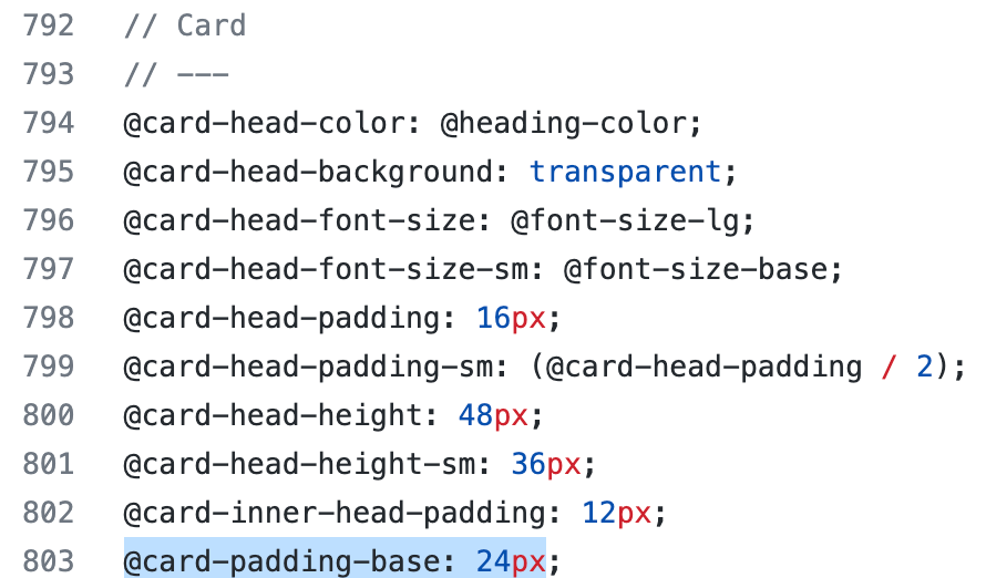
Card padding
@card-padding-base: 24px
动态主题
https://ant.design/docs/react/customize-theme-variable-cn
如果使用了 babel-plugin-import,需要将其去除

若有收获,就点个赞吧
0 人点赞
