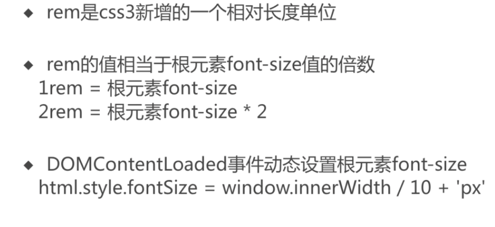
移动端通过 rem适配多种机型
1rem 默认 = 16px,因为 浏览器默认的字体是 16px
字体大小跟着 html根元素变化
动态修改 html的font-size来修改 rem
rem的基准值
- rem数值计算
- rem与 scss的结合
rem的基准值,就是 html的 font-size,默认是 16px
rem与scss的结合
px2rem
@function px2rem($px) {$rem: 37.5px;@return ($px / $rem) + rem;}.main {width: px2rem(100px);height: px2rem(100px);}
动态修改font-size
js动态修改 font-size
// 获取视口宽度const clientWidth = document.documentElement.clientWidth || document.body.clientWidth;const html = document.querySelector('html');html.style.fontSize = `${clientWidth/10}px`;
document.addEventListener('DOMContentLoaded', () => {// 获取视口宽度const clientWidth = document.documentElement.clientWidth || document.body.clientWidth;const html = document.querySelector('html');const fontSize = (clientWidth/10) > 50 ? 50px (clientWidth/10);html.style.fontSize = `${fontSize}px`;});window.addEventListener('resize', () => {});
mediaQuery
css的优先级,和顺序有关,顺序在后面的,权重要高
mediaQuery的缺点:
- 手机碎片化严重,要写很多的 mediaQuery
```css
@media screen and (max-width: 768px) {
html {
} }font-size: 20px;
// 指定宽高 @media screen and (max-width: 320px) and (min-height: 578px) { html { font-size: 16px; } } ```

若有收获,就点个赞吧
0 人点赞
