为了绘制一个数据集中二元变量的分布,可以使用jointplot(),这个函数能够产生一个多面板的图像,在图像上包括两个变量之间的关系,在单独的坐标中还绘制出了各个变量的分布。
绘制分布图的函数用法如下:
seaborn.jointplot(x, y, data=None, kind='scatter',stat_func=<function pearsonr>,color=None, size=6, ratio=5,space=0.2, dropna=True, xlim=None,ylim=None, joint_kws=None,marginal_kws=None,annot_kws=None, **kwargs)
(1)特殊参数:
kind : 图类型,值为{ “scatter” | “reg” | “resid” | “kde” | “hex” }之一,分别对应为散点图、回归图、残差图、核密度估计、六角图。
(2)基本参数
(1)
color : 颜色。参数类型: matplotlib 颜色
(2)
size : 图的尺度大小(正方形),默认为 6。参数类型:数值型。
(3)
ratio : 中心图与侧边图的比例,越大、中心图占比越大。参数类型:数值型。
(4)
space : 中心图与侧边图的间隔大小。参数类型:数值型。
(5) s:散点的大小(只针对散点图scatter),参数类型:数值型。
(6) linewidth:散点边缘线的宽度(只针对散点图scatter),参数类型:数值型。
(7) edgecolor:散点的边界颜色,默认无色,可以重叠(只针对散点图scatter),参数类型:matplotlib 颜色。
(8) {x, y}lim:x、y轴的范围。参数类型:二元组
(9) {joint, marginal, annot}_kws:中心图、侧边图与统计注释的信息。例如:joint_kws=dict(s=80,edgecolor=’g’), marginal_kws=dict(bins=15,rug=True,color=’g’),
annot_kws=dict(stat=’r’,fontsize=15)。
plot()是Matplotlib画图的最主要方法,Series和DataFrame都有plot方法。plot()默认生成是曲线图,可以通过kind参数生成其它的图形,可选的值为:line、bar、 barh、kde、scatter、等。对于坐标类数据,可以用散点图来查看它们的分布趋势和是否有离群点的存在。
使用Matplotlib库的plot()方法做散点图,数据为萼片的长和宽
import pandas as pd # 导入pandas库import warnings # 载入当前版本seaborn库时会有警告出现,先载入warnings,忽略警告import seaborn as sns # 导入seaborn库import matplotlib.pyplot as plt # 导入matplotlib库warnings.filterwarnings("ignore") # 忽略警告sns.set(style="white", color_codes=True) # 确定主题为whiteiris = pd.read_csv("iris.csv") # 读取csv数据并转为Pandas的 DataFrame格式iris.plot(kind="scatter",x="SepalLengthCm", y="SepalWidthCm")plt.show()
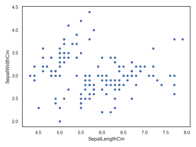
利用matplotlib作散点图
使用seaborn库的FacetGrid()方法做分类散点图,可以将不同分类数据点用不同颜色进行标注,数据为萼片的长和宽。
import pandas as pd # 导入pandas库import warnings # 载入当前版本seaborn库时会有警告出现,先载入warnings,忽略警告import seaborn as sns # 导入seaborn库import matplotlib.pyplot as plt # 导入matplotlib库warnings.filterwarnings("ignore") # 忽略警告sns.set(style="white", color_codes=True) # 确定主题为whiteiris = pd.read_csv("iris.csv") # 读取csv数据并转为Pandas的 DataFrame格式sns.FacetGrid(iris, hue="Species", size=5).map(plt.scatter,"SepalLengthCm","SepalWidthCm").add_legend()plt.show()
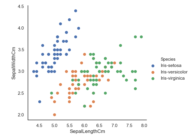
用seaborn做分类散点图
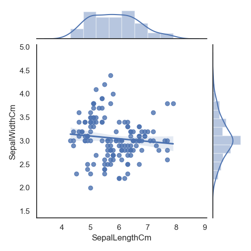
使用seaborn库的jointplot ()方法做散点图,数据为萼片的长和宽。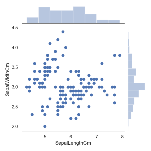
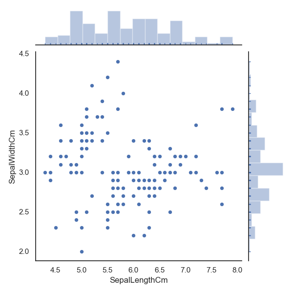
seaborn库的jointplot
()方法做散点图
使用seaborn库的jointplot
()方法做回归图和六角图(如图10.40所示),数据为萼片的长和宽。
import pandas as pd # 导入pandas库import warnings # 载入当前版本seaborn库时会有警告出现,先载入warnings,忽略警告import seaborn as sns # 导入seaborn库import matplotlib.pyplot as plt # 导入matplotlib库warnings.filterwarnings("ignore") # 忽略警告sns.set(style="white", color_codes=True) # 确定主题为whiteiris = pd.read_csv("iris.csv") # 读取csv数据并转为Pandas的 DataFrame格式sns.jointplot(x="SepalLengthCm", y="SepalWidthCm",data=iris, size=5, kind="reg") #回归图plt.show()sns.jointplot("SepalLengthCm", y="SepalWidthCm",data=iris, size=5, kind="hex") #六角图plt.show()
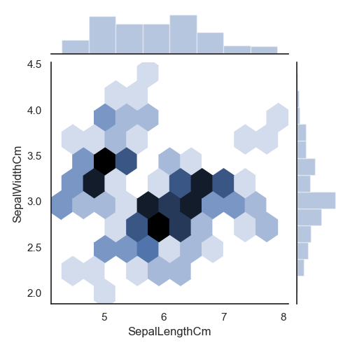
回归图和六角图
使用Seaborn库的jointplot ()方法做KDE 图和散点图+KDE 图,数据为萼片的长和宽
import pandas as pd # 导入pandas库import warnings # 载入当前版本seaborn库时会有警告出现,先载入warnings,忽略警告import seaborn as sns # 导入seaborn库import matplotlib.pyplot as plt # 导入matplotlib库warnings.filterwarnings("ignore") # 忽略警告sns.set(style="white", color_codes=True) # 确定主题为whiteiris = pd.read_csv("iris.csv") # 读取csv数据并转为Pandas的 DataFrame格式sns.jointplot("SepalLengthCm", y="SepalWidthCm",data=iris, size=5, kind="kde")plt.show()sns.jointplot("SepalLengthCm", y="SepalWidthCm",data=iris, size=5).plot_joint(sns.kdeplot, zorder=0, n_levels=6)plt.show()
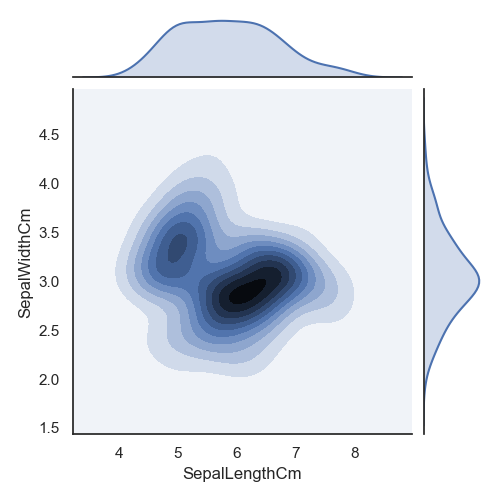
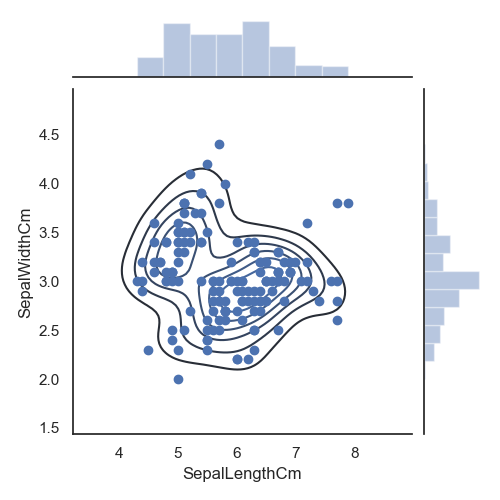
KDE 图和散点图+KDE
图

若有收获,就点个赞吧
0 人点赞
