pyplot.plot(*args, scalex=True, scaley=True, data=None, **kwargs)plot([x], y, [fmt], *, data=None, **kwargs)plot([x], y, [fmt], [x2], y2, [fmt2], ..., **kwargs)
参数
x, y:类似数组的数据或标量数据
fmt:标明颜色、线型和标记的字符串,如:“r—o”表示红色、破折线,标记为圆圈
data:可索引的数据对象
返回值:
list of Line2D(2D曲线的列表)
表示绘制曲线的数据列表,如[
所绘图的点或线节点的坐标由x,y给出。
可选参数fmt是定义基本格式(如颜色、标记和线型)的便捷方法。
'b' # blue markers with default shape'or' # red circles'-g' # green solid line'--' # dashed line with default color'^k:' # black triangle_up markers connected by a dotted line
格式字符串由颜色、标记和线条部分组成:
fmt = '[marker][line][color]'
还支持其他组合,例如[color][marker][line],但需要注意的是,它们的解析可能不明确。
“fmt”是一种快捷的字符串表示法,下面三条语句效果相同。
plot(x, y, 'go--')plot(x, y, color='green', marker='o', linestyle='dashed')plot(x, y, color='green', marker='o', linestyle='--')
标记:
| character | description | character | description |
|---|---|---|---|
| ‘.’ | point marker | ‘p’ | pentagon marker |
| ‘,’ | pixel marker | ‘P’ | plus (filled) marker |
| ‘o’ | circle marker | ‘*’ | star marker |
| ‘v’ | triangle_down marker | ‘h’ | hexagon1 marker |
| ‘^’ | triangle_up marker | ‘H’ | hexagon2 marker |
| ‘<’ | triangle_left marker | ‘+’ | plus marker |
| ‘>’ | triangle_right marker | ‘x’ | x marker |
| ‘1’ | tri_down marker | ‘X’ | x (filled) marker |
| ‘2’ | tri_up marker | ‘D’ | diamond marker |
| ‘3’ | tri_left marker | ‘d’ | thin_diamond marker |
| ‘4’ | tri_right marker | ‘|’ | vline marker |
| ‘8’ | octagon marker | ‘_’ | hline marker |
| ‘s’ | square marker |
线型:
| character | description |
|---|---|
| ‘-‘ | solid line style |
| ‘—‘ | dashed line style |
| ‘-.’ | dash-dot line style |
| ‘:’ | dotted line style |
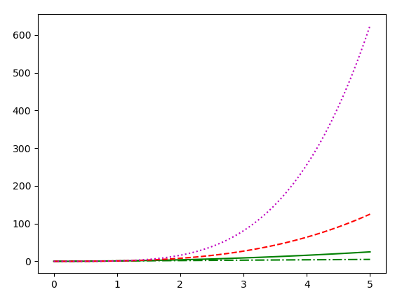
import matplotlib.pyplot as pltimport numpy as npx = np.linspace(0, 5)# [0,5),产生50个点的等差数组y1 = xy2 = x ** 2 # 生成一系列x平方值的数组y3 = x ** 3 # 生成一系列x立方值的数组y4 = x ** 4plt.plot(x, y1, 'g-.')plt.plot(x, y2, 'g-')plt.plot(x, y3, 'r--')plt.plot(x, y4, 'm:')plt.show() # 显示创建的绘图对象
颜色:
支持的颜色缩写为单字母代码
| character | color |
|---|---|
| ‘b’ | blue |
| ‘g’ | green |
| ‘r’ | red |
| ‘c’ | cyan |
| ‘m’ | magenta |
| ‘y’ | yellow |
| ‘k’ | black |
| ‘w’ | white |
1.根据标签数据绘制
有一种方便的方法可以使用带标签的数据(即可以通过索引obj[‘y’]访问的数据)绘制图像。可以在数据参数中提供数据对象,而不必在x和y中提供数据,只需为x和y提供标签:
plot('xlabel', 'ylabel', data=obj)
import matplotlib.pyplot as pltimport pandas as pddf = pd.read_csv('XRD_AFOtxtd.csv')plt.plot('2d', 'Intensity', data=df) # 根据列标题获取数据plt.show() # 显示绘制结果

2.绘制多组数据
绘制多组数据有多种方法。
最直接的方法就是多次调用plot。例如:
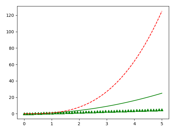
import matplotlib.pyplot as pltimport numpy as npx = np.linspace(0, 5)# [0,5),产生50个点的等差数组y1 = xy2 = x ** 2 # 生成一系列x平方值的数组y3 = x ** 3 # 生成一系列x立方值的数组plt.plot(x, y1, 'g^') # 绘制二次函数曲线plt.plot(x, y2, 'b-') # 绘制二次函数曲线plt.plot(x, y3, 'r--') # 绘制三次函数曲线plt.show() # 显示创建的绘图对象
与以下代码等效:
import matplotlib.pyplot as pltimport numpy as npx = np.linspace(0, 5)# [0,5),产生50个点的等差数组y1 = xy2 = x ** 2 # 生成一系列x平方值的数组y3 = x ** 3 # 生成一系列x立方值的数组plt.plot(x, y1, 'g^', x, y2, 'g-', x, y3, 'r--')plt.show() # 显示创建的绘图对象
再如:
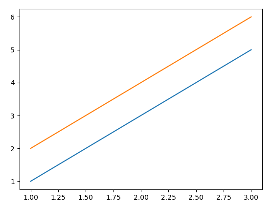
import matplotlib.pyplot as pltimport numpy as npx = [1, 2, 3]y = np.array([[1, 2], [3, 4], [5, 6]])plt.plot(x, y)plt.show()
与以下代码等价:
import matplotlib.pyplot as pltimport numpy as npx = [1, 2, 3]y = np.array([[1, 2], [3, 4], [5, 6]])for col in range(y.shape[1]):plt.plot(x, y[:, col])plt.show()
默认情况下,图中每条线都指定了一个由“ style cycle”指定的不同样式。“fmt”和line属性参数仅在希望与这些默认值有明显不同时才需要使用的。线条风格也可以使用rcParams属性指定。
pyplot.subplots(nrows=1, ncols=1, *, sharex=False,sharey=False, squeeze=True, subplot_kw=None,gridspec_kw=None, **fig_kw)
创建一个画布和一组子图。
可以方便的在一次调用中创建多子图的通用布局,包括封闭的图对象。
行和列的默认值均为1,表示一行一列,即一个子图。
此方法的返回值有2个:
fig:Figure
ax:axes.Axes or array of Axes
如果创建了多个子图块,ax可以是单个轴对象,也可以是轴对象数组。生成的数组的维度可以通过 squeeze关键字控制,请参见上文。
处理返回值的典型习惯用法有:
import matplotlib.pyplot as pltfig, ax = plt.subplots()print(fig) # Figure(640x480)print(ax) # AxesSubplot(0.125,0.11;0.775x0.77)# using the variable axs for multiple Axesfig, axs = plt.subplots(2, 2)print(axs) # [[<AxesSubplot:> <AxesSubplot:>]# [<AxesSubplot:> <AxesSubplot:>]]# using tuple unpacking for multiple Axesfig, (ax1, ax2) = plt.subplots(1, 2)print(ax1, ax2) # AxesSubplot(0.125,0.11;0.352273x0.77)# AxesSubplot(0.547727,0.11;0.352273x0.77)fig, ((ax1, ax2), (ax3, ax4)) = plt.subplots(2, 2)print((ax1, ax2), (ax3, ax4)) # (<AxesSubplot:>, <AxesSubplot:>)# (<AxesSubplot:>, <AxesSubplot:>)

若有收获,就点个赞吧
0 人点赞
